Old Marvel versus Sherlock Holmes

oldmarvel4.jpg

Arriving in the post this week, one of the books whose covers I was creating late last year. Work-wise, the past year has been busier than usual which means I’ve fallen behind with the logging of recent commissions. In the past few months I’ve created several album designs, more book covers, an entire book design (cover plus interior), and also been working on two bigger projects at the same time. Things have calmed down a little now so updates will be forthcoming.

oldmarvel1.jpg

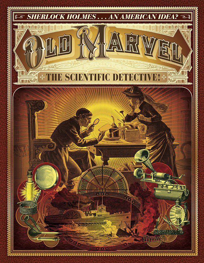
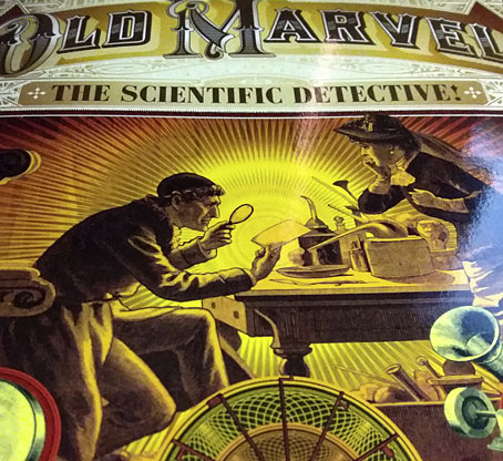
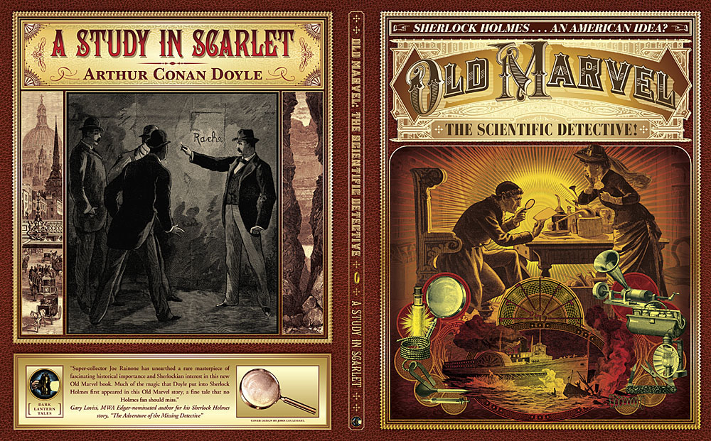
Old Marvel: The Scientific Detective is another design for Mark Williams’ Dark Lantern Tales imprint which once again resurrects a forgotten detective from pulp obscurity, and in a larger format than before. The new volume is significant for presenting a Sherlock Holmes-like character—credited to the pseudonymous “Grip”—who predates Holmes’ first appearance by three years, thereby suggesting a possible inspiration for Arthur Conan Doyle. Holmes collector Joe Rainone provides the details of publication and sets out the available evidence in an informative foreword. The Old Marvel character not only pre-empts Holmes by using his scientific knowledge to solve mysteries but he also pre-empts subsequent generations of spies and investigators with the various gadgets he uses, including what may be the first fictional deployment of an Edison voice recorder. My brief for the cover was to combine the illustration of the character with a vignette showing a shipping disaster from the story plus some of the contents of the detective’s tool kit.

oldmarvel2.jpg

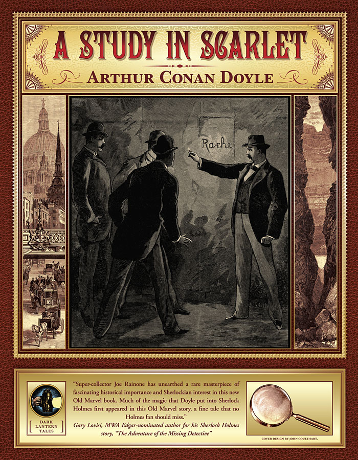
The book is actually two stories in one volume, with the second half being a reprint of the very first Sherlock Holmes novel, A Study in Scarlet. Both stories are presented as semi-facsimiles of their original US printings, together with reproductions of title pages and so on. The Holmes story is reproduced from its appearance in The Illustrated Home Guest in 1892, and includes rare illustrations one of which appears on the cover. Doyle’s first Holmes novel is the most controversial of all his stories—at least if you’re a Mormon—since this is the one where the inhabitants of Salt Lake City are depicted as a murderous religious cult. I filled out the cover with panels showing the two main story locations: a view of London via Ludgate Circus and a canyon in Utah. Finding a period engraving of St Paul’s Cathedral that remained visually interesting when narrowed down in this way took some time.

oldmarvel3.jpg

Previously on { feuilleton }
More detectives
The Joe Phenix Detective Series
Illustrating Sherlock Holmes

The other Carceri

carceri12.jpg

Dark prison with a courtyard for the punishment of criminals (c.1750) by Giovanni Battista Piranesi. (NB: not one of the Carceri d’Invenzione although it is another imaginary prison.)

Piranesi’s etchings of imaginary prisons, the Carceri d’Invenzione, are his most celebrated and influential works but they’re not the only such views to be found in 18th-century art. What you see here are some of the prison settings designed for the theatre and opera of the time, where incarceration or unjust imprisonment was a recurrent theme. Beethoven’s only opera, Fidelio, is one of the more famous examples, with all the action taking place inside the walls of a Spanish prison.

carceri08.jpg

Prison Courtyard with Figures (c. 1720). Attributed to Francesco Galli Bibiena.

Many of these designs are by various Galli Bibienas, a multi-generational family of Italian artists and architects who included theatrical designers among their talented number. The Galli Bibienas’ prisons lack the invention and menace of Piranesi’s etchings—many of them look as neat and tidy as their designs for colossal gardens and palaces—but I enjoy the dramatic perspectives all the same.

carceri01.jpg

Prison Interior (c.1725–1730) by Antonio Galli Bibiena.

carceri01.jpg

Print depicting the Prison scene in the opera-ballet Cerere placata at the Royal Palace of Jove (1772). Carlo Bibiena (artist) and Giovanni Battista Nolli (etcher).

carceri03.jpg

Design for a stage set: the interior of a prison. School of Francesco Galli Bibiena.

Continue reading “The other Carceri”

Quay Brothers record covers

quays01.jpg

Institute Benjamenta (1998) by Lech Jankowski.

Continuing an occasional series about artists or designers whose work has appeared on record sleeves. Regular readers won’t be surprised to hear that I’ve had this one in mind for some time but it’s taken a while to put together. The main problem has been the Quay Brothers’ habit of using a variety of different names when they were working as designers; variations include “Stefen” rather than Stephen Quay, the Brothers Quai, Gebr. Quay, Jumeaux Quay, The Quays, Atelier Koninck (or Koninck Atelier), and so on. The catalogue compilers at Discogs do a good job of keeping up with the alternate names of groups or musical artists but stumble over those used by anyone else associated with an album’s production. Consequently, this collection of covers shouldn’t be taken as complete or final. Some of the discoveries would have been impossible without the checklist of Quays ephemera that accompanied the MoMA exhibition in 2012.

quays02.jpg

Blood, Sweat & Tears (1968) by Blood, Sweat & Tears.

This must be one of the earliest of the Quays’ commercial works. As with other covers from the first decade of their career, the credit is for illustration alone, graphic design came later.

quays03.jpg

Mozart: Violin Concerto No. 2 In D Major, Violin Concerto No. 5 In A Major (“Turkish”) (197?); Zurich Chamber Orchestra, Zino Francescatti, Edmond De Stoutz.

quays04.jpg

George Rochberg: String Quartet No. 3 (1973); The Concord String Quartet.

quays05.jpg

Fiction Tales (1981) by Modern Eon.

Continue reading “Quay Brothers record covers”

Fantaisies Florales

pilters01.jpg

Plants and flowers are a common feature of Art Nouveau sourcebooks; Alphonse Mucha, Eugène Grasset and Maurice Verneuil all produced books for designers filled with floral patterns and motifs which generally remain faithful to their models. The designs in Fantaisies Florales by Jean Pilters are less concerned with fidelity to nature, especially in the background decorations whose swirling elaborations look like precursors of the psychedelic art that would help revive popular interest in Art Nouveau decades later. Pilters’ designs were published as a series of loose-leafed portfolios which in these copies have lost their covers, hence the gummed labels which spoil two of the plates.

pilters02.jpg

So who was Jean Pilters? Information is scarce, unfortunately, beyond descriptions of the artist as a French designer. The plates, which possibly date from 1910 (nobody is sure about the year of publication either), look like copies of colour originals but if an earlier colour edition exists I’ve yet to find any examples. Monochrome and tanned with age they may be but there’s enough here for me to work with. I may be borrowing some of these details in the near future.

pilters03.jpg

pilters04.jpg

pilters05.jpg

Continue reading “Fantaisies Florales”

Weekend links 606

smith.jpg

An alphabet by Tina Smith.

• Coming in March from Warp records: reissues of three Broadcast releases that were previously only available in limited quantities, Microtronics, Volumes 1 & 2, and Mother Is The Milky Way. The latter is an EP which makes a perfect companion to Witch Cults Of The Radio Age, and while its reissue means I’ll no longer be able to brag about owning one of the rare originals it really ought to have been more widely available. In addition, Warp will be releasing the group’s first live album, BBC Maida Vale Sessions, a collection of performances for radio. All these releases are packaged in new cover designs by Julian House.

• “Nature Boy was the conduit through which vegetarian ideals, nonconformism and notions of living in harmony with nature began to filter into US culture.” Jon Savage on the exotic world of Eden Ahbez.

• At Dennis Cooper’s: Two booklets of Austin Osman Spare: Earth: Inferno (1905), The Book of Pleasure (Self-Love) (1913).

Joyce refused to fix the meaning of the words on the page and left the reader to fend for themselves. So the content may not be actually shocking, but the book feels exciting—as though it might turn shocking any second. Anything might stir in the body or consciousness of a character, in the body or consciousness of the reader. My mother was right to consider it a dangerous text. The thing the censors worried about were the uncensored workings of their own minds.

More than any other book, Ulysses is about what happens in the reader’s head. The style obliges us to choose a meaning, it is designed to make us feel uncertain. This makes it a profoundly democratic work. Ulysses is a living, shifting, deeply humane text that is also very funny. It makes the world bigger.

Anne Enright on Ulysses at 100

• At Aquarium Drunkard: occult scholar Mitch Horowitz on the Transmissions podcast.

• 5th Dimension: DJ Food examines a piece of psychedelic Op-art by Michael English.

• New music: Möbius by Jonathan Fitoussi/Clemens Hourrière.

• At Spoon & Tamago: Hiraku Suzuki’s Constellations.

• The month in type at I Love Typography.

Wyrd Daze Six Star.

Nature Boy (1975) by Big Star | Nature Boy (1980) by Manu Dibango | Nature Boy (1999) by Jon Hassell