William Burroughs book covers

wsb1.jpg

This site has a great selection of Burroughs’ cover art. By no means complete but pages like this are always fascinating for showing the variety of visual interpretations that can be brought to a single title. Also nice to see how books looked in their earlier editions before they achieved status as “classic” works. And sometimes you see odd book title variations, so Queer in some foreign editions has become Pederast.

wsb2.jpg

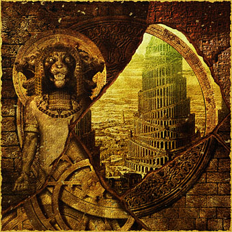
Too many great designs to choose from so I’ve picked out a couple of favourites by Thomi Wroblewski for Picador editions of the early Eighties. Cities of the Red Night remains my favourite Burroughs novel and I still toy with the idea of doing an illustrated edition one day.

Elsewhere on { feuilleton }
The book covers archive
The William Burroughs archive

New things for August

kabbalah.jpg

A couple of updates to the site this month. Firstly there’s another interview with Eroom Nala focussing on life, art and (inevitably) my forthcoming Haunter of the Dark book.

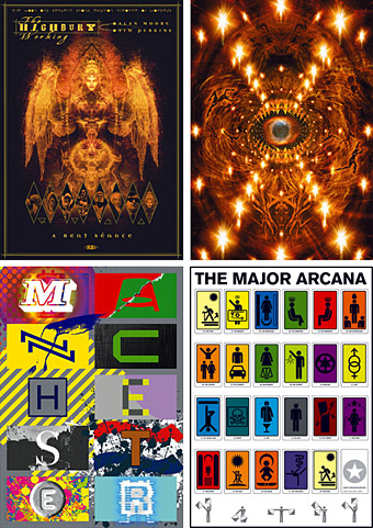
And I’ve finally got round to expanding the line of CafePress products (T-shirts and a larger poster print) for my Kabbalah poster which seems to be my most popular work judging by sales there. This surprises me seeing as it was done on a whim in 2000 after a visit to London. Alan Moore later used it in an issue of Promethea but I don’t know whether the people interested in it are Promethea fans or some of the new breed of Kabbalists.

I’ll be adding more products for other lines, and some new things, as time permits over the next few weeks.

Update: CafePress have decided that my artwork may need “copyright clearance”. So don’t bother trying to buy anything just yet.

Update 2: CafePress tell me that “Transport for London provided us with a notice stating that the use of the London Underground Roundel infringes upon their intellectual property rights”. I presume this means now I’ll have to amend the artwork to remove the offending article. Copyright hell: it’s the wave of the future. Get used to it. See this Boing Boing post for a good example of London Transport’s dead hand.

Update 3: Products reworked with slightly amended artwork although for some reason the page is still showing the old items.

Helvetica: the film

helvetica.jpg

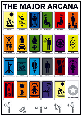
Yes, a documentary about a typeface by Gary Hustwit. And why not, say I? More films about typography, please. I paid homage to the ubiquitous Swiss font with my design for Savoy’s A Serious Life which used Helvetica Neue in various weights throughout.

Helvetica is a feature-length independent film about typography, graphic design and global visual culture. It looks at the proliferation of one typeface (which will celebrate its 50th birthday in 2007) as part of a larger conversation about the way type affects our lives. The film is an exploration of urban spaces in major cities and the type that inhabits them, and a fluid discussion with renowned designers about the choices and aesthetics behind their use of type.

Helvetica encompasses the worlds of design, advertising, psychology, and communication, and invites us to take a second look at the thousands of words we see every day.

The film was shot in high-definition on location in the United States, England, the Netherlands, Germany, Switzerland, France and Belgium. It is currently in post-production and is slated to begin screening at film festivals worldwide starting in early 2007.

Interviewees in Helvetica include some of the most illustrious and innovative names in the design world, including Erik Spiekermann, Matthew Carter, Massimo Vignelli, Michael Bierut, Wim Crouwel, Hermann Zapf, Stefan Sagmeister, Jonathan Hoefler, Tobias Frere-Jones, Experimental Jetset, and many more.

Via Typographica.

A few thousand science fiction covers

sf_covers.jpg

Seems that this has been around for a while but I’ve only just run across it. Jim Bumgardner has created a browsable “table-top” of thousands of sf magazine covers using minimal Flash and Perl scripting; unlike many Flash-oriented web toys you don’t have to waste valuable minutes watching a progress bar before it starts working. Rest your mouse anywhere on the picture and a cover lifts itself from the mass; double-click that cover and it grows larger. He also has a similar page for covers of Mad magazine and 1001 graphic novels and comics. And an explanation of how it all works.

Previously on { feuilleton }
The book covers archive

Paris V: Details

Final Paris posting here, gathering up more of the better photos.

door.jpg

Walk down any residential street and you’ll see amazing doors like this that lead to the courtyards of apartment blocks. All the decorations are different, as are the brass door-handles emblazoned with human or animal heads. You could spend months photographing them.

Continue reading “Paris V: Details”