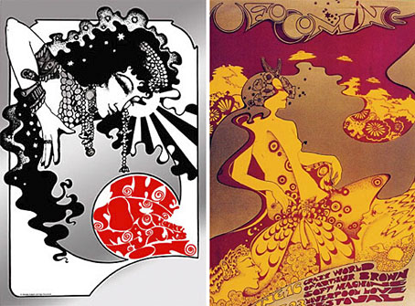
left: The Soft Machine Turns On (1967); right: UFO Coming (1967).
This was a bitter blow coming at a time when I’ve been working on something inspired in part by Hapshash and the Coloured Coat, the 1960s design duo comprised of Michael English and Nigel Waymouth. The two artists, together with associate Martin Sharp, are indelibly associated with the London psychedelic scene of the late Sixties. Whereas Sharp’s posters were often loose and dramatically bold explosions of shape and colour, the Hapshash posters were more carefully controlled in their curating of disparate elements borrowed from Art Nouveau—especially Mucha and Beardsely—comic strips, Op Art, Pop art and fantasy illustration. Their work perfectly complemented the very distinctive atmosphere of the capital’s psychedelic scene which, for a couple of hectic years, saw an explosion of new bands (or old bands in new guises) fervently engaged in a lysergic exploration of Victoriana, childhood memories and frequent silliness. UK psychedelia is generally more frivolous than its US equivalent which had the Vietnam War and civil disorder to deal with; English and Waymouth’s graphics captured the London mood.
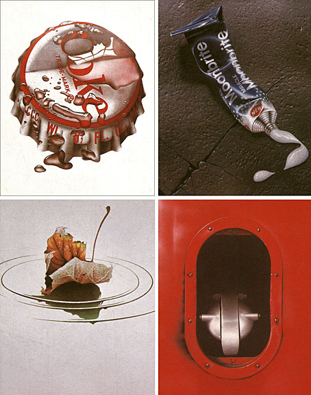
top left: Coke (1970); top right: Toothpaste (1974).
bottom left: Leaf Falls (1972); bottom right: Red no. 3 (1978).
In the 1970s English refashioned himself as a hyper-realist painter of foodstuffs and other consumer goods, and his meticulous airbrush style led to work as an advertising artist. Those paintings are beautifully rendered but often leave me feeling slightly queasy. I much prefer his work from later in the decade which depicted equally meticulous close-up views of oil-smeared buses and trains. Paper Tiger published a book collection in 1979, 3D Eye, which gathers the best of his work from the poster art on.
• Obituaries: Guardian | Times
• Hapshash poster galleries here and here
Previously on { feuilleton }
• The Look presents Nigel Waymouth
• The New Love Poetry