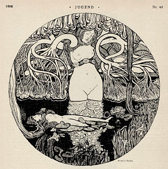
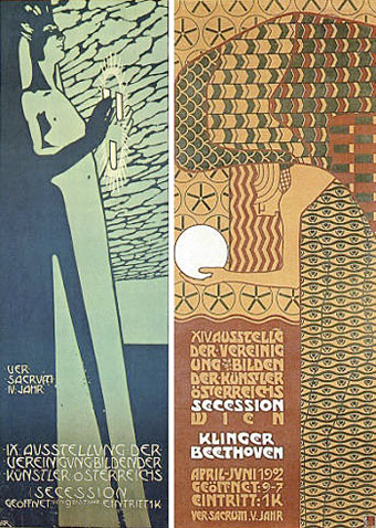
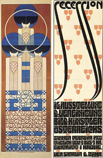
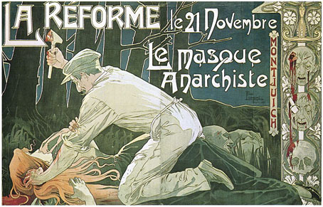
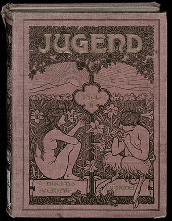
Art Nouveau Revival 1900 . 1933 . 1966 . 1974

artrevival.jpg

It was the slightly gamy residue of the super-elegant and exotic pictures of Aubrey Beardsley. I have always considered the 1900 period as the psycho-analytical end-product of the Greco-Roman Decadence. I said to myself: Since these people will not hear of aesthetics and are capable of becoming excited only over “vital agitations”, I shall show them how in the tiniest ornamental detail of an object of 1900 there is more mystery, more poetry, more eroticism, more madness, perversity, torment, pathos, grandeur and biological depth than in their innumerable stock of ugly fetishes, possessing bodies and souls of a stupidity that is simply and uniquely savage!

Salvador Dalí, The Secret Life of Salvador Dalí (1942).

More from Paris, whereupon it becomes necessary to ask: how much more groovy could this poster be? And the answer is none. None more groovy. Art Nouveau Revival 1900 • 1933 • 1966 • 1974 is an exhibition running at the Musée d’Orsay, Paris, which traces the echoes of Art Nouveau through Surrealism into the revival of the 1960s.

artrevival2.jpg

Poster by Albert Angus Turbayne for Macmillan’s illustrated Standard Novels (1903).

Rejected and scorned in the decades following its brief flowering, Art Nouveau was spectacularly rehabilitated in the 1960s. This re-evaluation offers a particularly interesting interlude in the history of style in that many different areas were affected at the same time by this phenomenon: the history of art, the art market, contemporary creative work, particularly design and graphics.

There’s further detail here, along with photos of some of the exhibits. Verner Panton’s Visiona II makes another appearance and in addition to Dalí and company there’s the magic word “psychedelic”. The exhibition runs until February 4, 2010, and there’s a catalogue co-written by the V&A’s fin de siècle expert Stephen Calloway which I’m going to have to buy. Via.

Previously on { feuilleton }
Beardsley at the V&A
Michael English, 1941–2009
Temples for Future Religions by François Garas
Antonin Mercié’s David
Art Nouveau illustration
Dirty Dalí
Verner Panton’s Visiona II
Flowers of Love

Netherlands decorated books

netherlands1.jpg

left: Over kunst en kunstenaars (1923); right: Over literatuur (1924).

A few examples from a collection of gorgeous Art Nouveau and Art Deco cover designs.

The books cover the period 1893–1939 and contains bindings in the Nieuwe Kunst and Art Nouveau styles by contemporary artists working in the Netherlands such as Jozef Cantre (1890–1957) and Jan Toroop (1858–1928). The collection is particularly strong on P.A.H. Hofman’s designs.

netherlands2.jpg

left: Tziganen (1924); right: Rond de wereld (1931).

Elsewhere on { feuilleton }
The book covers archive

Michael English, 1941–2009

english1.jpg

left: The Soft Machine Turns On (1967); right: UFO Coming (1967).

This was a bitter blow coming at a time when I’ve been working on something inspired in part by Hapshash and the Coloured Coat, the 1960s design duo comprised of Michael English and Nigel Waymouth. The two artists, together with associate Martin Sharp, are indelibly associated with the London psychedelic scene of the late Sixties. Whereas Sharp’s posters were often loose and dramatically bold explosions of shape and colour, the Hapshash posters were more carefully controlled in their curating of disparate elements borrowed from Art Nouveau—especially Mucha and Beardsely—comic strips, Op Art, Pop art and fantasy illustration. Their work perfectly complemented the very distinctive atmosphere of the capital’s psychedelic scene which, for a couple of hectic years, saw an explosion of new bands (or old bands in new guises) fervently engaged in a lysergic exploration of Victoriana, childhood memories and frequent silliness. UK psychedelia is generally more frivolous than its US equivalent which had the Vietnam War and civil disorder to deal with; English and Waymouth’s graphics captured the London mood.

english2.jpg

top left: Coke (1970); top right: Toothpaste (1974).
bottom left: Leaf Falls (1972); bottom right: Red no. 3 (1978).

In the 1970s English refashioned himself as a hyper-realist painter of foodstuffs and other consumer goods, and his meticulous airbrush style led to work as an advertising artist. Those paintings are beautifully rendered but often leave me feeling slightly queasy. I much prefer his work from later in the decade which depicted equally meticulous close-up views of oil-smeared buses and trains. Paper Tiger published a book collection in 1979, 3D Eye, which gathers the best of his work from the poster art on.

• Obituaries: Guardian | Times
• Hapshash poster galleries here and here

Previously on { feuilleton }
The Look presents Nigel Waymouth
The New Love Poetry

Further tales from the Obscure World

penchee1.jpg

L’enfant penchée.

We’re at the penultimate post in this week-long tribute to the Cités Obscures series of François Schuiten and Benoît Peeters, and there isn’t enough space left to cover some of the more recent volumes in detail. What follows is a quick skate through three more major works.

penchee2.jpg

L’enfant penchée.

L’enfant penchée (1996), or The Leaning Child, is an expanded version of a 1995 children’s story by Schuiten and Peeters, Mary la penchée. Mary is the young daughter of wealthy industrialists from Mylos struck down one day by some cosmic calamity which shifts her centre of gravity, causing her to permanently lean at an apparently impossible angle. When she’s bullied at school she runs away and joins a circus. A meeting with scientists and astronomers leads to a resolving of her affliction, and the repairing of her ruined life. This is a fascinating story for a number of reasons, not least the existence of a parallel narrative taking place in our world which is conveyed using photographs, and which unveils some of the metaphysical aspects of the Obscure World. The story of Mary is also flawlessly drawn. Schuiten uses a black-and-white style modelled on the work of old magazine illustrators like Franklin Booth, and there are further references to Winsor McCay and Jules Verne.

Continue reading “Further tales from the Obscure World”

Les Murailles de Samaris by Schuiten & Peeters

map.jpg

The Obscure World.

Les Murailles de Samaris (1983) by François Schuiten and Benoît Peeters is the first of the stories which explores the world of Les Cités Obscures, a “counter-Earth” on the opposite side of our Sun with a continent of separate city-states, each with their own distinct architectural style. Having discovered these stories first in their French editions it wasn’t immediately apparent how much the Obscure World was supposed to be connected to our own; a number of the books contain references to people or places in our world, while the city of Brüsel, subject of the book of that name, is a kind of parallel Brussels. The counter-Earth explanation isn’t given in the early books but seems to have evolved later, as does Schuiten and Peeters’ introduction of portals between the worlds which imply a two-way leakage of influence. Writer and artist encourage readers of the series to suggest or “discover” new portals to the Obscure World.

samaris1.jpg

A view over Xhystos.

The distant city of Samaris is the mysterious destination of Les Murailles de Samaris (The Walls of Samaris). The story begins in the city of Xhystos whose style is fully Art Nouveau in a manner reminiscent of the celebrated Belgian architect Victor Horta, if Horta had been allowed to design a city where every building is decorated with wrought-iron curves and glass-canopied roofs, and where trams go by on elevated roads several storeys high. The narrator, Franz, is informed by the city authorities that he’s been chosen to go on a perilous mission to discover whether rumours about the nature of Samaris are true or not. Previous explorers have failed to return so Franz’s friends and girlfriend regard his acceptance of the mission as suicidal. What follows is a journey by steam train out of the city into a surrounding zone of lawless ruins, then a journey by “altiplane” and “aerophele”, the latter being a kind of multi-winged sand yacht.

Continue reading “Les Murailles de Samaris by Schuiten & Peeters”