A TV Dante by Tom Phillips and Peter Greenaway

dante1.jpg

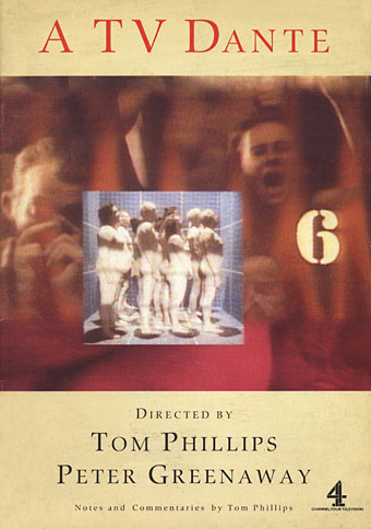
More cult stuff from Ubuweb, you lucky people. Being a big Tom Phillips enthusiast I’ve been watching A TV Dante (1989) for years, having taped the one and only broadcast of the series. I also bought the accompanying booklet (below).

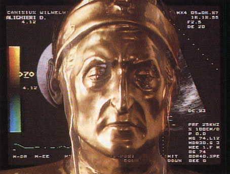
This ambitious program, produced by the award-winning film director Peter Greenaway and internationally-known artist Tom Phillips, brings to life the first eight cantos of Dante’s Inferno. Featuring a cast that includes Sir John Gielgud as Virgil, the cantos are not conventionally dramatized. Instead, the feeling of Dante’s poem is conveyed through juxtaposed imagery that conjures up a contemporary vision of hell, and its meaning is deciphered by eminent scholars in visual sidebars who interpret Dante’s metaphors and symbolism. This program makes Dante accessible to the MTV generation. Caution to viewers: program contains nudity. (8 segments, 11 minutes each)

Given the nature of the collaboration, this can’t be compared to many other TV productions. Greenaway wasn’t staging a drama, he was using the TV screen as a flat space like a moving painting, or a series of diagrams and connected symbol systems. The division of the screen has a parallel in some of Phillips’s paintings (and his artist’s book of the Inferno) and makes use of Phillips’s familiar stencil lettering. There are actors: as mentioned above, Sir John Gielgud took the role of Virgil, with Bob Peck as Dante and Joanne Whalley-Kilmer as Beatrice. And there are recurrent motifs: triangle, concentric circles, cardiograph displays, Muybridge animations and so on. “Footnotes” were provided by a company of experts who appear in small inset panels to comment on the text while it’s being read. Phillips himself is one of the principal commentators since it was his translation being used.
dante2.jpg

Peter Greenaway’s feature films have never interested me very much, I prefer him when he’s doing things like this which probably explains why I like Prospero’s Books, his version of The Tempest; much of that film’s approach seems to have been developed from A TV Dante. It’s a shame that only eight of the Cantos were filmed in this way. There were plans to film all thirty four using other directors (with Greenaway to return at the end) but this endeavour took place at the end of the period when Channel 4 was still a haven for unusual arts projects. Regime change subsequently charted a course for the lowest common denominator. And with the two leading actors now dead it wouldn’t be possible to resume the project. In the end this doesn’t matter too much. What remains is an introduction to a perennially fascinating book and an example of how television could—if someone had the courage—ditch the clichés of drama documentary and try something genuinely new.

The official Tom Phillips website
The Tom Phillips blog

Previously on { feuilleton }
John Osborne’s Dorian Gray
20 Sites n Years revisited
The last circle of the Inferno
20 Sites n Years by Tom Phillips
Pauline Baynes, 1922–2008

baynes1.jpg

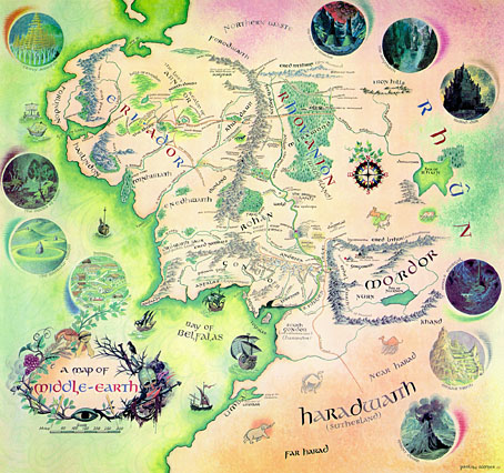
Pauline Baynes, who died earlier this week, was for a long while the only Tolkien illustrator of note. Her work was approved by Tolkien himself but faded from view as the JRRT spin-off industry began to expand in the late Seventies and other artists quickly crowded the field, many of whom lacked her subtlety and sympathy for the material. It was her artwork which Allen & Unwin used on their single-volume edition of Lord of the Rings and in the late Sixties they also produced a poster of her Middle Earth map (above; complete version here). That poster hung on my bedroom wall and fascinated me with its view of the now over-familiar characters and the vignette details of various locations.

baynes3.jpg

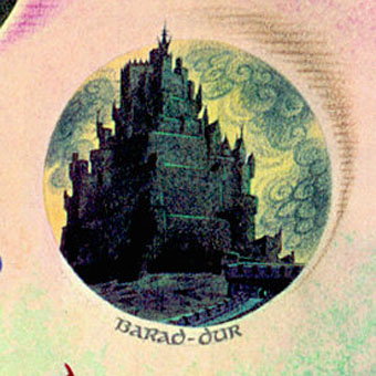
Those vignettes, such as her tiny rendering of Sauron’s Dark Tower, seemed at the time a perfect summation of Tolkien’s world and I still prefer her hulking Barad-dûr to the spiny monolith seen in Peter Jackson’s films. Her friendship with Tolkien led to a similar commission for maps and illustrations from CS Lewis and it’s as the illustrator of the Narnia books that she’s most celebrated. I never read Lewis’s work, and came to Lord of the Rings late, so the infatuation with this brand of heroic fantasy swiftly gave way to the ambivalent moralities of Michael Moorcock‘s Elric, Fritz Leiber‘s Lankhmar and Mervyn Peake’s Gormenghast. Her work wouldn’t have suited those writers but for Tolkien and Lewis she was ideal.

baynes2.jpg

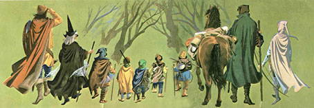
The Fellowship of the Ring from the Middle Earth map.

One of the newspaper obituaries notes:

It was somewhat to her chagrin that she developed a reputation over the years as an illustrator of mostly Christian works and, to redress the balance, one of her last creations (her “children” as she called them) was a series of designs for selections from the Qur’an, scheduled for publication in 2009.

These days Charles Williams is the writer who interests me still from the Oxford group known as “the Inklings”, of whom Tolkien and Lewis were the most famous members. Williams was also a Christian propagandist but his use of fantasy was more sophisticated and, in the extraordinary Many Dimensions (1931), he too managed to depart from the Christian sphere by blending HG Wells-style science fantasy with Islamic mysticism.

Brian Sibley wrote a Pauline Baynes obituary for The Independent and his blog features an excellent overview of her life and work.

Elsewhere on { feuilleton }
The illustrators archive

Previously on { feuilleton }
Mervyn Peake in Lilliput

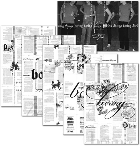
boring boring boring boring boring boring boring by Zach Plague

boring.jpg

This multi-faceted design event from Featherproof Books turned up in the post recently, a book which actually deserves the designation “novel” for once. boring boring boring boring boring boring boring by Zach Plague manifests across a range of media—book, poster, compact disc—with the book being the most elaborately-designed work of fiction I’ve seen in a long time.

When the mysterious gray book that drives their twisted relationship goes missing, Ollister and Adelaide lose their post-modern marbles. He plots revenge against art patriarch The Platypus, while she obsesses over their anti-love affair. Meanwhile, the art school set experiments with bad drugs, bad sex, and bad ideas. But none of these desperate young minds has counted on the intrusion of a punk named Punk and his potent sex drug. This wild slew of characters get caught up in the gravitational pull of The Platypus’ giant art ball, where a confused art terrorism cell threatens a ludicrous and hilarious implosion. Zach Plague has written and designed a hybrid typo/graphic novel which skewers the art world, and those boring enough to fall into its traps.

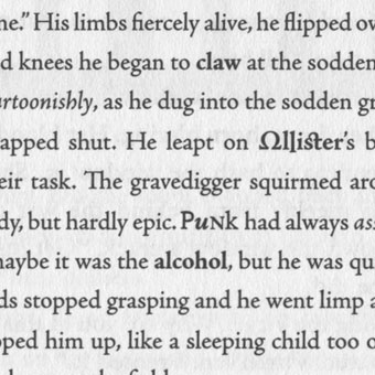
I’ve not had chance to read this yet (still plodding through Ulysses) so can’t comment on the story but I like the design. As well as a fancy spot UV finish on the jacket (that’s a mix of matt and gloss to you) and much vogueishly baroque business occurring in and around the pages, the text is set in a variety of typefaces with considerable attention to detail.

boring2.jpg

Adobe’s book design application InDesign has a find and replace function which simplifies this kind of thing but it still takes some dedication to apply it to every page of a novel. The usual reaction to experimental work like this is for people to cry “gimmick”; in the case of the recent run of Savoy Books, my most detailed design—for Robert Meadley’s A Tea Dance at Savoy (2003)—featured illustrations and inset elements on every page, only to be dismissed by one review as being “like a website”, whatever that means. Given that the design of novels hasn’t advanced much since the 19th century I’d say we could stand to see more of this approach. Typographic experiment has a lengthy history despite the general lack of encouragement, from early examples in Apollinaire’s poetry to more recent works such as House of Leaves by Mark Z Danielewski. There’s always the risk that doing this becomes a distraction but then interesting art has to take risks as well. The rule of thumb among the science fiction writers of the Sixties when they were pushing the stylistic boundaries was that the form followed the content; if the content can support this kind of presentation there’s no reason not to try it, is there?

Elsewhere on { feuilleton }
The book covers archive

New things for August

cyaegha.jpg

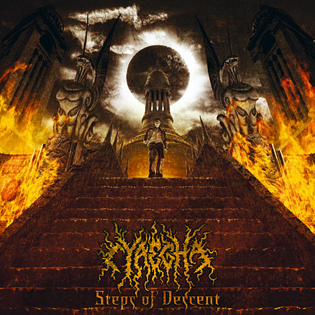
Arriving in the post today was Steps of Descent, the new CD from American band Cyaegha featuring my design and illustration. The name Cyäegha (sic) belongs originally to a Cthulhu Mythos entity invented by Eddie C Bertin, author of The Whispering Horror, my favourite story from the Pan Book of Horror anthologies of the Seventies. The cover illustration is based on a scene from HP Lovecraft’s The Dream Quest of Unknown Kadath and the cover and inner pages feature some photographic material from one of my Paris trips. I was very pleased with the way this turned out and I believe the band are too. Steps of Descent is officially released by Canonical Hours on the 8th of August.

steampunk.jpg

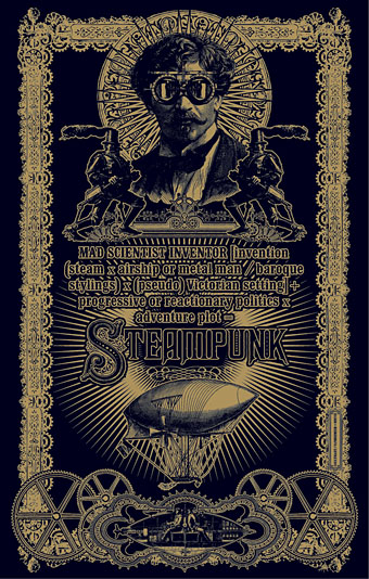
Another recent piece of work is this Steampunk design suggested by writer Jeff VanderMeer who wanted a suitable layout for his semi-serious Steampunk formula. Jeff and wife Ann edited the recent Steampunk anthology from Tachyon so he knows whereof he speaks. This was going to be a T-shirt design but it seems now it may have a different outlet; more about that if and when it happens. The growing popularity of Steampunk as a sub-culture has raised some hackles recently but I like it even though I’ve not read many of the latest literary contributions. Anything which puts more brass, dirigibles and florid Victoriana into the world gets my vote.

Previously on { feuilleton }
Zeppelin vs. Pterodactyls
Wanna see something really scary?