Alan Moore: an extraordinary gentleman | Novelist, magician and “guru of the graphic novel” Alan Moore talks to Steve Rose about Watchmen, the dark side of Hollywood and the morality of pornography.
Category: {books}
Books
Edward William Lane’s Arabian Nights Entertainments
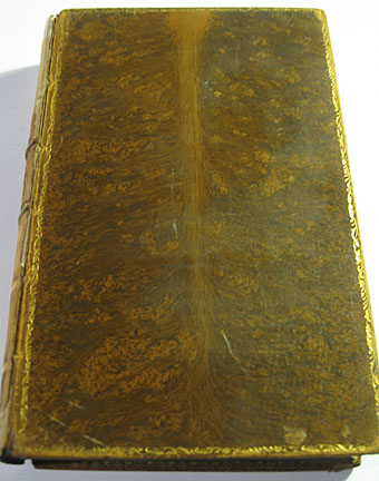
This weekend’s book purchase looks like an expensive volume but was actually pretty reasonably-priced for a book that’s 126 years old. This is no. III of a three-volume set of the Thousand and One Nights translated by Edward William Lane, published by Chatto & Windus in 1883. I bought it mainly for the copious wood engraving illustrations by William Harvey although the book itself is a beautiful, if battered, work of art: gold edging on the boards, marbled endpapers (something we did at Savoy for Lucy Swan’s novel) and marbling on the paper edges (Lucy’s book had gold edging). Like many fine old books the heavy boards and thick paper stock means it’s very heavy and it’s these quality materials which have helped it survive this long.
I wasn’t going to put this through the flatbed scanner so a few photo snaps follow.
Continue reading “Edward William Lane’s Arabian Nights Entertainments”
Lorca was censored to hide his sexuality, biographer reveals
Soviet posters
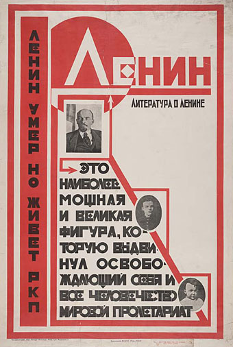
“Lenin is dead but the Russian Communist Party lives on” (no date).
More typography and yet more Soviet poster art which seems perennially popular with graphic designers. Bold Constructivist designs like this example are part of the reason why: over 80 years old yet still striking. Type foundry P22 have a set of Constructivist fonts similar to the typeface used here. Poster tip via Coudal.
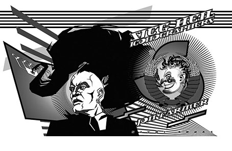
Sieg Heil Iconographers, title spread (2006).
I plundered the Soviet style in 2006 for the design of Jon Farmer’s Sieg Heil Iconographers for Savoy Books. The typeface this time was Jonathan Barnbrook’s contemporary design, Newspeak. Does the assertive bad taste of the book’s title undermine the Communist propaganda or do the Agitprop graphics ironically counterpoint the discussion of fascist history within? That’s left for the reader to decide.
Previously on { feuilleton }
• Lenin Rising
• Dead Monuments
• Soviet ceramics of the 1920s
• Enormous structures II: Tatlin’s Tower
Down and out in Paris
Down and out in Paris | Jeanette Winterson revisits Shakespeare and Company.