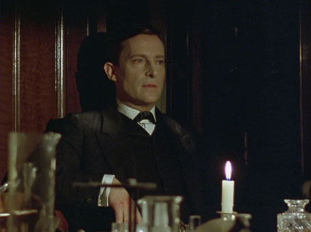
Coulthart Calendar 2009

calendar1.jpg

I’ve been a bit late with the new calendar this year but it’s finally available at CafePress. I’ve also been somewhat remiss in reusing last year’s pages rather than uploading new ones. Preparing 12 pages of art takes time even if you’re using old images—they have to be the right dimensions, after all—and I’ve been preoccupied this year with too many other things. So while the cover is new (based on this HP Lovecraft-derived picture), the pages are the same tinted versions of the art for The Great Old Ones from my Haunter of the Dark book. Considering the popularity of these pictures I’m guessing that some people will be quite happy with that; a selection from the series also appeared in the enormous Lovecraft Retrospective from Centipede Press earlier this year.

In other Lovecraft-related news, I’ve been slowly drawing a new Cthulhu portrait since demand for Cthulhoid work remains high. I’m not sure when this will be finished yet as other work takes precedence but this is where you’ll hear about it first.

calendar2.jpg

calendar3.jpg

Previously on { feuilleton }
The monstrous tome

Last in Line by Light Syndicate

ls1.jpg

Last in Line is the debut album by Manchester band Light Syndicate and the CD packaging is something I put together after being asked to rescue a design which wasn’t quite working. I kept the band’s original idea of black trees on a red background but substituted their drawing with an adaptation of a 1910 folk tale illustration by Reginald Lionel Knowles. Knowles’ name is an obscure one today, his most visible work being the florid endpaper design which the Everyman Library used on their books up to 1935.

Last in Line is available locally from today (I guess that means Piccadilly Records) and nationwide from January 12th.

ls2.jpg

ls3.jpg

ls4.jpg

Elsewhere on { feuilleton }
The illustrators archive

Rockwell Kent’s Moby Dick

kent1.jpg

From Rockwell Kent’s masterful 1930 edition. Would be nice to point to a complete online set of these illustrations but there doesn’t seem to be one. The black and white pictures are from this Flickr set which has a couple more examples.

Update: A (near) complete set of illustrations!

kent2.jpg

kent3.jpg

Elsewhere on { feuilleton }
The book covers archive
The illustrators archive

Peacocks

peacock1.jpg

The Modern Poster by Will Bradley (1895).

A selection from the NYPL Digital Gallery. There’s more by the great Will Bradley (1868–1962) here.

peacock2.jpg

Abstract design based on peacock feathers by Maurice Verneuil (1900?).

peacock3.jpg

Pavo; Lophophorus (1834–1837).

Elsewhere on { feuilleton }
The illustrators archive

Previously on { feuilleton }
Rene Beauclair
Elizabetes Iela 10b, Riga
The Maison Lavirotte
Whistler’s Peacock Room
Beardsley’s Salomé

The best font won

gotham.jpg

The beautifully elegant Gotham typeface by Hoefler & Frere-Jones was already becoming pretty ubiquitous even before the Obama brand designers chose it for all their campaign graphics. I’ve used it myself a couple of times recently, notably on the jacket for Keith Seward’s Horror Panegyric. Some typefaces have a flush of popularity then fade as they start to look dated but I can’t see this happening with Gotham. Hoefler & Frere-Jones have pulled off the very difficult task of creating a new sans serif that not only works as well as classics such as Futura and Gill Sans but is on the way to being a classic in its own right.

gotham2.jpg

Previously on { feuilleton }
New things for December