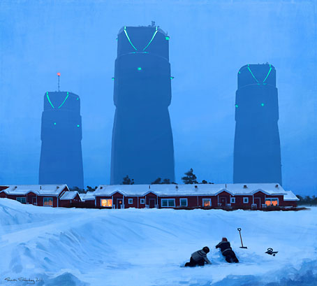
Simon Stålenhag‘s SF artwork will be published in book form if funding is secured. In the future everything will be crowdfunded for 15 minutes.
• Mixes of the week: FACT Mix 494 is a fantastic dub selection by Colleen; Secret Thirteen Mix 151 is by Sally Dige; Stephen Mallinder‘s return to the doom-laden Industrial music of the 1980s suits the post-election mood. Mallinder’s mix is helping promote Industrial Soundtrack for the Urban Decay, a documentary by Amélie Ravalec.
• “…it felt more like real life to me than the average hour-long television show.” Sopranos creator David Chase on what he enjoyed about Twin Peaks. Related: Twin Peaks Tarot cards.
• Sound & Song in the Natural World edited by Tobias Fischer & Lara Cory. A book about animal music and communication with a 60-minute CD of field recordings.
• “The psychedelic renaissance has already begun, and for the most part I welcome it,” says Erik Davis in a wide-ranging interview with Sean Matharoo.
• It rumbles on: Brown Pundits on “An Embarrassment at PEN”. A useful collection of stories, reactions and polemic from the past two weeks.
• Fanny and Stella: The Shocking True Story, a play by Glenn Chandler about Victorian London’s scandalous pair of cross-dressing men.
• Artist Charles Ray causes a problem for the Whitney Museum of American Art with his sculpture of a naked Jim and Huckleberry Finn.
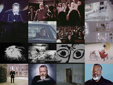
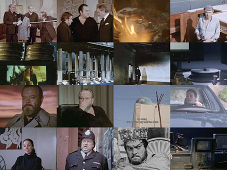
• “Don’t believe Orson Welles,” says his biographer Simon Callow, “especially when he calls himself a failure.”
• A return to Adolph Sutro’s Cliff House features several photos I’d not seen before.
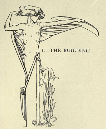
• More Tarot: Arcana: The Tarot Poetry Anthology is looking for funding.
• At Dangerous Minds: The ancient magic of the record label.
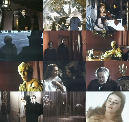
• Foreign Movie Posters
• Tarot (Ace of Wands theme, 1970) by Andy Bown | Distant Dreams (Part Two) (1980) by Throbbing Gristle | The Devil In Me (1982) by Stephen Mallinder