Liénard’s grotesques

lienard01.jpg

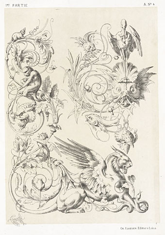
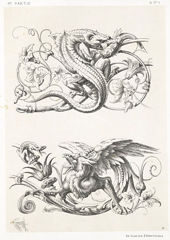
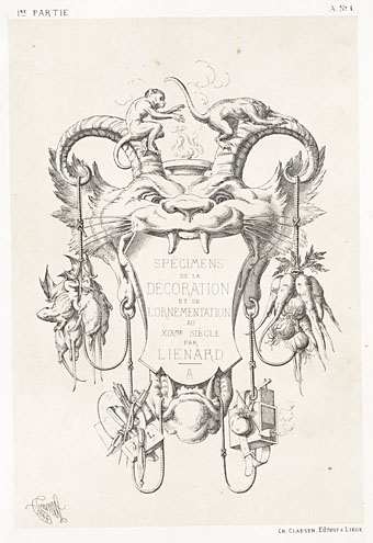
Yesterday’s book was from the Internet Archive scans of the Sterling and Francine Clark Art Institute Library. The majority of the books in the collection are related to textiles or crafts but the archive has a few design books of which this is one example. Spécimens de la Décoration et de l’Ornementation au XIXe Siècle (1866) presents baroque designs by French sculptor Michel Liénard (1810–1870). Most of the book is familiar decorative work but the opening section contains some marvellous grotesques and animal designs. All the plates feature careful shading and detail, and are worth viewing at a larger size.

lienard02.jpg

lienard03.jpg

Continue reading “Liénard’s grotesques”

The Book of Delightful and Strange Designs

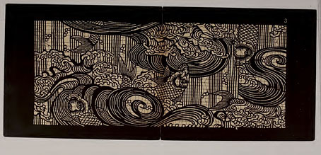
stencil01.jpg

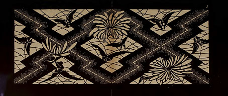
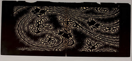
As is evident, the designs in question are Japanese stencils from a book of 100 stunning examples published in 1893. Author Andrew White Tuer adopts a surprisingly disingenuous tone in his explanatory introduction which is “dedicated to that most capricious, never-to-be-understood, weathercocky, provokingly incorruptible, and absolutely necessary person, the gentle reader”. Leaving aside such eccentricity, the stencils are astonishing things, especially when many of them are not only finely detailed but also form repeating patterns. Once again, I recognise some of the designs from bad reproductions in cheap books so it’s good to find them in such high quality.

stencil02.jpg

stencil03.jpg

Continue reading “The Book of Delightful and Strange Designs”

Lovecraftiana calendar

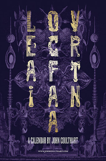
lovecraftiana1.jpg

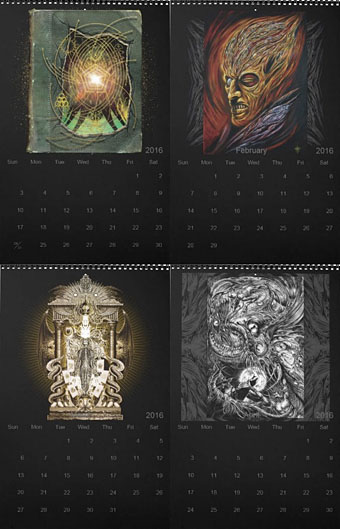
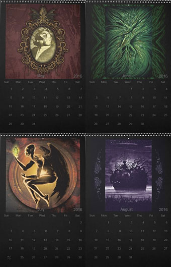
It may have been delayed by a week but the Coulthart calendar for 2016 arrives earlier in the year than some of its predecessors. A few months ago I had no idea what I was going to do for a calendar this year; I had a lot of work in progress, and more scheduled for the autumn, so creating all-new artwork wasn’t the best idea. Then on the plane back from Providence I thought, “Oh, yeah…Lovecraft…” So here’s a selection of Lovecraftian artwork old and new. The most recent pieces are from the front and back cover of the NecronomiCon convention booklet; among the older works there are two paintings which weren’t intended to be illustrative of The Weird but can be if you give them suitable labels, hence The Yellow King for February (see the pages at larger size here). The capitals on the cover are from the wonderful collaged set designed by Roman Cieślewicz, and which can be found in Dover’s Bizarre and Ornamental Alphabets.

lovecraftiana2.jpg

I’ve mentioned the problem caused by CafePress cancelling the line of portrait-oriented calendar templates that I’d been using for several years. The calendar templates at Zazzle didn’t quite match the old CafePress ones but with some fine-tuning of the options I’ve got as close as I could. There’s a slight disadvantage in the way the dates are overlaid on the artwork but then the artwork is already pierced by a hole at the top so this seems negligible. Zazzle’s template improves on CafePress by offering a range of coloured pages and coloured wire-binding so I’ve gone for a none-more-black interior. Zazzle also lets you design a back cover which means this is the first calendar where I’ve been able to provide credits and dates for all the pictures. Buyers also have the option of choosing their own regional holidays; CafePress is resolutely US-centric with all its products. The purchase page is here.

For the moment all the previous calendars, including the popular Psychedelic Alice ones, are unavailable although I’ll be moving them to Zazzle when I have a spare moment. Watch this space.

lovecraftiana3.jpg

Continue reading “Lovecraftiana calendar”

Weekend links 275

wessi.jpg

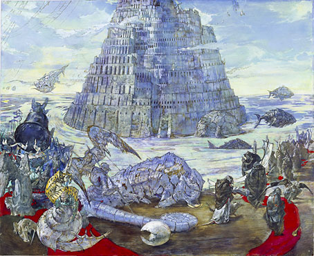
A painting from the Projekt Babelturm series by Wessi.

• “The first thing I would say is that I have no idea what authentic psych music is, and I have no wish to pursue that either. To me the idea of real psych is a paradox. I can’t see how you can have such a thing as real psychedelia when the whole thing is based on a psychedelic drug that gives you hallucinations and illusions and layers and layers of unreality.” Rob Chapman talking to Ben Graham about his new book, Psychedelia And Other Colours.

Elsewhere in a rather psychedelic week: Rob Young reviewed Chapman’s book for the New Statesman; Dangerous Minds posted “Hypnotic video of how a psychedelic masterpiece is made“; and in Germany a homeopathy conference “ended in chaos in Germany after dozens of delegates took a LSD-like drug and started suffering from hallucinations.”

• Coming soon from Dark Entries (so to speak), another collection of Patrick Cowley‘s music for gay porn films.

Jonathan Barnbrook works some quotes from JG Ballard into the British Road Sign Project.

• “Sorcery is more popular than football in Morocco,” says writer and filmmaker Abdellah Taïa.

• “If you’re going to make something, you should try and be wild,” says Mica Levi.

• Coca-Cola Milanese: Patrick Ellis considers the state of the world’s fair in 2015.

• Hear two pieces from Collapse, the forthcoming album by Drew McDowall.

• Mix of the week: Secret Thirteen Mix 162 by Ketev (Yair Elazar Glotman).

Emptyset’s Signal transforms Earth’s ionosphere into sound art.

Paul Laffoley: The Force Structure of the Mystical Experience.

• Fuck off, Star Wars, Ben Wheatley’s High Rise is on its way.

Ideologic Organ

Psychedelic Ride (1967) by The Ides | Psychedelic Warlords (Disappear In Smoke) (1974) by Hawkwind | Psychedelic Sewing Room (1989) by Bongwater
Christopher Dresser’s Studies in Design

dresser28.jpg

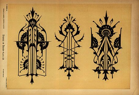
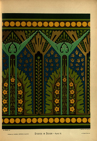
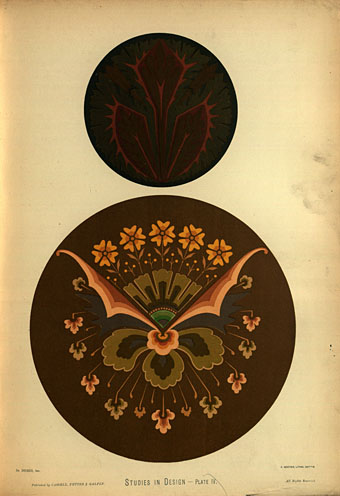
The previous post about Christopher Dresser’s design studies proved popular so here’s another discovery from the same source. A surprise this time was seeing the middle motif on the page above; I have this separated from its neighbours in a collection of Art Nouveau graphics, and used it on the slipcase of a Cradle of Filth CD in 2002. Studies in Design (1876) is a collection of colour plates of Dresser’s design work. Some of these emulate medieval or Arabian/Persian decoration but the most interesting examples for me are Dresser’s more personal pieces. Once you’ve seen a few of these his style is easy to recognise. Thanks to some searching by Mr TjZ I now know that a number of collections of Dresser’s designs are available from (who else?) Dover Publications. More for the shopping list.

dresser18.jpg

dresser19.jpg

Continue reading “Christopher Dresser’s Studies in Design”