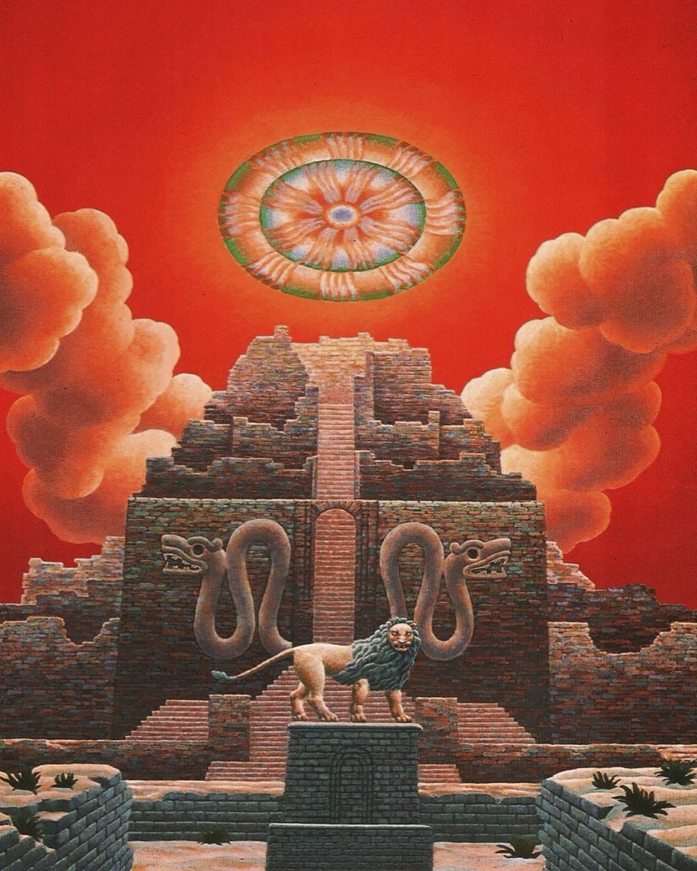
This illustration by Gustave Doré (with engraving work by Louis Sargent) is a beautiful example of how to fill a scene with detail and texture without losing a sense of depth or control of the light and shade. Piranesi’s etchings, especially his views of Roman ruins, are often as skilfully rendered, resisting the tendency of concentrated shading to turn into a depthless field of grey. Doré’s scene is from one of his illustrated editions that seldom receives a mention in lists of his works, Atala, a novella by François-René de Chateaubriand set among the Native American peoples of Mississippi and Florida. Those vaguely Mesoamerican ruins are an invention of the artist, being barely mentioned in the text. Doré’s illustrations often exaggerate details when they have to depict the real world; he even took liberties with the views of London he published following his visit to the city in 1869. This combination of ruined architecture and verdant foliage is something I’ve always enjoyed even though I’ve never worked out why the imagery is so appealing. Doré’s illustration is as close as he usually gets to Piranesi’s views of overgrown Roman ruins, only in this case the elements have been reversed, with foliage dominating the carved stonework.

Production sketch by Mario Larrinaga from The Making of King Kong (1975).
Last week I mentioned Jean Cocteau’s enthusiasm for Doré’s illustrations, their influence being apparent in the set designs for La Belle et la Bête. Doré’s influence was even more visible in another Beauty and the Beast story filmed a decade earlier, King Kong, as described in The Making of King Kong by Orville Goldner and George Turner:
[Willis] O’Brien’s idea of emulating Doré as a basis for cinematographic lighting and atmosphere may have originated with the pioneer cameraman and special effects expert, Louis W. Physioc, who in 1930 stated that “if there is one man’s work that can be taken as the cinematographer’s text, it is that of Doré. His stories are told in our own language of ‘black and white,’ are highly imaginative and dramatic, and should stimulate anybody’s ideas.”
The Doré influence is strikingly evident in the island scenes. Aside from the lighting effects, other elements of Doré illustrations are easily discernible. The affinity of the jungle clearings to those in Doré’s “The First Approach of the Serpent” from Milton’s Paradise Lost, “Dante in the Gloomy Wood” from Dante’s The Divine Comedy, “Approach to the Enchanted Palace” from Perrault’s Fairy Tales and “Manz” from Chateaubriand’s Atala is readily apparent. The gorge and its log bridge bear more than a slight similarity to “The Two Goats” from The Fables of La Fontaine, while the lower region of the gorge may well have been designed after the pit in the Biblical illustration of “Daniel in the Lion’s Den.” The wonderful scene in which Kong surveys his domain from the “balcony” of his mountaintop home high above the claustrophobic jungle is suggestive of two superb Doré engravings, “Satan Overlooking Paradise” from Paradise Lost and “The Hermit on the Mount from Atala.

King Kong (1933).
I’m sceptical of Goldner and Turner’s suggestion that this illustration of the two goats inspired King Kong’s tree-bridge, the only thing the two scenes share is a piece of wood spanning a chasm. The Chateaubriand illustration is much more redolent of King Kong, as is evident from some of the films’s marvellous production sketches by Byron Crabbe and Mario Larrinaga.

The Most Dangerous Game (1932).
The tree-bridge scene has another precedent in a very similar bridge that appears briefly in The Most Dangerous Game, a film made by King Kong’s producer and director in 1932 using the same jungle sets, and featuring many of the same actors and crew. The jungle scenes in the earlier film show a similar Doré influence, with many long or medium shots framed by silhouetted vegetation. The film even includes the animated birds that are later seen flapping around the shore of Skull Island.

Atala’s fallen tree makes at least one more notable film appearance in Ray Harryhausen’s Mysterious Island, another film about a remote island populated by oversized fauna. Harryhausen’s island doesn’t have much of a jungle but he always mentioned King Kong and Willis O’Brien as the two greatest influences on his animation career. He also picked up on O’Brien’s use of Doré’s work, something he often mentioned in interviews. If Charles Schneer’s budgets hadn’t restricted the films to Mediterranean locations I’m sure Harryhausen would have made greater use of Doré’s jungles.
Previously on { feuilleton }
• Uncharted islands and lost souls