Prints update

tarot.jpg

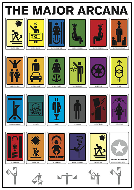
The Major Arcana (2006): a C-type print on Fuji gloss paper. A1 or A2 sizes.

I’m continuing to add artwork to Etsy which will be available as prints in a variety of sizes and papers. I would have done more of this by now but I’m still very busy working through the commissions of the past few months so progress has been slow. The system does actually work as intended, however, with orders being routed automatically to the printer then printed and shipped within 24 hours. The initial setup may take longer than places like CafePress but the benefits are multiple, not only a faster turnaround (and cheaper worldwide postage) but now I can create prints of any size I want, and with a variety of papers and finishes. Most of the items there at the moment are the things I consider “greatest hits” so the latest additions include new poster versions of my psychedelic Alice in Wonderland artwork, together with the International Symbols Tarot poster and yet more Lovecraftiana. Requests are, of course, still welcome.

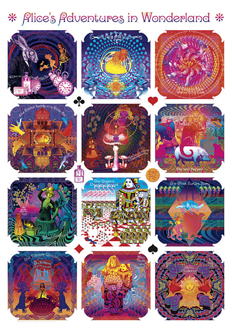
wonderland.jpg

Psychedelic Wonderland (2009): a C-type print on Fuji gloss paper. A1 or A2 sizes.

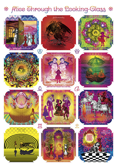
looking-glass.jpg

Psychedelic Looking-Glass (2010): a C-type print on Fuji gloss paper. A1 or A2 sizes.

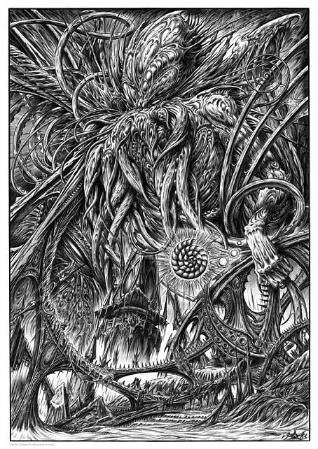
cthulhu.jpg

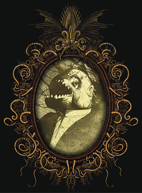
Cthulhu (1998): a giclée print on Canson Aquarelle rag paper. A3 size.

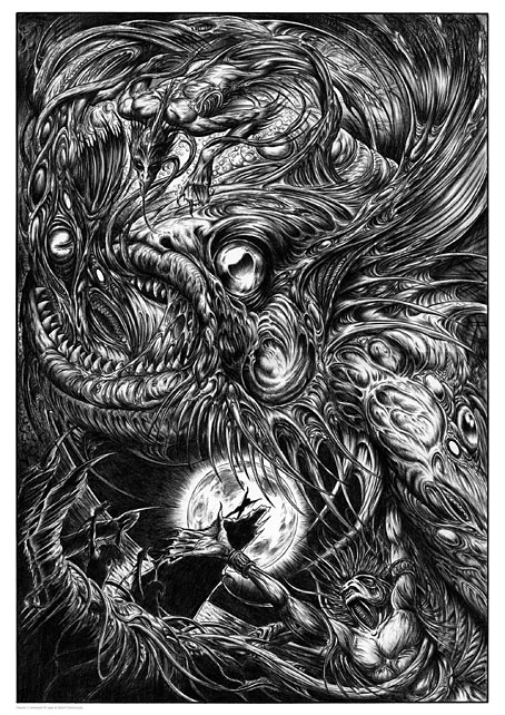
dagon.jpg

Dagon (1999): a giclée print on Canson Aquarelle rag paper. A3 size.

Previously on { feuilleton }
Prints at Etsy

Weekend links 597

okazaki.jpg

Untitled art by Toshio Okazaki from JCA Annual 5, 1984.

• “Yeah, when I first started writing it, nobody knew what to call it at all. I mean, the publishers didn’t know what to call it. They thought that Tolkien was (writing about) a post-apocalyptic nuclear world. That’s the only way they could perceive an alternate world, in other words. And it was the same with Mervyn Peake… they’re all interpreted that way. The idea of putting ‘fantasy’ on a book meant usually meant that it was a children’s book. And if you put fantasy as the genre, they usually put ‘SF’ larger than ‘fantasy’ to show that it was what it was.” Michael Moorcock (again) talking to Derek Garcia about fiction, games, and (of course) Elric.

• “Non-payment, low payment, late payment and promises of jam tomorrow, or at some unspecified future date, bedevil the freelance life as they did five centuries ago.” Indeed. Boyd Tonkin on Albrecht Dürer, patron saint of stroppy freelancers.

• “All at once, Non-Stop Erotic Cabaret is tender, outrageous and daft.” Patrick Clarke compiles an oral history of Soft Cell’s debut album.

Yeah, it was kind of a media hype. In January [1967], the media said, [breathless] ‘Oh my god, San Francisco is the place to be. Come to San Francisco, wear flowers in your hair.’ So we had a meeting of the people in the Haight-Ashbury about how we were going to deal with so many people coming. The Diggers decided to kind of make it a university of the streets, an alternative anarchist culture.

We knew that all these people were coming to San Francisco, and we knew they weren’t going to stay. And we thought, well, the best thing we could do would be to kind of educate them about the kinds of things that are possible in society, and then let them go back to where they’re from, and they would carry these ideas. And that is what happened. We were quite successful in that.

Judy Goldhaft of the San Francisco Diggers talking to Jay Babcock for another installment of Jay’s verbal history of the hippie anarchists

• “What ‘impossible’ meant to Richard Feynman; what I learned when I challenged the legendary physicist,” by Paul J. Steinhardt.

• At Strange Flowers: part one of James Conway’s essential end-of-year shopping list, Secret Satan.

• Mixes of the week: Part II and Part III of the three-part At The Outer Marker series by David Colohan.

• At Dennis Cooper’s: Olivia Duval presents…Suave: A History of Les Disques du Crépuscule.

Mystery and Truth of the Cthulhu Myth, a Japanese guide to the Cthulhu Mythos.

• Intimacy, Loss and Hope: Inside Florian Hetz’s beautiful 2020 photo diary.

• New music: The Tower (The City) by Vanessa Rossetto/Lionel Marchetti.

Nite Jewel’s favourite albums.

• RIP Stephen Sondheim.

Nothing Is Impossible (1974) by The Interns | Mission Impossible Theme (1981) by Ippu-Do | Impossible Guitar (1982) by Phil Manzanera

Resurrecting R’lyeh

rlyeh-2021.jpg

Then, driven ahead by curiosity in their captured yacht under Johansen’s command, the men sight a great stone pillar sticking out of the sea, and in S. Latitude 47°9′, W. Longitude 126°43′, come upon a coastline of mingled mud, ooze, and weedy Cyclopean masonry which can be nothing less than the tangible substance of earth’s supreme terror—the nightmare corpse-city of R’lyeh, that was built in measureless aeons behind history by the vast, loathsome shapes that seeped down from the dark stars. There lay great Cthulhu and his hordes, hidden in green slimy vaults and sending out at last, after cycles incalculable, the thoughts that spread fear to the dreams of the sensitive and called imperiously to the faithful to come on a pilgrimage of liberation and restoration.

HP Lovecraft, The Call of Cthulhu (1928)

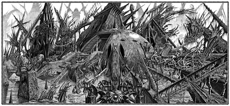
Behold the fruits of a more benevolent pilgrimage of liberation and restoration. It was just over a year ago that I decided to draw an exact replica of the R’lyeh triple-spread from my comic-strip adaptation of The Call of Cthulhu, the intention being to make the picture available as a poster-sized print once I had a print-ordering system in place. The picture may now be purchased here as a giclée print on Hahnemüle Pearl art paper. This is a big picture (870.46 x 401.15 mm or 34.27 x 15.793 ins), and unlike my other Etsy prints I’m afraid there won’t be a half-size version which means the price will remain relatively high. I’m also keeping it as a black-and-white piece despite the temptation to create a tinted version.

And so to the obvious question: why did I want to redraw a large and very detailed piece of art in the first place? Pull up a weed-festooned Cyclopean bollard and I’ll explain…

starrywisdom.jpg

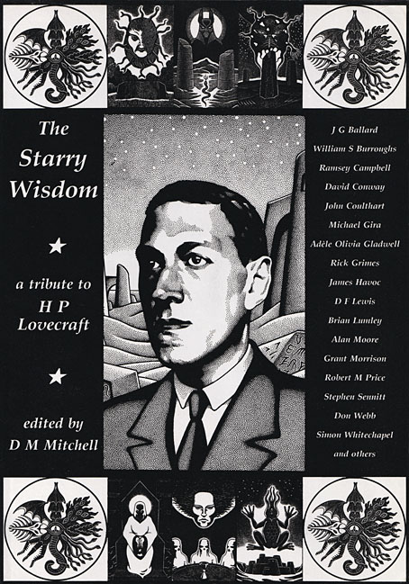
Creation Books, 1994. Cover art by Peter Smith.

I spent 17 months drawing The Call of Cthulhu, from January 1987 to May 1988, using my preferred media of the time, a 0.2 mm Rotring Variant pen on A3 sheets of Daler cartridge paper. The story took its time getting into print but it was eventually published in 1994 by Creation Books as part of The Starry Wisdom, a collection of Lovecraftian fiction edited by DM Mitchell. I was very pleased to be represented in the book but the pleasure turned to dismay when it transpired that all the artwork had vanished after the printing was done. Or almost all the artwork… To this day I don’t know whether the drawings by other artists suffered the same fate, but my Cthulhu pages disappeared along with the anatomical cross-section and the Yuggoth collage that I created specially for the collection. I still don’t know what really happened either, whether the drawings were stolen (possible), thrown away deliberately (unlikely), or thrown away accidentally (also possible). The lack of resolution to the whole business is partly my fault. Losing all that art was a painful thing to consider, and I couldn’t accuse the printer of anything when nobody could say what had happened (I was in the Creation office during one of the phone conversations between publisher and printer). The printer was also located in the middle of a rural county somewhere so journeying there would have been difficult for this non-driver, as well as being pointless if they could only tell me what I knew already. Time passed and I did my best to put the whole episode behind me.

pens.jpg

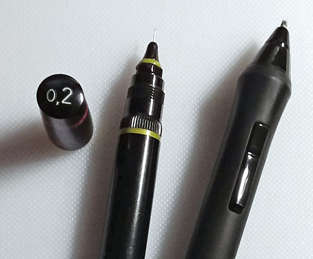
Drawing technology then and now: the Variant pen I used throughout the 1980s and the Wacom stylus I use today. That Variant nib is so fine that I have a faint ink dot tattooed on one of my knuckles from where I accidentally stabbed it into my hand. The Wacom pen looks stubby in comparison but is capable of drawing equally fine lines and much more besides.

On the plus side (there was one), the printer had done a good job of half-toning the artwork, so even though the Starry Wisdom pages are rather small the detail in the drawings is still evident. And I also had a complete set of photocopies of the A3-sized originals. I’d been working for Savoy Books since 1989 during which time making photocopies of new drawings had become second nature. Since 1994 this set of copies has become the original art for the Call of Cthulhu strip, rather like the surviving prints of Murnau’s Nosferatu which are all that anyone can see of his film today. The analogy is an apt one since it also extends to picture quality. Just as silent films always look their best when they’ve been restored from the camera negative, my Rotring drawings really need to be reproduced from the originals. The 0.2 mm pen that I insisted on using throughout the 1980s was too fine for the photocopy machines of the time, especially when my shading was so densely rendered that I might as well have been using a pencil. This isn’t so much of a problem if the pages are being reduced in size but it became one last year when I had the idea of making a print of the R’lyeh panorama that would be the same size as the original drawings. Giclée printing is an ink-jet process that reproduces fine detail with great accuracy, so while I could make full-size prints of the Cthulhu pages they’d never look better than what they were, photocopies that hadn’t fully captured the fine lines of the drawings. This wasn’t the only problem.

Continue reading “Resurrecting R’lyeh”

T-shirts by Skull Print

skullprint-dotu.jpg

I’m very pleased to announce that I’ve partnered with T-shirt printers Skull Print to make shirts available featuring my artwork. See this standalone page for details. Skull Print are a small business based in the UK who specialise in music-related merchandise. Joe Banks pointed me in their direction when he was wondering if I’d considered doing a shirt design based on the cover of his Hawkwind book, Days of the Underground. To thank Joe for this, the first shirt is an adaptation of his cover design, which is followed by a very old piece of cover art for the Zones album by Hawkwind. Skull Print cater to a substantial Hawkwind fanbase so it makes sense to make this one available. And since we’re now in the horror month, I’ve added a couple of recent Lovecraft-related designs which have been tailored specially for this purpose.

skullprint-monsters.jpg

A design based on my cover for Lovecraft’s Monsters, an excellent story collection edited by Ellen Datlow.

I should emphasise that these aren’t the only shirt designs available. Skull Print operate on a print-on-demand basis so in theory any artwork of mine may be printed as a shirt if someone makes a request for one. (With a couple of exceptions; a few designs are subject to copyright restrictions.) The advantage that Skull Print have over other services such as CafePress is that I don’t have to spend time uploading the artwork to a website then creating a special sales page for it. Anyone who wants a shirt can now send me a request for one then I send the artwork to Skull Press and they’ll take care of everything else.

joyce.jpg

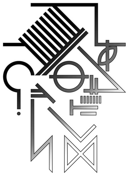
I’ll be setting up a few more designs with PayPal buttons when I have a spare moment. Some designs have been surprisingly persistent sellers at CafePress, such as my ideogrammatic portrait of James Joyce which is often ordered in the run-up to Bloomsday. A few years ago a shirt bearing this design was ordered by one “M. Atwood” of Halifax, Nova Scotia. I’ve been hoping ever since that the M. Atwood who everyone knows as a writer might turn up somewhere dressed in this item. If anyone sees a photo like this then please let me know!

Previously on { feuilleton }
Hawkwind: Days of the Underground
The Chronicle of the Cursed Sleeve
Rock shirts
Void City

Révélations Posthumes by Rivière and Andreas

revelations1.jpg

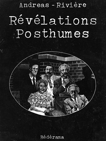
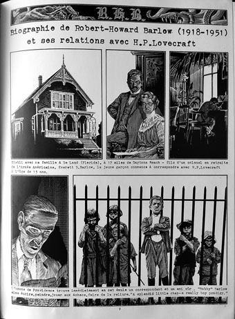
Le livre est arrivé. Révélations Posthumes, written by François Rivière and illustrated by Andreas (Martens), turned out to be better than I expected: 58 pages of very sharp black-and-white illustration on coated paper, and in the hardcover album format which has long been my favourite mode of presentation for comic books. The quality of the printing has made me realise that the reprint of RHB in The Cosmical Horror of HP Lovecraft (see this post) had blacked in many of the fine lines of Andreas’s scraperboard drawings, resulting in darker panels with diminished detail. Here you see the story as it was drawn, and—more importantly—with all of its pages present. The reprint of La Femme de Cire du Musée Spitzner (The Spitzner Museum’s Wax Woman) fared much better in Escape magazine.

revelations2.jpg

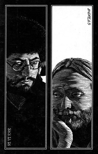
Auteur et artiste.

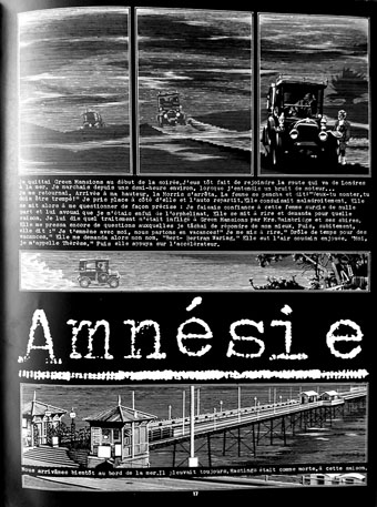
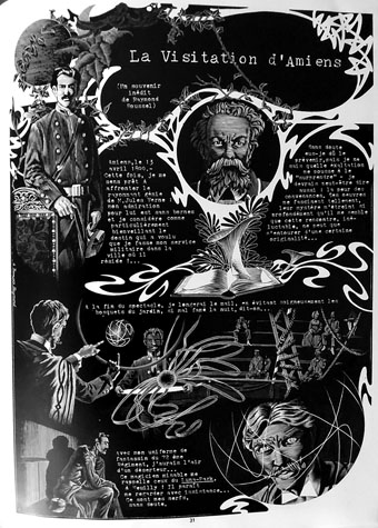
The other three stories in this collection are all new to me. Amnésie concerns the strange disappearance of Agatha Christie in December 1926, an event which has been the source of much unresolved speculation (Monsieur Rivière is apparently a great Christie enthusiast); La Visitation d’Amiens recounts a meeting in 1899 between the young Raymond Roussel when he was posted to Amiens during his military service, and the aging Jules Verne, whose fantastic inventions would influence Roussel’s 1914 novel, Locus Solus; Le Crime de la Mosquée is set in Rochefort-sur-Mer in 1936, and concerns a young Englishman, Alfred J. Nobbs, visiting the home of the late Pierre Loti, another writer whose works inspired Raymond Roussel. Writers dominate this book, which no doubt explains the choice of typewritten captions.

revelations3.jpg

The introduction by Pierre-Jean Rémy suggests that all the stories are combinations of fact and fiction, but the Lovecraft and Robert H. Barlow story seems to be based in full on Barlow’s biography, while the Spitzner Museum story concerns a Belgian painter, Pol Delmotte, who doesn’t appear to exist at all outside these pages. (“Delmotte” is very probably based on Paul Delvaux but the events of the story would have prevented him being named as such. Thanks to Paul R. for the comments noting this.) Whatever the case—and it’s impossible for me to really tell when my French is so poor—the artwork is superb. The very similar look of the Barlow and Spitzner stories, all elongated panels and the occasional half-toned photograph, had led me to expect a similar form for the other stories but Andreas varies his layouts from story to story. Amnésie adds a black background to the pages, while La Visitation d’Amiens removes most of the panel borders to create a series of floating vignettes, Art Nouveau flourishes and other decoration. Le Crime de la Mosquée differs from the rest by filling each page with a landscape-ratio composition, a rare thing in comics. The backgrounds of the last few pages present a series of architectural interiors whose meticulous rendering rivals the engravers of the 19th century for veracity and detail. The book as a whole shows Andreas to be a master of the scraperboard technique but this volume also seems to comprise the totality of his work in the medium. His later books contain a great quantity of exceptional art but the pen-and-ink style he uses is often sketchier and more stylised, inevitably so given the pressures of comic-book production. I’m tempted to hope that Titan might one day produce a English translation of this book but they’d be more likely to do the Rork saga or the rest of the Cromwell Stone series first, and there are many volumes of those. Révélations Posthumes has at least been reprinted several times since 1980 so it’s easy to find.

revelations4.jpg

revelations5.jpg

Continue reading “Révélations Posthumes by Rivière and Andreas”