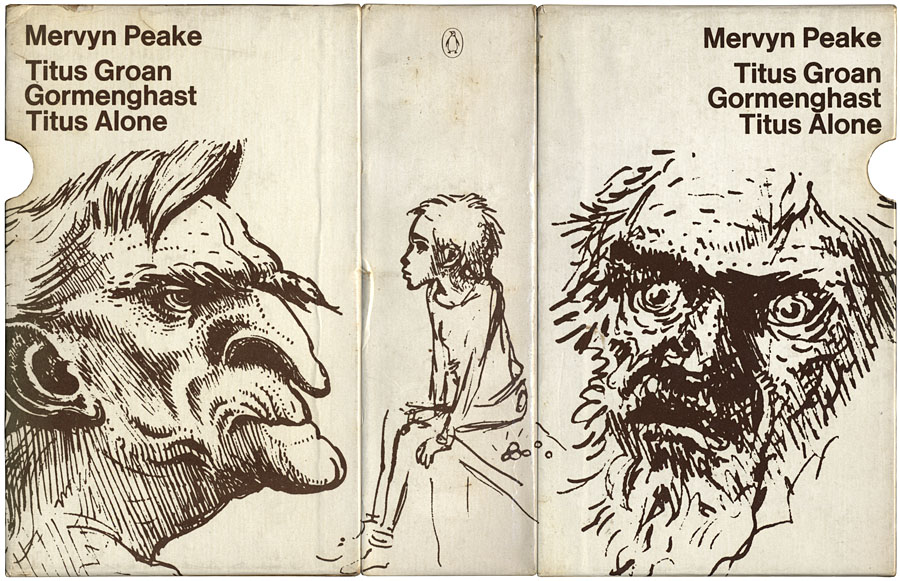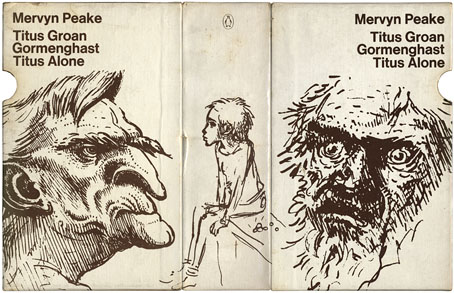
Bellgrove, young Titus and Barquentine by Mervyn Peake. Case designed by Robert Hollingsworth.
I’d thought about posting the covers of my boxed set of Gormenghast paperbacks a couple of years back when there was a flurry of blogospheric attention being given to Penguin cover designs…thought about it then never got round to it. The reason for doing so now is twofold: firstly I’ve been re-reading the books, and secondly some Gormenghast-related news emerged this week which gives this post an additional relevance.
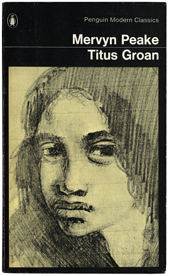
Fuchsia by Mervyn Peake.
The set of Peake paperbacks which Penguin published in 1968 (and their subsequent reprints) were the first editions of Peake’s trilogy which I encountered so I can’t help but regard them as the ones, the only copies I could countenance reading. That may change, however (see below). I’ve no idea how scarce the boxed edition is but the books are reprintings from 1970 so I presume Penguin put out a boxed gift set to make the most of Peake’s posthumous success. I always liked the presentation which is the standard Penguin Modern Classics format of the period, it leaves to you how much you want to regard the books as works of fantasy or simply novels of a rather grotesque and highly imaginative reality. Titus Groan‘s sketch of a glowering and thoroughly unglamorous Fuchsia was a daring choice for a cover intended to lure a newer, younger audience to Peake’s work. The drawing says a great deal about the author’s unsentimental attitude towards his creations; compared to the florid and often delicate covers of the fantasy books being published by Ballantine in the late Sixties (a series which included the Gormenghast trilogy), it seems shockingly unpleasant.
Continue reading “A profusion of Peake”