
Category: {art}
Art
The Look presents Nigel Waymouth
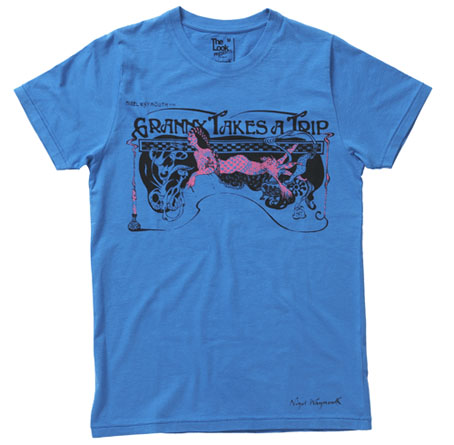
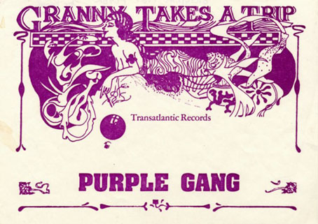
This delightful piece of Art Nouveau-inflected grooviness is one of the new T-shirts designed by Nigel Waymouth for The Look via Topman. Waymouth, as some readers here may know, was part of Hapshash & the Coloured Coat in the late Sixties, London’s leading group of psychedelic poster artists. In addition to design, Waymouth and Sheila Cohen opened the legendary Kings Road boutique Granny Takes A Trip (named after its stock of antique clothes) in 1966. That shop’s fame inspired a one-off single by Stockport group The Purple Gang in 1967 which the BBC banned for alleged drug references, although the trip in question concerns an elderly woman journeying each year to Hollywood. Waymouth’s flyer for the single, of which the shirt design is a variant, can be seen below.
The Look Presents Nigel Waymouth – in-store and online at Topman from Friday August 8
“Sepia tints and flouro tones…darkly psychedelic graphics for the 21st Century…”
Nigel Waymouth is a legend of British rock fashion and design.
Not only did he found the wild 60s Kings Road boutique Granny Takes A Trip (whose ever-changing shop design attracted the likes fo the Rolling Stones, The Beatles, Anita Pallenberg, Brigitte Bardot and Marianne Faithfull), but his graphic design company Hapshash produced eye-popping designs, posters and record sleeves for the The Who and Jimi Hendrix.
Original Hapshash artwork is highly prized in collector circles and Granny’s clothes are seriously sought-after on the vintage market. Now Nigel Waymouth makes his re-entry into fashion via The Look Presents – http://thelookpresents.com – with a contemporary t-shirt range reflecting the original Granny’s aesthetic by delving into decadent psychedelia replete with sepia tints and flouro tones.
The first five t-shirts are available in-store and online at Topman from August 8, with the launch party on August 14 at the George and Dragon in Shoreditch.
The Look Presents Nigel Waymouth is the second collection from the creative hub formed by author Paul Gorman and Soho boutique owner Max Karie. Our first, a collaboration with rock & roll brand Wonder Workshop, proved a great success earlier this summer and this autumn we launch The Look Presents Priceless, a menswear capsule collection with couturier to rock royalty Antony Price.
The shirts are priced £20 each. I rarely wear T-shirts on their own but I’ll probably have to get one of these, for the associations if nothing else.
Previously on { feuilleton }
• The New Love Poetry
• Dutch psychedelia
• Family Dog postcards
• The 14-Hour Technicolor Dream revisited
boring boring boring boring boring boring boring by Zach Plague
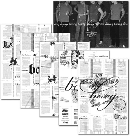
This multi-faceted design event from Featherproof Books turned up in the post recently, a book which actually deserves the designation “novel” for once. boring boring boring boring boring boring boring by Zach Plague manifests across a range of media—book, poster, compact disc—with the book being the most elaborately-designed work of fiction I’ve seen in a long time.
When the mysterious gray book that drives their twisted relationship goes missing, Ollister and Adelaide lose their post-modern marbles. He plots revenge against art patriarch The Platypus, while she obsesses over their anti-love affair. Meanwhile, the art school set experiments with bad drugs, bad sex, and bad ideas. But none of these desperate young minds has counted on the intrusion of a punk named Punk and his potent sex drug. This wild slew of characters get caught up in the gravitational pull of The Platypus’ giant art ball, where a confused art terrorism cell threatens a ludicrous and hilarious implosion. Zach Plague has written and designed a hybrid typo/graphic novel which skewers the art world, and those boring enough to fall into its traps.
I’ve not had chance to read this yet (still plodding through Ulysses) so can’t comment on the story but I like the design. As well as a fancy spot UV finish on the jacket (that’s a mix of matt and gloss to you) and much vogueishly baroque business occurring in and around the pages, the text is set in a variety of typefaces with considerable attention to detail.
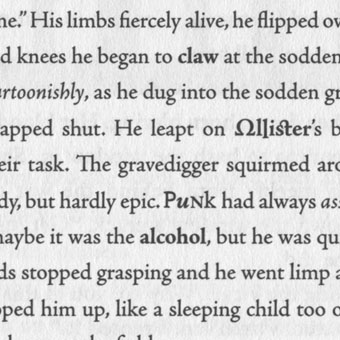
Adobe’s book design application InDesign has a find and replace function which simplifies this kind of thing but it still takes some dedication to apply it to every page of a novel. The usual reaction to experimental work like this is for people to cry “gimmick”; in the case of the recent run of Savoy Books, my most detailed design—for Robert Meadley’s A Tea Dance at Savoy (2003)—featured illustrations and inset elements on every page, only to be dismissed by one review as being “like a website”, whatever that means. Given that the design of novels hasn’t advanced much since the 19th century I’d say we could stand to see more of this approach. Typographic experiment has a lengthy history despite the general lack of encouragement, from early examples in Apollinaire’s poetry to more recent works such as House of Leaves by Mark Z Danielewski. There’s always the risk that doing this becomes a distraction but then interesting art has to take risks as well. The rule of thumb among the science fiction writers of the Sixties when they were pushing the stylistic boundaries was that the form followed the content; if the content can support this kind of presentation there’s no reason not to try it, is there?
Elsewhere on { feuilleton }
• The book covers archive
The art of Samuel F Stimpert
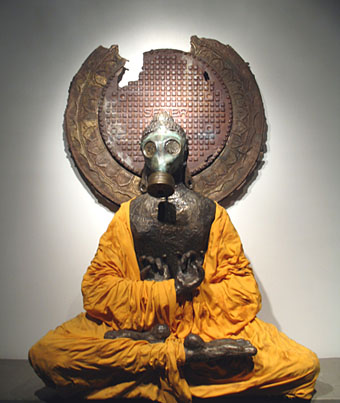
Icon II, Siddhartha Gotama in gas mask, 2003–2007.
More bronze gas mask art at Samuel Stimpert’s site.
Previously on { feuilleton }
• Giant Skeleton and the Chocolate Jesus
Chris Watson: Oceanus Pacificus
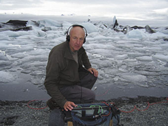
This is worth noting even though it’s nearly over, a short presentation of sound recordings by Chris Watson at the alt.gallery, Newcastle. Watson was a founder member of one of my favourite groups of the post-punk era, Cabaret Voltaire. He left CV in 1981 and shortly thereafter formed The Hafler Trio, an experimental audio outfit with whom I conducted some correspondence for a couple of years. I still have a letter somewhere signed by the group authorising me to act (creatively) on their behalf, a licence I’m sorry to say I never took advantage of beyond sneaking the name of their enigmatic mentor, Robert Spridgeon, into the Thackery T Lambshead Pocket Guide to Eccentric and Discredited Diseases. Watson today is an internationally renowned wildlife sound recordist, responsible for a number of stunning CDs on the Touch label, as well as much work for television documentaries. The alt.gallery exhibition runs to August 6, 2008.
Oceanus Pacificus brings the sounds of the largest ocean, encompassing almost a third of our planet, into one of the UK’s smallest galleries. This unique four channel sound installation is created from nighttime underwater recordings of the Pacific Ocean.
Recorded at the depth of three metres, reflecting the exact physical dimensions of the gallery space, the installation presents underwater voices, rhythms and movements rarely heard by the human ear. The ebb and flow of the Humboldt Current creates a seductive and harmonic rhythm as cold water wells up from the depths, drawing up the sounds of life.
The recordings were made on location around the Galapagos Islands 1000km off the coast of Ecuador, using a pair of Dolphin Ear Pro Hydrophones onto a NAGRA ARES-PII digital audio recorder. The four hydrophones were fixed on a square wooden rig and suspended three metres below the surface at night to capture the voices and rhythms of this hostile environment.
Chris Watson is a sound recordist specialising in natural history with a particular and passionate interest in recording the wildlife sounds of animals, habitats and atmospheres from around the world. He is interested in the quality, depth and diversity of sounds produced by water, from single drops to streams, ice sheets, glaciers, waterfalls and oceans. He has described the sounds of water as “the music of another medium”.
He is one of the most prolific and versatile figures working in sound today. In 1971 he was a founder member of the influential Sheffield-based experimental music group Cabaret Voltaire and in 1981 was a member of The Hafler Trio. His sound recording career began in 1981 when he joined Tyne Tees Television. Since then he has worked with David Attenborough on BBC TV productions such as The Life of Birds and The Blue Planet. In 1998 he won a BAFTA for Best Factual Recording for The Life of Birds.
He has produced various sound installations, including Whispering in the Leaves commissioned by AV Festival 08 and Forma. From 19 July – 2 November he will be presenting the sound installation Cima Verde as part of Manifesta 7 in Italy.
The 7” record Oceanus Pacificus was released by Touch in 2007 as part of the Touch Sevens series of 7” vinyl only releases. For further information please visit www.touchmusic.org.uk/touchsevens.
Previously on { feuilleton }
• Max Eastley’s musical sculptures
• The Avant Garde Project