Hommage à KS.
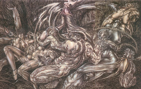
The web isn’t the best place to see works by this extraordinary German artist, most of what’s available tends to be tiny thumbnails which give no impression of the detail in her drawings and paintings. Ruppert is another artist who’s been brave enough to try illustrating Lautréamont’s Maldoror but I’ve yet to see anything of her interpretation. Given the nature of both book and pictures one might easily pair any number of her intense and erotic works with Lautréamont’s words.
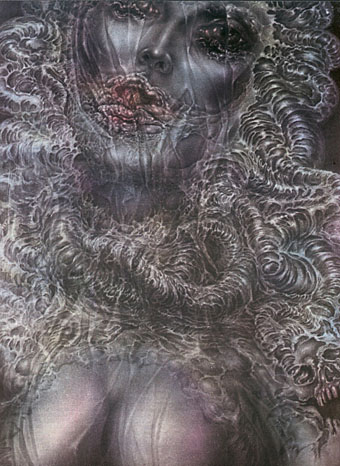
La Décadence.
These are some of the better online samples, the last one coming from her official site (now defunct, unfortunately) which also includes some recent black and white work but little else. The curious are advised to search book dealers for print portfolios or exhibition catalogues.
See also:
• Sibylle Ruppert, 1942–2011
• Sibylle Ruppert revisited
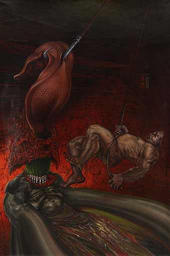
Tear out (1984–87).
Elsewhere on { feuilleton }
• The fantastic art archive
Previously on { feuilleton }
• Maldoror illustrated