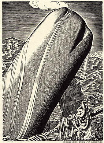
Thursday Afternoon by Brian Eno

thursday.jpg

Cover painting by Tom Phillips, design by Russell Mills.

A post for a Thursday.

Brian Eno’s ambient music receives a lot of playing time here, especially Music for Airports, On Land, The Shutov Assembly and, when something really minimal is required, Neroli. But it’s Thursday Afternoon that receives the most attention. Recorded at the request of Sony Japan in 1984, Thursday Afternoon is a single piece that originally accompanied seven of Eno’s “video paintings”, each of them showing Christine Alicino warped and blurred by ultra-slow motion and video noise. Like his earlier static views of the New York skyline, Mistaken Memories of Medieval Manhattan, filming vertically means that proper viewing can only be achieved by turning the TV on its side. The soundtrack is a beautifully rendered composition which uses Eno’s customary process of letting a number of looped phrases form a shifting musical moiré.

Compositionally, Thursday Afternoon belongs to the family of works which also includes Discreet Music and Music for Airports. Like them it is an even-textured, spacious and contemplative piece in which several musical events appear and recur more or less regularly. Each event, however, recurs with a different cyclic frequency and thus the whole piece becomes an unfolding display of unique sonic clusters. Eno has characterised this style of composition as “holographic”, by which he means that any brief section of the music is representative of the whole piece, in the same way that any fragment of a hologram shows the whole of the holographic image but with a lower resolution. (From the album notes.)

Daniel Lanois, Roger Eno and Michael Brook were all involved in the creation and production of Thursday Afternoon and the piece works as well played very quietly as it does at louder volume. When played louder more of the background detail becomes apparent, including some very faint birdsong which is most discernible at the end when much of the music has faded away. Perfect for colouring the atmosphere of a room whilst reading, working or talking with friends. It’s also a favourite of mine for playing in the bedroom with someone special.

Thursday Afternoon was released on video cassette then appeared on CD in 1985. As a single track of 61 minutes, this was one of the first original recordings which made specific use of the extended running time of the CD format. The cover painting was by {feuilleton} favourite, artist Tom Phillips, with design by artist and designer Russell Mills. Ten years earlier, Eno had used a detail of Phillips’ painting After Raphael on the cover of Another Green World.

eno.jpg

All of which is a long-winded way of saying that you can now see the original sound and vision version of Thursday Afternoon at Ubuweb. Not ideal by any means but it gives you an idea of the complete work rather than the trunctated versions on YouTube. Eno’s video paintings, Thursday Afternoon included, are now available on DVD should you require them in higher quality. Just be prepared to turn your TV on its side.

Update: Eno’s ambient processes have now reached the iPhone with the Brian Eno and Peter Chilvers app, Bloom.

Elsewhere on { feuilleton }
The album covers archive

Previously on { feuilleton }
Tiger Mountain Strategies
20 Sites n Years by Tom Phillips
Generative culture
Exposure by Robert Fripp
My Life in the Bush of Ghosts

Art Nouveau illustration

stolba.jpg

The cover picture of yesterday’s book purchase complements the month, being a woodcut by Leopold Stolba entitled February from a Ver Sacrum calendar for 1903. The book is Art Nouveau: Posters and Designs (1971), a collection edited by Andrew Melvin for the Academy Art Editions series and the book includes some covers for Jugend magazine which coincidentally was the subject of Monday’s post.

letters.jpg

Ornamental letters from The Studio magazine, 1894; no artists credited.

I wrote about another of the books in the Academy series, The Illustrators of Alice, a couple of years ago and while I don’t really need yet another Art Nouveau book, the presence of a few illustrations I hadn’t seen before made the purchase worthwhile. Further examples follow.

Continue reading “Art Nouveau illustration”

Jugend Magazine

jugend.jpg

Two of several cover illustrations by Hans Christiansen (1866–1945) for 1898 issues of Jugend magazine. I waited a long time for someone to put together a site devoted to Jugend and good as this one is I can’t help but wish it was as thorough as the Simplicissimus site. Jugend is a regular fixture in histories of Art Nouveau since it was the magazine’s promotion of the new graphic style which gave the movement a name in Germany, Jugendstil. The covers look strikingly advanced today in the way they vary their style and the presentation of the magazine title from one week to the next. The monotonous branding of contemporary magazines seems staid in comparison. Christiansen’s swirling title design shows why these covers had such an influence on the psychedelic poster art of the 1960s. You can see a larger copy of that cover here and a further 299 drawings and paintings by the artist here.

Elsewhere on { feuilleton }
The illustrators archive

Previously on { feuilleton }
Meggendorfer’s Blatter
Simplicissimus

The art of Ryan Martin

martin1.jpg

To Live and Die in LA.

I really like Ryan Martin’s beautiful paintings of fey youths in vibrant, vaguely surreal scenarios. Those familiar with the work of Leonardo da Vinci may recognise Please, Please, Please Let Me Get What I Want as being based on The Lady with an Ermine (1490). There isn’t a great deal of Martin’s work around since he’s only just starting out but you can see more of it at Mark Wolfe Contemporary Art.

martin3.jpg

Please, Please, Please Let Me Get What I Want.

martin2.jpg

Cupid de Locke.