Humpty Dumpty variations

thurstan.jpg

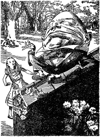
Humpty Dumpty by EB Thurstan (1930).

A preoccupation of the past couple of weeks has been Lewis Carroll’s Alice books as I’ve been working on an Alice in Wonderland project which I’ll unveil shortly. Looking around at some of the numerous visual interpretations of the stories I came across two portfolios I hadn’t seen before by comic artist Frank Brunner. These are from the late Seventies, and typically for that decade they work an erotic twist on the books by adding ten years to Alice’s age whilst depriving her of clothes. Nudity aside, Brunner’s drawings don’t depart from tradition very much—or add much, for that matter—but I did notice that he’d based his Humpty Dumpty figure on an earlier version by illustrator EB Thurstan.

brunner.jpg

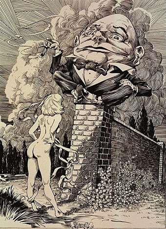
Humpty Dumpty by Frank Brunner (1978?).

The reason Thurstan’s Humpty is so familiar is that I’d borrowed it myself for one of the many appearances by the character in the Lord Horror comic series, Reverbstorm. Humpty’s presence there would involve too much explanation so you’ll have to be satisfied with the character who explains Jabberwocky remaining inexplicable. As for Brunner’s drawings, you can see coloured versions on his website.

reverbstorm.jpg

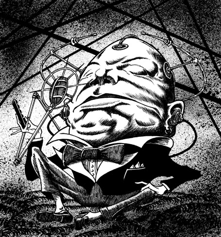
Humpty Dumpty from Reverbstorm #3 (1994).

Previously on { feuilleton }
Alice in Wonderland by Jonathan Miller
The Illustrators of Alice

Technology, then and now

A recent book purchase was A Century of Punch (1956), a weighty collection of drawings from the humour magazine edited by RE Williams. While much of the comedy is now very dated, many of the illustrations and cartoons yield other pleasures, not least by being a fascinating snapshot of the times and their attitudes. Some of those attitudes remain with us, and the handful of drawings below struck me for their resonance with current discussions about the impact of new technology. But first, here’s a far-sighted prediction from 1878 (note: Ceylon is now Sri Lanka):

punch1.jpg

EDISON’S TELEPHONOSCOPE (Artist unknown)
Paterfamilias (in Wilton Place): “Beatrice, come closer, I want to whisper.”
Beatrice (from Ceylon): “Yes, Papa Dear.”
Paterfamilias: “Who is that charming young lady playing on Charlie’s side?”
Beatrice: “She’s just come over from England, Papa. I’ll introduce you to her as soon as the game’s over.”

Continue reading “Technology, then and now”

Jeppe Hein’s mirror labyrinth

hein.jpg

Follow Me by Jeppe Hein. Photo by Jamie Woodley.

More mirror art. Yes, I really like this kind of thing, and this particular example, Follow Me by Danish artist Jeppe Hein, looks especially fine with the sunlight and trees reflected from its panels. Hein’s labyrinth is a new and permanent installation in the grounds of Royal Fort House at the University of Bristol; the grounds are open to the public so anyone can pay the work a visit.

The artwork comprises a square labyrinth of 76 vertical polished steel plates sited at the base of an incline leading down from Royal Fort House. Visitors will be encouraged to enter the labyrinth to experience the effect of the work. Once inside, the reflections of participants and surrounding plants and trees are multiplied.

Jeppe Hein was inspired by the University as a place of self-discovery, as well as by the history of the gardens – particularly the designs of 18th-century landscape gardener Sir Humphry Repton, who similarly sought to promote imaginative encounters. (More.)

Previously on { feuilleton }
A=P=P=A=R=I=T=I=O=N
The art of Josiah McElheny

Bridget Riley Flashback

riley.jpg

Movement in Squares (1961).

Continuing the Sixties theme, the Walker Art Gallery in Liverpool has an exhibition running whose title, Bridget Riley Flashback, alludes to the connection between Riley’s vibrant Op Art and the psychotropic concerns of the decade which brought her to the world’s attention. Riley’s works nearly always look very clean and mechanical in reproduction which can tend to defeat their purpose as paintings. The actual pictures are paint on canvas, with each square or line carefully applied by hand (not always by herself it should be noted; she had assistants), and present a deliberate contradiction in their rigid formalism and hand-crafted production. Their large size also gives them substantially greater visual impact.

A seminal work in the show is ‘Movement in Squares’, which was purchased by the Arts Council collection in 1962, the year after it was made. Consistently exhibited in retrospectives of her work, she credits the work as the beginning of her breakthrough into abstraction. This shows an insight into the role of the Arts Council collection in supporting British artists and collecting the art treasures of the future.

Bridget Riley Flashback runs until December 13, 2009.

Previously on { feuilleton }
Design as virus #4: Metamorphoses
New Bridget Riley

Michael English, 1941–2009

english1.jpg

left: The Soft Machine Turns On (1967); right: UFO Coming (1967).

This was a bitter blow coming at a time when I’ve been working on something inspired in part by Hapshash and the Coloured Coat, the 1960s design duo comprised of Michael English and Nigel Waymouth. The two artists, together with associate Martin Sharp, are indelibly associated with the London psychedelic scene of the late Sixties. Whereas Sharp’s posters were often loose and dramatically bold explosions of shape and colour, the Hapshash posters were more carefully controlled in their curating of disparate elements borrowed from Art Nouveau—especially Mucha and Beardsely—comic strips, Op Art, Pop art and fantasy illustration. Their work perfectly complemented the very distinctive atmosphere of the capital’s psychedelic scene which, for a couple of hectic years, saw an explosion of new bands (or old bands in new guises) fervently engaged in a lysergic exploration of Victoriana, childhood memories and frequent silliness. UK psychedelia is generally more frivolous than its US equivalent which had the Vietnam War and civil disorder to deal with; English and Waymouth’s graphics captured the London mood.

english2.jpg

top left: Coke (1970); top right: Toothpaste (1974).
bottom left: Leaf Falls (1972); bottom right: Red no. 3 (1978).

In the 1970s English refashioned himself as a hyper-realist painter of foodstuffs and other consumer goods, and his meticulous airbrush style led to work as an advertising artist. Those paintings are beautifully rendered but often leave me feeling slightly queasy. I much prefer his work from later in the decade which depicted equally meticulous close-up views of oil-smeared buses and trains. Paper Tiger published a book collection in 1979, 3D Eye, which gathers the best of his work from the poster art on.

• Obituaries: Guardian | Times
• Hapshash poster galleries here and here

Previously on { feuilleton }
The Look presents Nigel Waymouth
The New Love Poetry