Green Pipes: Poems and Pictures

jpf01.jpg

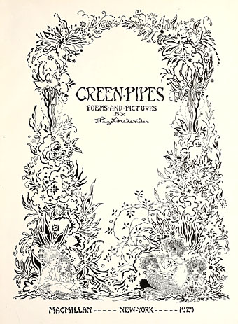
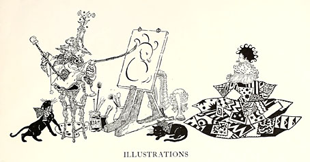
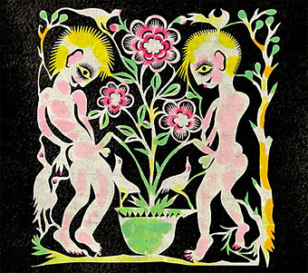
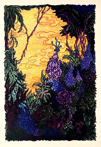
This is a strange book. Green Pipes: Poems and Pictures (1929) was written and illustrated by Joseph Rous Paget-Fredericks (1903–1963), a man better known these days for a substantial collection of memorabilia and archive material related to 20th-century dance. Paget-Fredericks studied with Léon Bakst then went on to create his own costume designs as well as producing some books for children of which this is an example. In style the poems aim at AA Milne’s When We Were Very Young but succumb to tweeness with a superfluity of fairies and pixies. At first glance the illustrations seem just as twee until you notice remarkable details such as costumes and foliage created from a wealth of disconnected lines and squiggles. The drawing of a Smoke Sprite is closer to something by Alastair than EH Shepard, while the Snow Fairy is the vaguest outline in a dress composed of circles, lines and dots. The Green Pipes of the title are the pipes of Pan, and so we get a late eruption of that peculiar flourishing of Pan Mania that extends from the 1890s to the 1930s. A book of children’s poetry isn’t the place you’d expect to encounter flower children kneeling before a piping faun but after the openly Pantheist chapter of The Wind in the Willows anything is possible. Far more out of place among all the fairies is a painting of a pirate brandishing a bloody cutlass. And what are we to make of the lines at the end of Elfin Children?

Then from the windowed heights we stream
By silent starlit mire…

The Starlit Mire (1911) was a book of epigrams by James Bertram & F. Russell illustrated by Austin Osman Spare (with a head of Pan blocked onto the cover). It’s not at all a book for children so the occurrence of that phrase in Paget-Fredericks’ poem is very surprising. Is “starlit mire” a quote that precedes the Bertram & Russell book? Please leave a comment if you know.

Read Green Pipes online here or download it here.

jpf02.jpg

jpf03.jpg

Continue reading “Green Pipes: Poems and Pictures”

Weekend links 114

bowie.jpg

David Bowie’s cigaretted fingers and bulging silver crotch point the way to the future. This summer sees the fortieth anniversary of the Ziggy Stardust album’s release. The Melody Maker ad above can be found with a wealth of other Ziggy-related material at the very thorough Ziggy Stardust Companion site. For me the definitive artefact isn’t the album itself but DA Pennebaker’s film of the final concert from the 1973 tour; the songs really come alive and Bowie’s performance is overwhelmingly electric. Related: Cracked Actor, the BBC documentary from 1975 about Bowie’s post-Ziggy life on and off the stage.

• The week in books: Amanda Katz described the remarkable history of a single copy of The War of the Worlds by HG Wells then asked “Will Your Children Inherit Your E-Books?” | Bosnian novelist Aleksandar Hemon in The Browser’s FiveBooks interview put Blood Meridian on his list. | “Call me the greatest American novel”: Christopher Buckley on Moby-Dick. | The Brit Lit Map.

• For another anniversary, the Alan Turing centenary, there’s The Strange Life and Death of Dr Turing (part two here) and Breaking the Code (1996), Derek Jacobi playing the tragic genius in a biographical drama.

Commissioner of Sewers (1991) a William Burroughs documentary by Klaus Maeck in which the author reads some of his work and endures a Q&A session with surprising equanimity.

• Music, flesh and fantasy: When Mati Klarwein’s hyperactive paintings stole the psychedelic show.

• Move Over Casio: Teenage Engineering’s OP-1 Portable Synth Looks Cool, Does Everything.

• A retrospective of art by Madge Gill (1882–1961) at The Nunnery, London.

• “Art is unavoidably work”: Terre Thaemlitz interviewed.

• A trailer for Document: Keiji Haino.

WB Yeats, Magus

Pathétique 1 (1994) by Fushitsusha | Pathétique 2 (1994) by Fushitsusha.

The art of Xiyadie

xiyadie1.jpg

Some vivid homoerotic paper cuttings by Xiyadie, a Beijing artist whose pseudonym means “Siberian Butterfly”. Some of the figures in these pieces are suitably butterfly winged but their appealing qualities make no difference to the Chinese authorities where they’re disallowed public exhibition. They are, however, currently on display at the Flazh!Alley Art Studio, San Pedro, California until 14th July. The Advocate interviewed Xiyadie in April and has a selection of his work. Via Homobilia.

xiyadie2.jpg

Elsewhere on { feuilleton }
The gay artists archive

Weekend links 113

leonard.jpg

Wunderkammer (2011) by Emma Leonard.

As someone who was eight years old at the time of the Apollo moon landing, I remember calculating that I would be thirty-nine in the magic year 2000 and wondering what the world would be like. Did I expect I would be living in such a world of wonders? Of course. Everyone did. Do I feel cheated now? It seemed unlikely that I’d live to see all the things I was reading about in science fiction, but it never occurred to me that I wouldn’t see any of them.

A quote from Of Flying Cars and the Declining Rate of Profit, an essay by David Graeber. Related: Another World: David Graeber interviewed by Michelle Kuo at Artforum.

Constellation, a series of portraits by Kumi Yamashita: “This body of work consists of three simple materials that, when combined, produce the portraits: a wooden panel painted a solid white, thousands of small galvanized nails, and a single, unbroken, common sewing thread.”

Nicole Rudick at The Paris Review on the history of psychedelic art. Related: The psychedelic art and design of Keiichi Tanaami. Also Manifesting the Mind: Footprints of the Shaman, a two-hour documentary about psychedelic drugs.

• Already mentioned here, The Lost Tapes, a 3-CD collection of previously unreleased recording by the mighty Can, is out on Monday. There’s a preview of ten of the tracks here.

• “I can’t think of anybody who would have a good word to say for centipedes…” Duncan Fallowell (a Can associate for many years) interviewed William Burroughs in 1982.

Herb Lubalin: American Graphic Designer and the Herb Lubalin Study Center’s Flickr sets.

Strange Flowers goes to the movies with everyone’s favourite Bavarian king, Ludwig II.

The Sphinx’s Riddle: The Art of Leonor Fini at the Weinstein Gallery, San Francisco.

• More Teutonica: A Spacemusic Primer by Dave Maier.

Van Dyke Parks: return of a musical maverick.

Forty Posters for Forty Years at Pentagram.

Donovan’s Colours (1968) by Van Dyke Parks | Sailin’ Shoes (1972) by Van Dyke Parks | Clang Of The Yankee Reaper (1975) by Van Dyke Parks.

Recovering Viriconium

viriconium01.jpg

Detail from Assassination in the Night (c. 1600?) by Monsù Desiderio.

Yesterday’s post looked at some of the past cover designs for M. John Harrison’s Viriconium books. This post makes a few suggestions for how they might be presented in the future. Since these are mostly covers that I’d like to see they’re not necessarily ideal for the audience a publisher might be aiming at, cover design is usually a three-way process involving designer, author and publisher. In the end I’ve resisted the temptation to draft a range of original cover proposals—writing these posts has taken long enough—so almost everything here uses pre-existing art. If I was designing covers for all four Viriconium books, however, and the brief was to orient them towards a fantasy readership, the first thing I’d try would be a series of four imaginary Tarot designs. A peculiar pack of Tarot cards is a recurrent feature of the books so I’d create four emblematic cards that featured significant elements and characters from each. The characters wouldn’t be too well defined, they’d be stylised, maybe even silhouettes. Each card would feature a dominant presence: offhand these would be one of the geteit chemosit for The Pastel City, a locust for A Storm of Wings, the Barley Brothers for In Viriconium and a Mari Lwyd horse skull for Viriconium Nights. These presences together with the human characters would loom over a silhouette city at the foot of each card whose outlines would change appearance from book to book, evolving gradually from a fantastic outline of domes and towers to something that resembles a contemporary city. The colours and treatments would show a similar evolution from the bright and bold styles of the Pamela Colman Smith Tarot deck to something more photographic, collaged from elements closer to our world. Maybe.

That’s an idea for the four individual books. All the examples here use the convenience of the omnibus edition so a single image (or pair of images) has to somehow represent the entire series. To save time and effort I’ve taken the liberty of hijacking a couple of Penguin Books layouts. I hope Penguin doesn’t mind, and I should also apologise to Harrison’s UK publishers, Gollancz, for making one of their authors jump ship. The Viriconium omnibus is certainly good enough to be considered a modern classic. Penguin’s recent template for its Modern Classics series happens to be very easy to apply to a wide range of artwork.

viriconium04.jpg

The Anti-Pope (1942) by Max Ernst.

Penguin has a long tradition of using pre-existing art on its covers, especially on those in its Penguin Classics series. You can almost make this into a parlour game: match your favourite novel with the best choice of painting. The tradition was extended to its science fiction titles in the early 1960s when the art of Max Ernst was featured several times along with the work of other Surrealists. Max Ernst is a favourite artist of mine so this is one I can’t resist. Many of Ernst’s decalcomania paintings of the 1940s would suit Viriconium but The Anti-Pope with its horse heads seems especially suitable.

Also on the Penguin sf covers was a picture by the mysterious “Monsù Desiderio” one of whose works can be seen at the top of this post. Desiderio was a 17th-century painter with a vague enough presence—works have been attributed to both François de Nomé and Didier Barra—and a line in gloomy architectural fantasias to make him an ideal Viriconium artist.

Continue reading “Recovering Viriconium”