Arcus (2019) by Markus Matthias Krüger.
• “Listeners can only make an educated guess as to what the experience of working with Slapp Happy might have done for Faust.” Fergal Kinney on the 50th anniversary of Sort Of by Slapp Happy, an eccentric intersection of Anglo-American rock and German experimentalism.
• Now that the summer is over people are making mixes again. Take your pick this week between a mix for The Wire by Shane Woolman at Stihia festival, The Observatory by Jay Keegan, or DreamScenes September 2023 at Ambientblog.
• Quantum poetics: “How Borges and Heisenberg converged on the notion that language both enables and interferes with our grasp of reality.” William Egginton explains, with a little help from Funes the Memorious.
“I feel as if I am entering Jorge Luis Borges’s Library of Babel, a universe of books and records, or maybe a labyrinth of paper and vinyl,” a flabbergasted Szwed relates. “The temptation is to read and listen to every one of them in hopes of at least finding the meaning behind Harry Smith the reader and listener.” He adds, with pointedly Borgesian anxiety, that “maybe my book is in there, already written.”
Ed Halter reviewing Cosmic Scholar: The Life and Times of Harry Smith by John Szwed
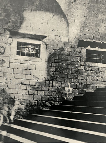
• At The Daily Heller: Photographs of lost buildings and American ruins.
• At Dennis Cooper’s: The unknowable presents…Secretly encoded.
• At The Paris Review: Six photos from WG Sebald’s albums.
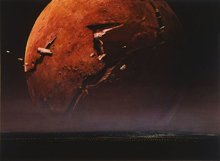
• Winners of the Astronomy Photographer of the Year 2023.
• The Art of Cover Art: A Substack by Rachel Cabitt.
• New music: Le jour et la nuit du réel by Colleen.
• Familiar Reality (1971) by Dr John | Reality Dub (Virtual Reality Mix) (1993) by Material | Reality Net (1994) by Richard H. Kirk