Weekend links 558

morghen.jpg

• One of the earliest posts here concerned The Suite of the Most Notable Things Seen by Cavaliere Wild Scull, and by Signore de la Hire on Their Famous Voyage from the Earth to the Moon (1776) by Filippo Morghen, a series of prints which depict the fantastic inhabitants, fauna and flora of the Moon. Morghen shows the Earth’s satellite to be a tropical place very similar to 18th-century conceptions of the New World or the Far East. Back in 2006 you couldn’t see copies of the prints as large or as detailed as this set at The Public Domain Review.

• “Last Call preserves the poignant irony that the trust and vulnerability that once made gay bars synonymous with gay community were also vectors of death, both in the form of murder and, later, HIV/AIDS.” Jeremy Lybarger on Elon Green’s study of the murders of four gay men in New York City in the 1990s.

• “No one in American letters ever pushed back against power over such a long time as [Lawrence] Ferlinghetti,” says John Freeman. Related: Ferlinghetti’s travel journals.

• New music with literary associations: Invisible Cities by A Winged Victory For The Sullen, and Star Maker Fragments by TAK Ensemble & Taylor Brook.

• Old music with no literary associations: The first of the forthcoming releases of live recordings by Can will be a 1975 Stuttgart concert.

The 120 Days of Sodom: France seeks help to buy ‘most impure tale ever written'”.

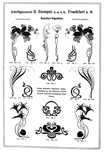
• The Joy of Circles: Vyki Hendy looks at some recent concentric cover designs.

• At Spoon & Tamago: Sculpted sushi made entirely from natural polished stones.

• My Hungry Interzone: Brian Alessandro on coming out and reading Naked Lunch.

• Andy Thomas maps Jah Wobble’s interdimensional dub.

• Mix of the week: XLR8R Podcast 684 by Ben Bondy.

• At Dennis Cooper’s: Jim Jarmusch Day.

Circles (1966) by Les Fleur De Lys | Circles (1970) by Blonde On Blonde | Carry On Circles (2006) by Tuxedomoon

Poster Art in Vienna

klinger08.jpg

Margit Schwarcz, 1923.

From Art Nouveau (see previous post) to Deco…almost. These posters are more Austrian Moderne, or Plakatstil, most of them being too early for Art Deco which only became an identifiable trend in the mid-1920s. The design above by Margit Schwarcz appeared here last August when I wrote an appreciation of the weird fiction of Stefan Grabinski. Schwarcz’s poster had been reworked as a cover for The Motion Demon, a collection of Grabinski’s rail stories, and I wanted to see the original. The same design appears in Poster Art in Vienna (1923), an introduction to work from the Julius Klinger school of poster art which seems to have been produced to promote the work of the Klinger artists (and Klinger himself) in the USA. The Schwarcz poster is very typical of the Klinger style, with bold shapes, bright inks, spiky serifs and cartoon-like drawings. Klinger’s earlier illustration work was very much in the post-Beardsley style, albeit with a similar cartoon-like approach, so there’s a trace of Beardsley still present in some of the figures.

klinger01.jpg

Julius Klinger, 1922.

This is a great book even if it provokes the melancholy thoughts that tend to arise when looking at something bright and inventive from Austria or Germany in the 1920s. I always find myself wondering how the artists fared during the storm of Nazism and war that would bear down on them in the following decade. Klinger was Jewish, and didn’t manage to escape to his beloved America; he was prevented from working after 1938, and was killed in Belarus in 1942. His name lives on in the Julius Klinger fonts which were based on his type designs. More of Klinger’s poster and illustration work may be seen at Vienna Secession.

klinger02.jpg

Julius Klinger, 1923.

klinger03.jpg

Julius Klinger, 1909.

klinger04.jpg

Julius Klinger, 1923.

Continue reading “Poster Art in Vienna”

Typographische Jahrbücher, 1902

tj02.jpg

My work this week is more Deco than Nouveau but I enjoy looking at Art Nouveau graphics even when I don’t have any immediate use for them. Typographische Jahrbücher was a German publication for typographers and printers whose pages are filled with samples of the latest type styles and print decorations, together with many adverts that use the same graphics. The examples here are from issues for the year 1902 when Art Nouveau (or Jugendstil as it was in Germany and Austria) had reached its peak as the predominant European style. This is the kind of book I love to see, one with a wide variety of borders, letterforms and motifs for print use alone, not designs for textiles or other crafts. Of note are the pages below promoting a pair of recent typefaces, Eckmann and Siegfried. Both designs soon fell out of fashion but returned to prominence in the 1960s among the typefaces of the occult revival. It’s a shame the quality of this book isn’t better—it’s another poor Google scan—but I’m happy to find it. 750 pages; dig in here.

tj20.jpg

tj05.jpg

tj01.jpg

tj09.jpg

Continue reading “Typographische Jahrbücher, 1902”

Weekend links 557

grygar.jpg

Poster by Milan Grygar for the 1969 Czech release of Fellini’s Juliet of the Spirits.

• “By encouraging composers to engage with sound as something more than just ‘notes on a keyboard’, the result [of the Buchla] was the kind of intricate sound design last heard in musique concrète. Works such as Morton Subotnick’s, Silver Apples of the Moon (1967) show a futurism completely absent on Wendy Carlos’ otherwise highly influential Switched-on Bach (1968), which used the keyboard-controlled Moog modular as if it were merely a glorified organ.” Oli Freke on the evolution of the synthesizer.

• “As humans began settling more consistently in one place to grow and thrive, the penis—or, more specifically, its erect form, the phallus—often came into use as a protector of fields that would prove fertile. In contrast to the comparative prudery of today, the phallus adorned everything from gods to shrines to personal homes and jewellery.” Emily Willingham on penial evolution in the animal kingdom.

• “The Trumpets of Jericho is, in part, so uniquely unsettling because it allows the woman in question to narrate her own horror. She is eager to give birth not to meet her child but so that she can go ahead and kill it.” Reed McConnell on the writings of Unica Zürn and (once again) Leonora Carrington.

At the center of it all, there was one director whom everyone knew, one artist whose name was synonymous with cinema and what it could do. It was a name that instantly evoked a certain style, a certain attitude toward the world. In fact, it became an adjective. Let’s say you wanted to describe the surreal atmosphere at a dinner party, or a wedding, or a funeral, or a political convention, or for that matter, the madness of the entire planet—all you had to do was say the word ‘Felliniesque’ and people knew exactly what you meant.

In the Sixties, Federico Fellini became more than a filmmaker. Like Chaplin and Picasso and the Beatles, he was much bigger than his own art. At a certain point, it was no longer a matter of this or that film but all the films combined as one grand gesture written across the galaxy. Going to see a Fellini film was like going to hear Callas sing or Olivier act or Nureyev dance. His films even started to incorporate his name—Fellini Satyricon, Fellini’s Casanova. The only comparable example in film was Hitchcock, but that was something else: a brand, a genre in and of itself. Fellini was the cinema’s virtuoso.

Martin Scorsese on “Il Maestro”, Federico Fellini

• At Dennis Cooper’s: For Your Crushed Right Eye: The instrumental films of Takahiro Iimura, Tetsuji Takechi, Toshi Matsumoto, Masao Adachi and Takashi Ito.

• “We wanted people to see that we exist.” Joan E. Biren, the photographer who recorded lesbian life in the 70s.

•New music: Alkisah by Senyawa, and Bishintai by Unknown Me.

• Mix of the week: XLR8R Podcast 683 by Laila Sakini.

Phallus Dei (1969) by Amon Düül II | Sidereal Hands At The Temple Of Omphalos (1996) by Scenic | Starman (feat. Peter Brötzmann) (2017) by Phallus Dei

Squirm: Drew Struzan versus Gustav Klimt

squirm1.jpg

This poster by Drew Struzan turned up in my RSS feed courtesy of 70s Sci-Fi Art. So Struzan did the US poster for Squirm, thought I, …who knew? Wait a minute…are those Klimt figures?! Closer scrutiny confirmed that, yes, Struzan does indeed appear to have swiped a handful of figures from Gustav Klimt as victims for the carnivorous worms. Squirm (1976) for those who haven’t seen it, is described by The Psychotronic Encyclopedia of Film as:

Pretty bad film about electrified earthworms in Georgia that have teeth and make noises like horses. It does have an amazing scene with long worms burrowing through a man’s face. Whole rooms are filled with what looks like thick spaghetti. Don Scardino is the studious young hero. The ads claimed there were “250,000 real worms” in the film. From the director of Blue Sunshine.

Michael Weldon’s book has a very lenient attitude towards this kind of nonsense so for a film to be labelled as bad is always a warning. Having seen Squirm, I agree with Weldon’s appraisal. There were a lot of animals attacking humans in the cinema of the 1970s, thanks in part to the success of Jaws, so a story about worms on the rampage is merely another addition to the trashy pile. (The Japanese poster even managed to emulate the famous Jaws poster.) Squirm is especially ridiculous when the humble earthworm is so resistant to being any kind of menace unless its size is dramatically increased, as in Dune or Tremors, the latter being a much better horror film with its own Jaws-like poster.

klimt1.jpg

Jurisprudence (1907) by Gustav Klimt.

Struzan’s figures are based on those in Jurisprudence, one of the paintings that Gustav Klimt worked on from 1900 to 1907 for the ceiling of the Great Hall at the University of Vienna. There were three pictures—the others represented Philosophy and Medicine—but all were deemed too pornographic for public display. The paintings were subsequently destroyed in 1945 by retreating Nazi troops after having been seized from their Jewish owners and moved with other loot to the Schloss Immendorf.

klimt2.jpg

squirm2.jpg

Klimt’s Jurisprudence is the strangest of all his works, with three Furies presiding over the cowed figure of a man ensnared by evil, represented here by an octopus. Philippe Jullian in Dreamers of Decadence declares Klimt’s symbolic cephalopod to be “unique in European Art”. I alluded to the Furies, and thereby surreptitiously alluded to those tentacles of evil, when I put a Klimt-like figure into my adaptation The Call of Cthulhu in 1988.

Continue reading “Squirm: Drew Struzan versus Gustav Klimt”