Weekend links 623

blot.jpg

A symmetrical ink blot from Gobolinks, or Shadow Pictures for Young and Old (1896) by Ruth McEnery Stuart & Albert Bigelow Paine, a book where the blots are much more interesting than the interpretative verses that accompany them.

• “…within a year, they were on The Tube, performing their German-language extrapolation of Throbbing Gristle’s Discipline to a visibly nonplussed audience.” Alexis Petridis on the return of Propaganda. The group’s debut album, A Secret Wish (previously), has long been an obscure object of desire round here.

• RIP Alan White, drummer in Yes for much of the 1970s (see Sound Chaser for details), and also—although nobody mentioned this at the time—the originator of the drum sounds sampled on a Fairlight for Beat Box by the Art Of Noise.

• “For the anthropologist Stewart Guthrie, pareidolia is not a fringe phenomenon: it is at the core of religious experience.” Hunter Dukes on the interpretation of ink blots.

• “…self-righteousness is the one thing that I don’t agree with,” says John Waters. “We used humour to fight when I was young.”

• New music: October Cut Up by Black Glass Ensemble, and New Witness by Michael Begg.

• Also RIP Shiv Kumar Sharma, master of the santoor.

• “Scientists recreate Cleopatra’s favourite perfume.

Simon Fisher Turner’s favourite albums.

• At Dennis Cooper’s: Len Lye Day.

Cleopatra’s Barge (1962) by Alex North | Cleopatra’s Needle (1963) by Ahab And The Wailers | Cleopatra King Size (2002) by Jah Wobble & Temple Of Sound

Solid Space: Jon Anderson’s cosmic voyage

olias1.jpg

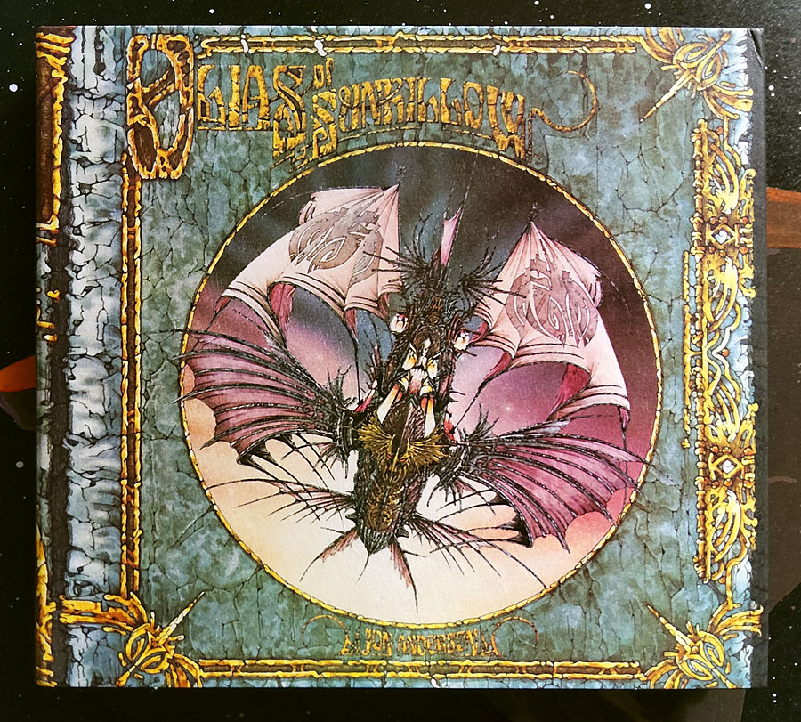
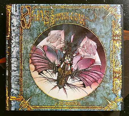
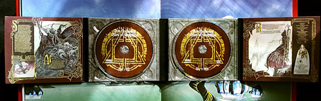
Jon Anderson’s solo debut, Olias Of Sunhillow, is reissued this week in a double-disc set comprising a remastered CD plus an audio DVD. I’d been hoping for some time that this album might be given a proper reissue, it’s one I like a great deal but my old CD has never sounded as good as it ought to. The album may command cult status round here but you don’t see it mentioned anywhere outside Yes forums or partisan enclaves like the Prog Archives. This post may be taken as a small corrective to the neglect.

olias2.jpg

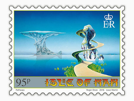
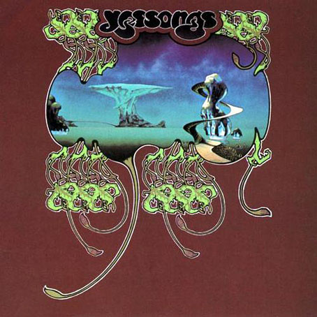
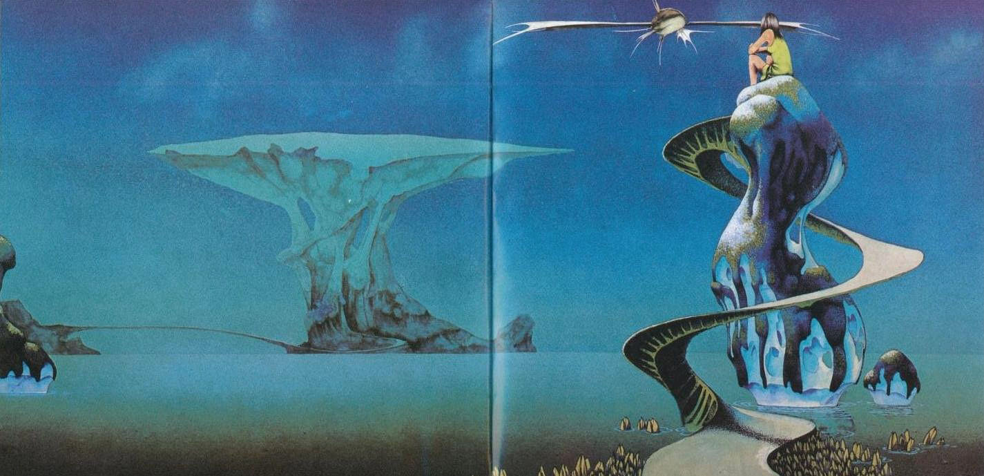
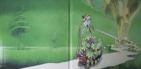
Olias Of Sunhillow was released in 1976, and was the most unusual of all the solo albums recorded by the individual members of Yes in the mid-70s, being a spin-off from some of the group’s early albums, or at least their cover art. Roger Dean’s first cover work for the group was on Fragile in 1971, for which he painted a miniature world rather like one of MC Escher’s planetoids. This was Dean’s idea, the band had suggested a broken piece of porcelain as the cover image. The back cover of the album showed the same planet in a state of fragmentation with a fish-like spaceship floating above it (see below). Another drawing of the fish-ship was added to the front cover before the album’s release, and it’s this ship, and the narrative it suggests, that leads eventually to Anderson’s solo album. Two years after Fragile, the planetary disintegration had turned into an exodus on the group’s triple-live album, Yessongs, the back cover of which shows pieces of planet being towed through space by a similar fish-ship. The other panels of the cover depict the arrival of these fragments on a newer, larger world. Anderson’s album takes this sequence of events then filters them through Vera Stanley Alder’s mysticism to craft a musical odyssey which Discogs describes as:

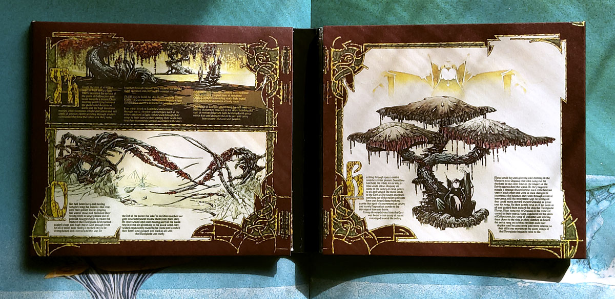
…the story of an alien race and their journey to a new world due to catastrophe. Olias, the title character, is the chosen architect of the glider Moorglade, which will be used to fly his people to their new home. Ranyart is the navigator for the glider, and Qoquaq is the leader who unites the four tribes of Sunhillow to partake in the exodus.

olias3.jpg

For many years in British music circles it would have been a grave error to even acknowledge this album’s existence, never mind admit to actually liking it. This was partly the old animus against progressive rock, an unexamined prejudice that lasted well into the 1990s, but Anderson’s album had so many strikes against it that it might have stood as the winner of a disapproval lottery for the more ideologically rigid writers and readers of the NME. It’s Jon Anderson (strike 1), the lead singer of progressive rock (2) group Yes (3), whose album is a science fiction (4)/ fantasy (5) concept (6), littered with Tolkien-like invented names and words (7), and with a multi-page sleeve embellished with detailed fantasy illustrations (8) by David Fairbrother-Roe. The design was art directed by Hipgnosis, who subsequently designed the next two Yes albums. Anderson originally wanted Roger Dean to create the packaging, which would have provided a further strike of disapproval against the album, but Dean’s career had gone into overdrive following the publication of Views so he either didn’t have the time or didn’t want to be involved. In Views Dean mentions “another project” based on the fish-ship’s journey which may be a reference to Anderson’s forthcoming album, the credits of which thank Dean for “planting the seed”.

views1.jpg

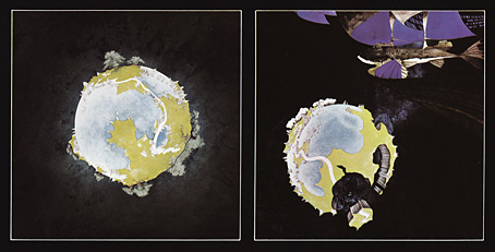
Roger Dean’s original artwork for Fragile (1971). Another fish-ship was added to the final cover art.

Continue reading “Solid Space: Jon Anderson’s cosmic voyage”

Roger Dean postage stamps

dean11.jpg

Roger Dean book covers last week; this week it’s postage stamps. These are exclusive to the Isle of Man Post Office, unfortunately, so there’s little chance of buying them over the counter in mainland Britain. First day covers, presentation packs and individual sheets may be ordered from the post office website, however. For those who can visit the Isle of Man there’s also an exhibition of Dean’s art running at the Manx Museum in Douglas until November.

Several of the paintings on the stamps are from the covers for albums by Yes and Asia, including the one above which was used twice on the live Yessongs album in 1973. (The large version inside the gatefold had a figure of a girl and a fish spacecraft added.) The version appearing on the stamp is Dean’s recent reworking of the piece. This removed the airbrushed clouds—added to disguise the footprints of his cats which had walked over the painting when it was drying—and also smoothed the gradients and added a reflection. I’ve been familiar with the album version of this picture for decades so I prefer the rougher original as it is on the cover (and in Dean’s Views book) without the girl and spacecraft.

yessongs.jpg

yessongs2.jpg

One other thing of note is Dean’s lettering design for the stamps. When I wrote about Dean’s art a few years ago I drew attention to the way his design work has been either marginalised or ignored altogether by people who dismiss him as a mere fantasy artist. All of Dean’s album covers have included unique letterforms that are immediately recognisable as his own (so too the logos and lettering he was designing for computer games in the 1980s) but I’ve yet to see this side of his work given any serious attention. (Postage stamp tip via It’s Nice That.)

dean8.jpg

dean9.jpg

dean10.jpg

dean7.jpg

dean12.jpg

Previously on { feuilleton }
Roger Dean book covers
Design as virus 17: Boris and Roger Dean
Roger Dean: artist and designer

Design as virus 17: Boris and Roger Dean

boris2.jpg

The compact disc for Flood (2000) by Boris.

The music of Japanese heavy rock trio Boris has been soundtracking the past few days hence this addition to an occasional series which has already seen the band mentioned once before. It’s common for rock groups at the heavier end of the spectrum to find a visual identity which is maintained across all releases. Boris have never been interested in this kind of consistency; not only do the band vary their appearance for group shots but their music, and the packaging which attends it, explores a variety of different styles. The album cover which featured in an earlier post was a careful copy of the sleeve for Nick Drake’s second album Bryter Layter. All the releases featured here play with Roger Dean’s graphic style of the early 1970s. All art and design credits are given to the band’s own label, Fangs Anal Satan, so we’ll have to assume that it’s a member of the band responsible for the design and illustration.

budgie.jpg

Logo for rock group Budgie by Roger Dean, 1973.

boris3.jpg

Flood CD insert.

boris1.jpg

A label design from 2006 based on Roger Dean’s first Virgin Records logo.

virgin.jpg

Virgin Records label by Roger Dean, 1973.

boris4.jpg

Walrus/Groon (2007).

The most elaborate Roger Dean pastiche is this 12-inch single, a collaboration with Japanese noise man Merzbow. On the A-side the band play a version of I Am The Walrus while Merzbow makes noises in the background; the B-side is named after a King Crimson track but the racket everyone makes sounds little like the original. The sleeve is a gatefold affair based on Dean’s design for Close To The Edge (1972) by Yes, complete with handwritten credits and Dean-like painting in the interior. The vinyl disc came in a variety of coloured formats and used the imitation Virgin label. In all, a very collectable item.

boris6.jpg

boris5.jpg

Previously on { feuilleton }
Design as virus 16: Prisms
Design as virus 15: David Pelham’s Clockwork Orange
Design as virus 14: Curse of the Dead
Design as virus 13: Tsunehisa Kimura
Design as virus 12: Barney’s faces
Roger Dean: artist and designer
Design as virus 11: Burne Hogarth
Design as virus 10: Victor Moscoso
Design as virus 9: Mondrian fashions
Design as virus 8: Keep Calm and Carry On
Design as virus 7: eyes and triangles
Design as virus 6: Cassandre
Design as virus 5: Gideon Glaser
Design as virus 4: Metamorphoses
Design as virus 3: the sincerest form of flattery
Design as virus 2: album covers
Design as virus 1: Victorian borders