Robot Artists and Black Swans

robotartists.jpg

Four years ago I designed and illustrated a book for Tachyon written by Bruce Sterling, Pirate Utopia. Robot Artists and Black Swans is a kind of sequel, being the work of the same author for the same publisher, and with a similar geographical focus on southern Europe. The new book differs from the earlier one by being a collection of stories rather than a single piece, many of which are set in or near the city of Turin where Sterling and his wife, Jasmina Tesanovic, spend much of their time. Sterling has been living in Europe for many years, long enough to have cultivated an alter-ego, Bruno Argento, an Italian science-fiction writer who is offered as the real author of the stories in Robot Artists and Black Swans.

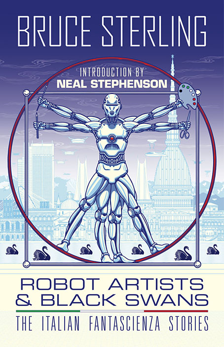
Pirate Utopia was an easy book to design because of the Futurist theme which I illustrated by adapting graphics by artist and designer Fortunato Depero. For the cover of the new volume I considered trying something similar with another Italian artist/designer, Franco Grignani (1980–1999). In addition to having studied in Turin, Grignani was commissioned by David Pelham to create cover art for a handful of Penguin science fiction titles in the late 1960s. Much of Grignani’s artwork is heavily indebted to the Op Art style popularised by Bridget Riley and Victor Vasarely, especially the early Riley formula of dazzling arrangements of parallel lines, a formula he made his own after Riley’s work evolved in other directions. Despite these favourable qualities, Grignani’s art proved too abstract for my purposes, and for Tachyon’s who wanted something more illustrative, so I ended up co-opting a very different Italian artist/designer, Leonardo da Vinci. The figure of Da Vinci’s Vitruvian Man has been parodied and pastiched many times so this isn’t remotely original (I’ve also used the original drawing on a pastiche book cover I designed for the Lambshead Disease Guide), but making the figure a robot was a convenient way of combining the title with Italian history. One of the stories in the collection, Pilgrims of the Round World, concerns the inhabitants of Turin during the Renaissance years, and mentions Leonardo (or “the Vinci boy”) several times, so the figure does have some actual relevance beyond being recognisably Italian. The background is, of course, the city of Turin given a slightly futuristic tweak, although it’s more Turinesque than a match for the place itself.

As usual, I’ll save discussion of the book’s interior until after publication which will be in March, 2021. Watch this spacetime.

Previously on { feuilleton }
Pirate Utopia by Bruce Sterling
Futurismo!

Victor Vasarely album covers

vasarely05.jpg

Terretektorh / Nomos Gamma (no date; late 60s) by Iannis Xenakis.

Xenakis and Victor Vasarely are paired again on this album cover from the late 1960s. Given how often record companies have used abstract artwork on the sleeves of classical recordings, especially those by 20th-century composers, you’d expect there to be more examples. There may well be but Discogs (always the easiest place to search) only turns up the following examples.

vasarely01.jpg

Chamber Concerto For 11 Instruments / Symphonic Variations (no date) by
Neils Viggo Bentzon / The Royal Danish Orchestra conducted by Jerzy Semkow.

vasarely04.jpg

Kontakte For Electronic Sounds, Piano And Percussion / Refrain For Three Instrumentalists (1968) by Aloys Kontarsky, Christoph Caskel, Karlheinz Stockhausen.

vasarely06.jpg

David Bowie (1969) by David Bowie.

I confess that until I began searching for Vasarely covers I hadn’t known that this was an early example. That’s partly down to David Bowie’s second album (the first in his official canon) having been reissued for years in a different cover with Bowie’s face filling the sleeve. The album reissues in 1999 restored the original design, one of the artist’s Folklore Planetaire series. The credit is to “Vaserelli”.

Continue reading “Victor Vasarely album covers”

Vasarely, a film by Peter Kassovitz

vasarely.jpg

I’ve always liked Victor Vasarely’s brand of Op-Art so this short film from 1960 would be of interest even without the addition of a score, Neg-Ale, by Iannis Xenakis. Considering the stature of the composer the music fails to add much at all so it’s no surprise to read at Ubuweb that Xenakis later withdrew it from his catalogue. Kassovitz’s film is worth watching for Vasarely’s artworks, however, especially some three-dimensional creations I hadn’t seen before.

Previously on { feuilleton }
Escher and Schrofer

Escher and Schrofer

schrofer5.jpg

Design by Jurriaan Schrofer.

That’s Maurits Cornelis Escher (1898–1972), the Dutch artist, and Jurriaan Schrofer (1926–90), the Dutch typographer and graphic designer. Aside from a shared nationality the pair had a similar interest in periodicity and incremental metamorphosis, something that’s strikingly apparent when you compare their works. I don’t know much about Schrofer so I can’t say whether he was consciously following Escher’s example or whether this is coincidence. Some of the gradations and distortions also bear comparison with the Op Art paintings of Bridget Riley, Victor Vasarely and others.

escher8.jpg

MC Escher signed most of his works with three square “MCE” letters which are remarkably similar to Schrofer’s type designs.

There’s an opportunity to find out more about Schrofer’s distinctive approach to graphic design in a forthcoming book from Unit Editions (currently available at a reduced pre-order price). More of his work can be seen at But Does It Float and scattered around Tumblr. MC Escher is well-represented on the web; I’d suggest starting at WikiPaintings.

escher1.jpg

Circle Limit I (1958) by MC Escher.

schrofer1.jpg

Design by Jurriaan Schrofer.

escher2.jpg

Square Limit (colour, 1964) by MC Escher.

Continue reading “Escher and Schrofer”