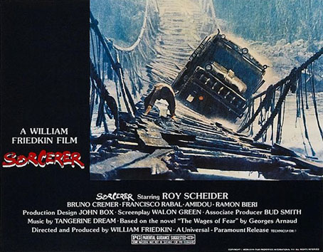
Earlier this week I finally got my hands on the recent Blu-ray reissue of William Friedkin’s Sorcerer (1977). Having only ever seen the film on the travesty of a DVD that appeared in 1998 I’m going to enjoy watching this at the weekend. Brits ought to know that (for now) the only edition available seems to be the US version although it is region-free, and if you buy from a UK film dealer on eBay you won’t get hit with import duties.
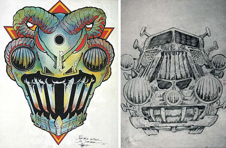
Sorcerer designs by Philippe Druillet.
By coincidence, Sorcerer has a minor connection with Philippe Druillet, although his contribution was so minimal that there’s not even a mention of his name on the obsessively detailed Sorcerer film blog. If you’ve seen the film (or Henri-George Clouzot’s equally good earlier version, Wages of Fear), or even read George Arnaud’s novel, you’ll know that the crucial part of the story concerns a potentially suicidal expedition by four men in two trucks, each of which are carrying crates of nitroglycerine through hazardous terrain to the site of an oil-well fire. Friedkin and writer Walon Green expand the story without aping any of Clouzot’s set-pieces (something few directors today would resist), while Friedkin adds some details of his own, notably in the design of the trucks which have distinct “faces” and their own names—”Lazaro” and “Sorcerer”—hence the film’s title which also nods misleadingly to The Exorcist. The truck design was Druillet’s contribution although there’s very little of this apparent on-screen, understandably so when his sketches show fantastic designs that would have no place in the dishevelled jungle town where much of the film takes place. Later sketches by production designer John Box can be found at Wikipedia.
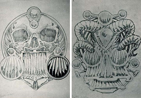
Sorcerer designs by Philippe Druillet.
What interests me most about this connection is its being another example of the surreptitious influence of French comics on American cinema during the 70s and 80s. Moebius is the most obvious example of this but it’s also there in the influence of Métal Hurlant/Heavy Metal on the look of Blade Runner, and in Enki Bilal’s design of Molasar in Michael Mann’s The Keep. Since the 1980s we’ve seen a greater industrialisation of conceptual art for the cinema, as a result of which directors are less inclined to look outside Hollywood for their stylists. And now that the treadmill of superhero franchises is grinding away relentlessly, Continental comics and their creators are even less visible than before.
Probably the oddest thing about the Sorcerer/Druillet connection is that the commercial failure of the film in 1977 has often been laid at the door of Star Wars, the advent of George Lucas’s dismal saga being regarded, with some justification, as the opening of the gate to the barbarian hordes. (Friedkin’s film might also have fared better had it not been titled as though it were an Exorcist sequel.) The irony here is that George Lucas happened to be a big Druillet enthusiast, although there’s little evidence of this in his films; in addition to writing an appreciation for Les Univers de Druillet in 2003, he also commissioned Druillet to create a one-off piece of Star Wars art in the late 70s. Knowing this it’s tempting to imagine Lucas creating a very different kind of science-fiction film in 1977, one with some Continental weirdness at its core. But when the world has already been deprived of Jodorowsky’s Dune it’s best not to dwell too much on might-have-beens.
Previously on { feuilleton }
• Ô Sidarta: a film about Philippe Druillet
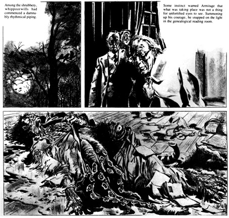
• Lovecraft: Démons et Merveilles
• Heavy Metal, October 1979: the Lovecraft special
• Philippe Druillet album covers
• Druillet’s vampires
• Salammbô illustrated
• Druillet meets Hodgson
 The man in black is talking about his monster. “It is elegant, fast and terrible. It exists to destroy—and destroys to exist. Once seen it will never be forgotten. It will remain with people who have seen it, perhaps in their dreams or nightmares, for a long, long time. Perhaps for all time.”