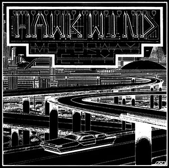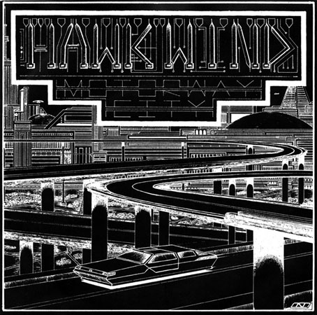
The process of updating the main website meant I had to check (and double-check, etc) every single page, so I’ve been looking at more of my old artwork than usual. This 7-inch single sleeve from 1983 made me belatedly realise that the wheel-less levitating car I put on the back of Joe Banks’ Hawkwind book has an ancestor here and on the cover of the third Friends and Relations compilation that Flicknife released in 1985. The continuity was accidental but Motorway City (the song) dates from the end of the period discussed in Joe’s book so it’s good to think that a vague reference to the Levitation era can be found on the cover art.
This odd drawing dates from 1980, a year when my life was in such turmoil I’m amazed I had time to do any drawing at all. I was 18 and had already burned my way through three dead-end jobs after leaving school the year before, by which point I was agreeing with Dave Brock’s Brainstorm ad lib on the Live Seventy Nine album, “I don’t want to be employed!” This attitude led to increasing rows with my mother which in turn led me to spend more time than usual in Blackpool library. Part of the inking on the drawing was done during one of these stress-free afternoons in the library reading room. I’d guess this was shortly after I’d met the group for the first time at their Preston concert on 20th October since most of the drawings I took with me were generic space art rather than pieces derived from Hawkwind songs. They’d played Motorway City that evening (the second song according to Setlist.fm) so I’m sure I would have made a point of showing it off. I say this is an odd drawing because I’ve no idea why I made it look so obviously like a single sleeve, but it’s possible that a single release of the song from the new Levitation album had been rumoured. Whatever the explanation, this was one of the first drawings I made using my new Rotring Variant pen which I used throughout the ensuing decade; one advantage of the dead-end jobs was they at least gave you enough money to afford expensive German technology. A year later, looking through a friend’s copy of Centigrade 232 by Robert Calvert, I was amused to discover a poetic complaint about the tendency of fine-nibbed Rapidograph pens to become blocked with ink. You have to treat them with care and respect, Bob.
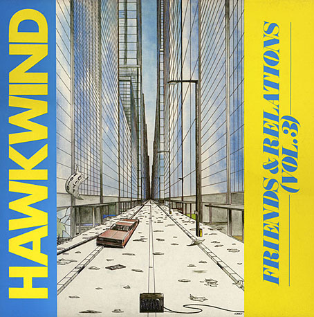
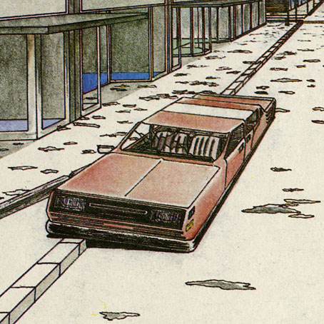
The car on the Friends & Relations cover wasn’t intended to be a reference to the earlier vehicle but removing the wheels was the easiest way of indicating a futuristic scene without any other overt signifiers. A shame, then, that the TV in the foreground is a cathode-ray tube in a wooden case. (And while I’m being critical, the careless use of perspective makes the car much too long.) Both these vehicles look rather graceless, as did cars in general in the late 1970s/early 1980s when there was a trend for boxy design. I’m usually indifferent to the automotive world but I could at least have borrowed some of the carapace sleekness you see in paintings by Syd Mead or Peter Jones.
The Friends & Relations album was reissued on CD in 2014 in one of the Atomhenge CD box sets: The Flicknife Years, 1981–1988. The set includes two other albums with covers of mine: Zones and Out And Intake. Zones was a compilation of recent live recordings and a few studio outtakes that includes the version of Motorway City released as a single, together with a Michael Moorcock song that’s unique to this album (and sung by the man himself), Running Through The Back Brain.
Previously on { feuilleton }
• Reality you can rely on
• Hardy art
• Silver machines
• Notes from the Underground
• Hawkwind: Days of the Underground
• The artists of Future Life
• Science Fiction Monthly
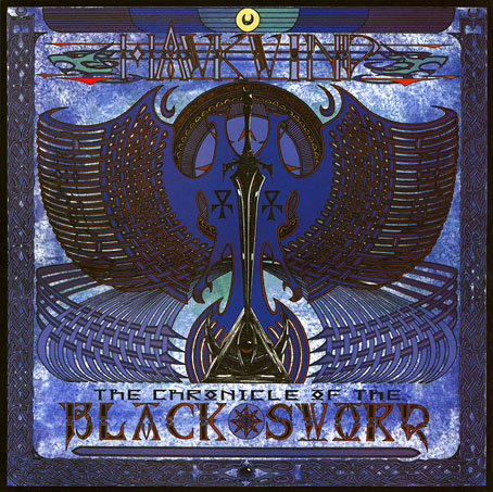
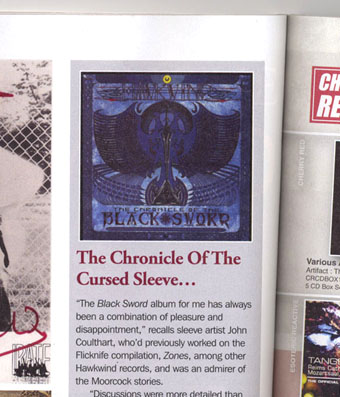
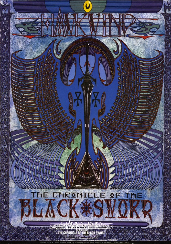
• The Chronicle of the Cursed Sleeve
• Rock shirts
• The Cosmic Grill
• Void City
• Hawk things
• The Sonic Assassins
• New things for July
• Barney Bubbles: artist and designer