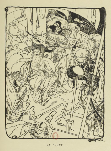
Led Zeppelin IV: Jimmy Page versus Little Bo-Peep

lz4.jpg

Background graphics by Aubrey Beardsley, 1893.

You’d think by now that everything would be known about an album with a Godzilla-sized cultural footprint like Led Zeppelin IV. I certainly thought so until last week when I turned up the source of something that the more obsessive Zepp-heads have been pondering for years. If this puts a bustle in your hedgerow then read on.

symbols.jpg

Led Zeppelin’s fourth album has been around now for half a century which means there really is a lot known about every detail of its production. Mysteries that used to confound friends of mine when we were teenagers have long been solved, questions such as what the hell the four symbols assigned to each member of the group actually signified; not only do we know the origin and meaning of those symbols, the enigmatic “Zoso” sigil chosen by Jimmy Page has an entire website dedicated to its various manifestations. We know where the photo on the cover was taken (Birmingham), and why the sleeve is devoid of identification (Page was annoyed with the press reaction to the previous album); we know that the hermit painting inside the gatefold is based on the Tarot card by Pamela Colman Smith, and we also know a great deal about the writing and recording of Stairway To Heaven. Erik Davis logged much of this in his 33 1/3 study of the album, and while he examines the band symbols in some detail he doesn’t say much about the rest of the hand-written inner sleeve beyond this comment:

Is there a meaning to the nifty Arts and Crafts typeface that Page lifted for the Stairway To Heaven lyrics on the other side of the sleeve? Or just a vibe?

The source, if not the meaning, of this script has been intriguing Zeppelin fans for many years, but I wasn’t aware of this until I happened to be reading the Wikipedia entry about the album and found myself equally intrigued. The game was afoot, Watson.

soh1.jpg

It makes them wonder: the hand-lettered lyrics.

A persistent question you see in fan circles is “What font was used to create X?” People will ask this question even when the design is a one-off, like Syd Mead’s logo for Tron, or something that’s obviously been lettered by hand. Led Zeppelin IV is an album guaranteed to raise the “What font?” question because the lyrics of the group’s most famous song, Stairway To Heaven, cover an entire side of the inner sleeve. On one of the fan forums I was reading someone was eager to identify “the font” because they wanted to apply the words to a bedroom wall. Many more people must have copied out those lyrics since 1971; I once had to do this myself for a female friend who was so besotted with Jimmy Page that she wanted the lyrics in a frame on her own bedroom wall.

tracks.jpg

According to the Wikipedia entry, Page revealed the source of the lettering to be an issue of The Studio, the British art and design magazine which helped launch Aubrey Beardsley’s career and did much to develop and promote the Art Nouveau style in the 1890s. I’m very familiar with The Studio, many posts here refer to it, and I happen to have a complete collection of issues downloaded from the journal archive at Heidelberg University. Seeing the magazine mentioned in this context immediately made me want to find the design that Page had adopted, but before I started flicking through thousands of pages I looked around to see if any of the Zepp-heads had tried searching for the magazine themselves. Evidently not; all the discussion I’ve seen about the inner sleeve tends to recycle the Wikipedia entry, nobody seems to have bothered looking for copies of the magazine. Okay then…

Continue reading “Led Zeppelin IV: Jimmy Page versus Little Bo-Peep”

Pavonine pattern play

pattern1.jpg

One of the projects I’ve been working on recently contains a large quantity of Art Nouveau design. I can’t discuss this any further for the usual embargo reasons, but I can show off this pattern which has been generated as a by-product of the main work. This is one of those fin-de-siècle designs that looks like it might have originated in the 1960s, a decade which saw a revival of interest in Art Nouveau graphics. Those sinuous lines would work well on a psychedelic poster, and there’s even a touch of Op art in the melting ovals that separate the peacock feathers.

pattern7.jpg

But this isn’t a design from 1970, it actually dates from 1900, the source being a small wallpaper sample that I spotted some years ago in issue 7 of Deutsche Kunst und Dekoration. “Frau Dunsky, Berlin” is named as the designer although there’s no further information about her design in the text. After seeing this I thought I’d have a go at copying the pattern in order to create a digital version but I soon gave up when it became apparent that too much work was required to convert the indistinct image into a sharp outline. I didn’t have a graphics tablet at the time, and my printer had broken down, so the only way to draw an outline was the hard way, using a mouse pointer.

pattern2.jpg

Vectorised and coloured.

A few days ago I pulled out the copy I’d been working on and, since I now have a graphics tablet, decided to try again. Even though creating the outline was easier this time I still wasn’t sure whether a repeatable pattern would be possible. The magazine sample is slightly warped, and the repeated elements don’t match exactly when overlaid, but I was able to compensate for the flaws with some stretching and redrawing in Photoshop. It’s very satisfying getting something like this to work, even more so when it’s a 120-year-old design that you’ve managed to resurrect. I also feel a little familial continuity with this kind of pattern making. My mother worked as a textile designer for a few years in the 1950s, although she never worked on anything like this, the designs produced by her studio were generally chintz-like floral patterns.

pattern3.jpg

Prior to redrawing the peacock design I’d resurrected another wallpaper design from the same period. This is one of several examples by a French designer, André Morisset, that appeared in issue 15 of L’Art Decoratif. Monsieur Morisset’s design was easier to work into a digital version, being a better reproduction, while the design itself is a square that tiles vertically and horizontally so it’s easier to build into a pattern.

pattern4.jpg

Drawing the outline.

pattern5.jpg

A tessellated tiff.

pattern6.jpg

A coloured vector version.

I’ll be doing a few more things like this when I get the chance. I’m not sure yet whether they’ll find a place in the things I’m working on, but once you have a satisfactory vector outline you can file the art away until you need it later.

Previously on { feuilleton }
Louis Rhead’s peacocks
Peacocks
Rene Beauclair
Whistler’s Peacock Room
Beardsley’s Salomé

Splendid Suns

suns.jpg

I answered a few interview questions recently for Shunga Gallery, a site concerned with the erotic side of Japanese prints, and with contemporary practitioners who work in a similar areas. (All NSFW, needless to say.) I’m not really an erotic artist but Marijn has selected a few examples of my artwork that contain prominent erections, going back to the badly-proportioned drawing of the Great God Pan that I did in 1986 for my late friend, Ed, when he was part of a Dutch music & performance group, Abrahadabra. The drawing appeared in the zine of the same name, and later provoked mild disapproval from the organisers of a video festival in Den Haag where Ed and friends were using it as a flyer to promote their activities. Also at Shunga Gallery are a few pages from the rebarbative Reverbstorm, a book that’s the darkest and nastiest thing I’ll ever do. Some of that artwork provoked a rather more serious form of disapproval, as I explain in the interview.

Continue reading “Splendid Suns”

Clichés & Gravures

cliche01.jpg

The clichés we have here aren’t the verbal variety but those which the OED defines as:

1. The French name for a stereotype block; a cast or ‘dab’; applied esp. to a metal stereotype of a wood-engraving used to print from. Originally, a cast obtained by letting a matrix fall face downward upon a surface of molten metal on the point of cooling, called in English type-foundries ‘dabbing’.

Clichés & Gravures is a two-volume collection (Volume 1 and Volume 2) of emblems, icons, small illustrations, initials, headings, frames and other print details published by the Deberny type foundry in 1912. Carol Belanger Grafton’s 3,800 Early Advertising Cuts is an edited selection of the same images which Dover Publications added to their Pictorial Archive series in 1991. I’ve been borrowing from Ms. Grafton’s book for many years, during which time I’ve wondered what might have been omitted from her selection. Once again the Internet Archive turns up the goods. The Dover reprint gives no indication that Deberny’s collection ran to two volumes and included colour printing in the second volume, plus a few pages of type designs; the Art Nouveau-styled design shown below is one that I can find immediate use for. If all of this somehow wasn’t enough, there are yet more clichés et gravures (and a lot more typefaces) in this type catalogue which Deberny published a few years later.

cliche02.jpg

cliche03.jpg

cliche04.jpg

cliche05.jpg

Continue reading “Clichés & Gravures”

Fantaisies Florales

pilters01.jpg

Plants and flowers are a common feature of Art Nouveau sourcebooks; Alphonse Mucha, Eugène Grasset and Maurice Verneuil all produced books for designers filled with floral patterns and motifs which generally remain faithful to their models. The designs in Fantaisies Florales by Jean Pilters are less concerned with fidelity to nature, especially in the background decorations whose swirling elaborations look like precursors of the psychedelic art that would help revive popular interest in Art Nouveau decades later. Pilters’ designs were published as a series of loose-leafed portfolios which in these copies have lost their covers, hence the gummed labels which spoil two of the plates.

pilters02.jpg

So who was Jean Pilters? Information is scarce, unfortunately, beyond descriptions of the artist as a French designer. The plates, which possibly date from 1910 (nobody is sure about the year of publication either), look like copies of colour originals but if an earlier colour edition exists I’ve yet to find any examples. Monochrome and tanned with age they may be but there’s enough here for me to work with. I may be borrowing some of these details in the near future.

pilters03.jpg

pilters04.jpg

pilters05.jpg

Continue reading “Fantaisies Florales”