The case of the fin de siècle fleuron

artnouveau.jpg

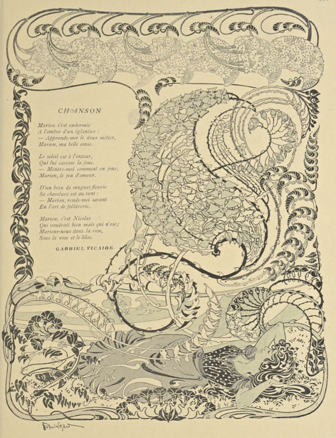
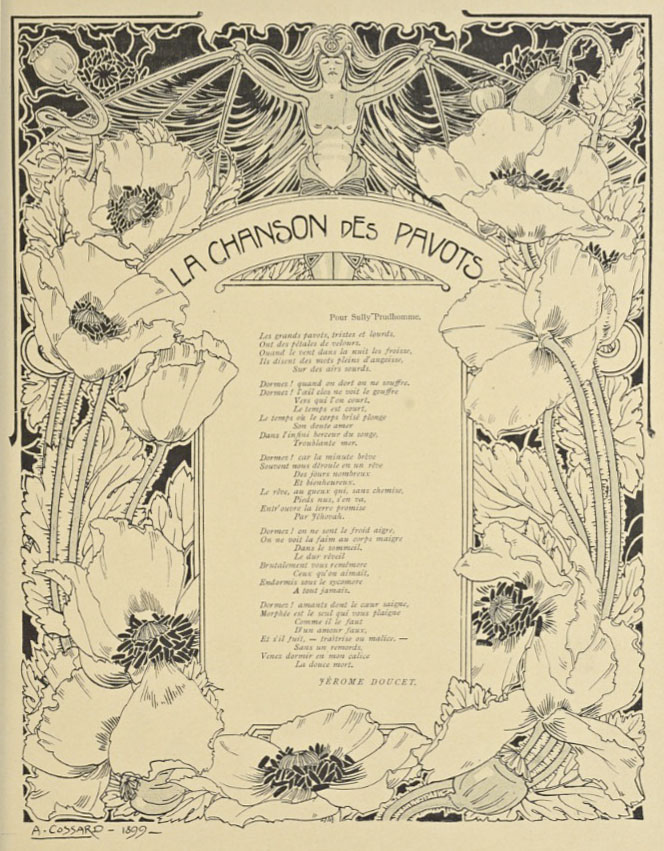
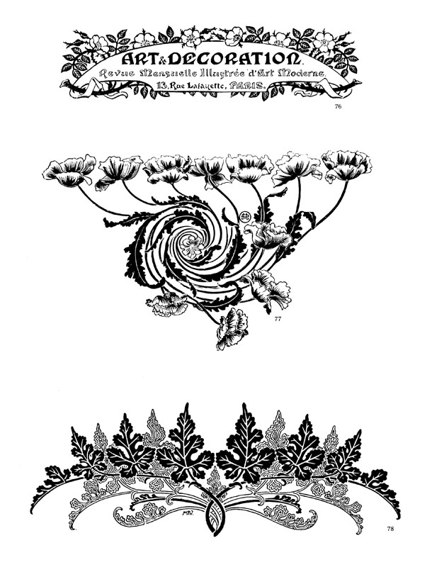
I said yesterday that poppies are a common feature of the fin de siècle magazines for the convenient way they combine long-stemmed flowers—ideal for all those Art Nouveau flourishes—with narcotic connotations that signal Decadence. The spiralling fleuron above is one example that readers of Savoy books may recognise, an occasional company logo which has been in use since the mid-1980s. David Britton chose the design from one of the Dover Pictorial Archive books, Carol Belanger Grafton’s Treasury of Art Nouveau Design and Ornament, and I later made a digital version from this page scan.

heroes.jpg

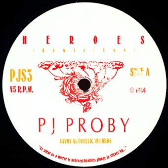
One of the earliest Savoy uses, a label design for Heroes (1986) by PJ Proby.

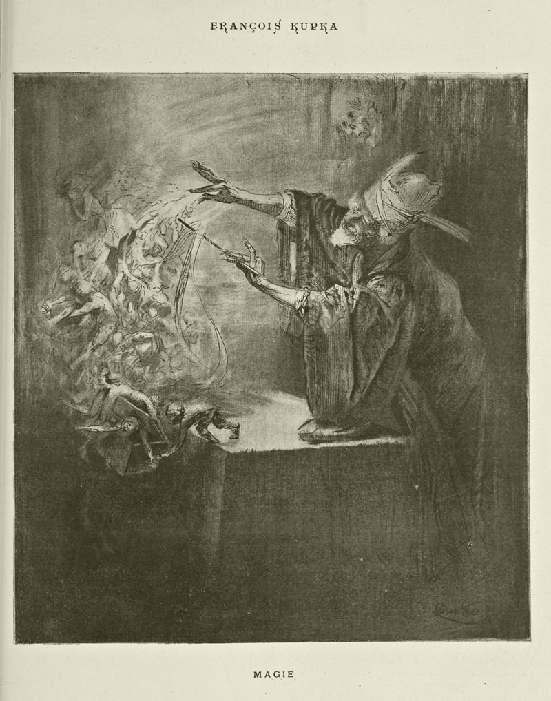
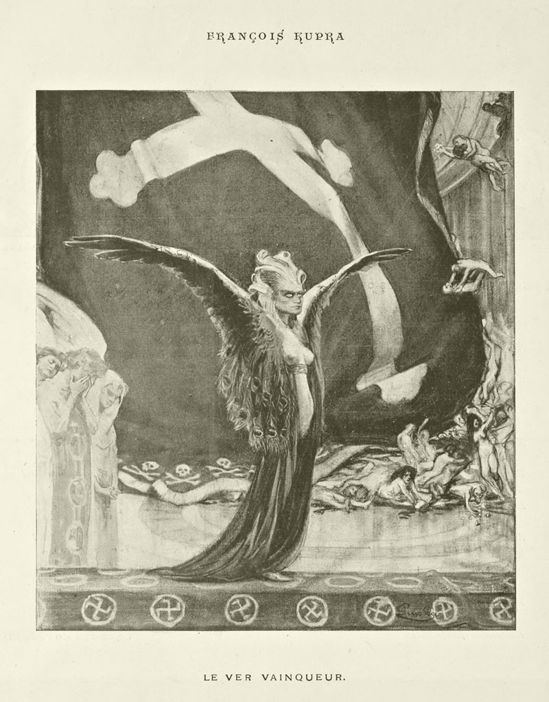
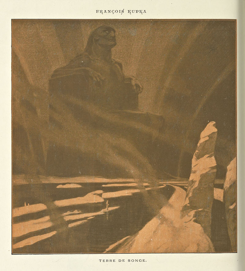
Having spent a great deal of time in recent years trawling through Art Nouveau magazines I was sure I was going to run into the original printing of the fleuron eventually. Some of the page decorations in Jugend are very similar but it wasn’t there or in Pan, Deutsche Kunst und Dekoration or The Studio. I don’t have a copy of the Grafton book, and Dave says his copy is lost, so I’ve no idea whether there’s a credit for the source of the designs; not all Dover books credit their source material in any detail. Earlier this week I decided to look in Art et Décoration, a magazine that was the French equivalent of The Studio, since the header at the top of the scanned page implied that the other designs might be from the same magazine. Aside from a couple of copies at the Internet Archive this means looking through the poor-quality scans at Gallica; by a fluke—because they don’t seem to have a complete run of the early issues—the January 1898 edition contained the page below showing the Savoy fleuron, an endpiece for an article devoted to another French art magazine, L’Image.

Continue reading “The case of the fin de siècle fleuron”

Cocorico graphics

graphics01.jpg

A final visit to Cocorico, the French humour magazine of the fin de siècle. Where graphics are concerned I’ve ignored the cartoons to concentrate on the Art Nouveau decoration which is plentiful in the early issues. The star here is Louis Popineau, an artist I only knew from the excessively florid page above which is reprinted sans poem in one of my design books. Popineau enjoyed foliage running riot in this manner but the magazine also features several of his excellent coloured prints. There’s a lot more of this type of work in the complete run of the magazine which may be found at the Internet Archive.

graphics02.jpg

A paean to the poppy by Jérome Doucet illustrated by Adolphe Cossard. Poppies were a very popular plant in the 1890s for obvious naroctic reasons. Cossard made them a feature of his cover for issue 32.

graphics03.jpg

Continue reading “Cocorico graphics”

Kupka in Cocorico

kupka1.jpg

As noted yesterday, Czech artist František Kupka produced a cover for French magazine Cocorico together with this handful of interior illustrations, all of which date from around 1900. Kupka was living in Paris at the time, and several of these drawings reflect his connections to the Symbolist movement. I’ve posted his Poe illustration before but everything else here is new to me. The most striking piece is Terre de Songe (Land of Dreams) which illustrates a text piece with the same title. Kupka aficionados will recognise this as a variation on a print he made in 1903, Resistance, or The Black Idol, a drawing which today seems to be his most popular (or most visible) work. I’ve wondered a few times whether a tiny speck visible in The Black Idol was meant to be a human figure, something which Terre de Songe confirms. A fantastic drawing in all senses of the word.

The four pictures which follow Terre de Songe are less impressive, a series of double-page satirical drawings whose obscure meaning isn’t helped by their being folded into the centre of the magazine. They’re included here for the sake of completeness.

kupka2.jpg

Magic.

kupka3.jpg

The Conqueror Worm (after Edgar Allan Poe).

kupka4.jpg

Land of Dreams.

Continue reading “Kupka in Cocorico”

Cocorico covers

cocorico01.jpg

Alphonse Mucha.

For a while now I’ve been waiting for several French journals of the fin de siècle to turn up online but humour magazine Cocorico has never been among them. I knew that Alphonse Mucha had contributed a handful of covers and some other graphics to Cocorico, notably the frontispiece (below) which ran in every issue. What I didn’t realise was that this title was effectively the French counterpart to Jugend magazine which had been running for two years when the first issue of Cocorico appeared in December 1898. Both magazines share the same mix of humorous articles, cartoons, serious art pieces and poetry, all connected by some very fine Art Nouveau graphics.

cocorico19.jpg

Alphonse Mucha.

Jugend has the edge when it comes to the graphics, some of which are very strange, but Cocorico looks much more like a humour magazine to contemporary eyes, with many cartoons that resemble those drawn today. Cocorico is also mostly free of the Jugend brand of satire which is often little more than nationalist rabble-rousing. Cocorico ran for 63 issues to 1902 by which time its format had changed and the florid graphics had been abandoned for a more sober layout. What follows is a selection of cover designs, many of which are Mucha’s work, and all of which follow the Jugend template of varying the art style and title design. There’s also one by František Kupka (or François as he was credited here) who also contributed interior illustrations in the later issues. There’ll be more about him tomorrow.

cocorico02.jpg

Alphonse Mucha.

Continue reading “Cocorico covers”

Weekend links 256

beardsley.jpg

Of a Neophyte, and How the Black Art Was Revealed unto Him by the Fiend Asomuel. Aubrey Beardsley for the Pall Mall Magazine, 1893.

• The occult preoccupations of the 1970s appear to be in the ascendant just now. Whether this is mere nostalgia or something in the zeitgeist remains to be seen but BBC Radio 4 aired an hour-long documentary on the subject this weekend entitled Black Aquarius. The guest list implies an inevitable focus on film and television but Matthew Sweet covered a lot of ground, taking in the Hermetic Order of the Golden Dawn, Aleister Crowley, Dennis Wheatley, The Process Church, and Alex Sanders, the public face of British witchcraft in the 1960s and 70s. Earlier this week at AnOther the focus was on Maxine Sanders, High Priestess of the Alexandrian coven and putative fashion icon even though she was generally photographed naked. Maxine and husband Alex are unavoidable when reading about UK occultism in the 1970s; among other things they were occult advisors to Satanic rock band Black Widow, and also released an album of their own in 1970, A Witch Is Born. Of more interest is Sacrifice by Black Widow, a 55-minute concert for German TV’s Beat Club.

• Jacques Rivette’s OUT 1 (1971) is a film more talked about than seen, in part because of a running time that exceeds 12 hours. So news of a Blu-ray release later this year is very welcome.

• “Bruce LaBruce: taking zombie porn and gay homophobic skinheads to MoMA”. The director goes through his filmography with Nadja Sayej.

• “Art is anarchistic, and when it becomes categorized, it loses impact.” RIP Bernard Stollman, founder of the amazing ESP-Disk record label.

• Magickal (and pseudonymous) synth music by Mort Garson: Black Mass (1971) by Lucifer, and The Unexplained (1975) by Ataraxia.

Kevin Titterton on Angelo Badalamenti and the soundtrack that made Twin Peaks.

• Mix of the week: Secret Thirteen Mix 149 by Robert Aiki Aubrey Lowe.

Rare Decay, a free bonus track from Aurora by Ben Frost.

Alan Garner is celebrated in a new collection, First Light.

• At Dangerous Minds: The Residents’ radio special, 1977.

Black Sabbath (1969) by Coven | Black Sabbath (1970) by Black Sabbath | Her Lips Were Wet With Venom (Satan Oscillate My Metallic Sonatas 1 & 2) (2006) by Boris & Sunn O)))