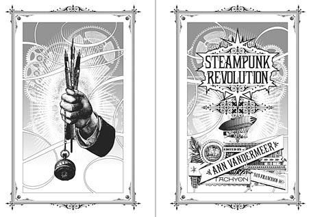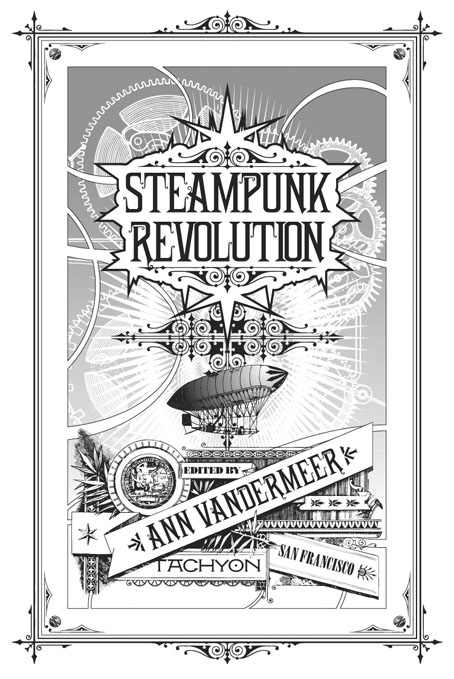
The “S” word again. One of the jobs from earlier this year is now available for purchase from publishers Tachyon and other outlets. Steampunk Revolution is the third in a series of steampunk story collections edited by Ann VanderMeer (Jeff VanderMeer was co-editor on the first two volumes). I designed the previous title, Steampunk Reloaded, and was working on these pages whilst also putting together the cover for Lavie Tidhar’s The Bookman Histories. Tidhar’s trilogy is a steampunk affair (and this collection features one of his Bookman stories) so there’s some slight overlap between the two designs, notably the use of a typographic “charm” I took from a Victorian printer’s catalogue. I’ve since seen that shape used elsewhere so it’s evidently more common than I thought. Bah.
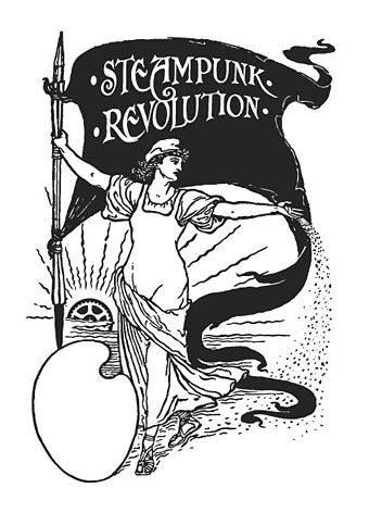
The title page design above can be added to my ongoing obsession with the Exposition Universelle of 1900. Malissa Kent’s story, The Heart is the Matter, ends with a scene at the Exposition so I had an excuse to use an elaborate banner which includes an Exposition medal. (The same medal, incidentally, that you still see on the labels of Campbell’s Soup). The illustration below is adapted from one of Walter Crane’s Socialist drawings, and I feel bad now that we didn’t credit him for it. Sorry, Walter.