Antony Little’s echoes of Aubrey

little1.jpg

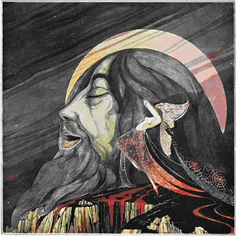
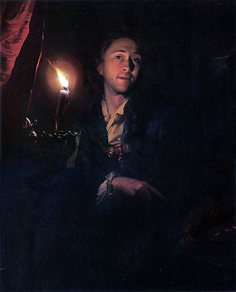
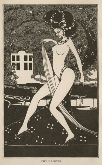
The Dancer (1967) by Antony Little.

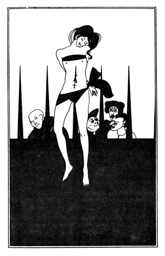
My thanks to Sweet Jane this time for alerting me to her post about a series of Beardsley-inspired illustrations from 1967 by Biba designer Antony Little. The Wandering Jew and Other Stories was the first translation in English of Apollinaire’s 1910 collection L’Hérèsiarque et Cie. I’ve known about this book for a while but few of the illustrations have been on view anywhere until this post. There are eight in all, each of them very adeptly capturing different phases of Beardsley’s drawing style, from the spare black-and-whites to the more detailed renderings seen in his later work. The drawing below is another in the series from a post of Callum’s which also includes a favourite of mine by Beresford Egan.

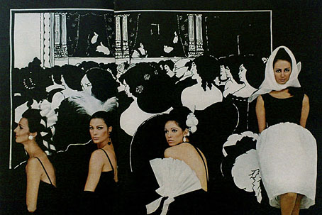
Little’s designs, and the prominence of the Biba stores, did much to make Art Nouveau in general, and Beardsley in particular, a crucial component of London fashion in the late 1960s. For more on that subject see this Sweet Jane post featuring yet more Beardsley borrowings and monochrome design, plus Osborne & Little’s fantastic Chinese Dragon wallpaper which made a memorable appearance last year in Only God Forgives.

little2.jpg

Elsewhere on { feuilleton }
The Aubrey Beardsley archive
The illustrators archive

Aubrey in LIFE

life.jpg

Turned out for a big night at the opera like Beardsley’s Wagnerites, girls wear bare-backed blacks by Trigère. Coiffed heads are by Hugh Harrison and Halston of Bergdorf Goodman’s; Halston also made the pouf-skirted dress. (Photo session by Milton Green & Joe Eula.)

Being determined to catalogue every last piece of Beardsley trivia from the 1960s, I’m compelled to note this post which I’d missed at Sweet Jane’s Pop Boutique a couple of years ago. An earlier post here showed one of the photos from a LIFE fashion feature using Aubrey’s drawings but the Sweet Jane post has scans of all the photos, plus accompanying text. This was published in February 1967, a few months after the summer exhibition at the V&A in London which introduced Beardsley’s work to a new generation, an exhibition which set in motion a wave of popular interest in his work.

I’m intrigued by the way the colour of the women’s bodies emerges from the drawings given the date when the magazine appeared. I’ve long seen 1966 as a very black-and-white year in graphic and aesthetic terms, whereas 1967 is obviously full-colour; the difference between the sleeves of the Beatles’ (Beardsley-derived) Revolver and Sgt Pepper albums are only two of the more prominent examples. These fashion photos could be regarded as being caught mid-way between the shift from one state to another. There are more shots of the Wagnerites above on this page. Thanks to Ian for drawing my attention to the Sweet Jane post.

Elsewhere on { feuilleton }
The Aubrey Beardsley archive

Spanish Salomés

salome1.jpg

Uncredited painting based on Modern Salomé (1927), a poem by Emilio Carrere.

Yet more on this indefatigable theme, the examples this time being by Spanish artists and illustrators. All the pieces are from this page, and the artists involved aren’t well-known at all so checking details isn’t easy. Take the references with a pinch of salt. Thanks to Thom for the tip!

salome2.jpg

Illustration by José Moya del Pino for The Death of Salomé (1915), a poem by Emilio Carrere.

Continue reading “Spanish Salomés”

Salomé: the font

salomefont01.jpg

This isn’t the first font that’s been named after Salomé but Salome (without accent) by Rebecca Alaccari and Patrick Griffin was a revival of an earlier design, Cantini, from 1972, whereas Salomé is an original creation by Spanish design studio Atipo. The Atipo design itself owes something to the 1970s being reminiscent of François Boltana’s Stilla (1973), albeit without the eccenticities that make Boltana’s typeface so redolent of the period. Salomé comes in four styles, all of them variations on the extra-bold weights of Didone typefaces.

salomefont02.jpg

Having a predilection for this look the design appeals to me even without its associations. Atipo add to the attraction by promoting their font family with some gorgeous illustrations juxtaposed against quotes from Oscar Wilde’s play. None of the poster designs or the booklet pages below are credited on the website. The on-screen booklet highlights significant moments from the play with illustrations that manage to be Beardsley-like without going down the pastiche route. This is the way to show off a new font design, it’s just a shame the booklet isn’t available as a pdf. The icing on the cake is that the regular style of Salomé is available for free so long as you help promote it via Twitter or Facebook. The complete family is available for a very reasonable price. Now I have to find something to create that’s worthy of the design.

salomefont03.jpg

salomefont04.jpg

Continue reading “Salomé: the font”

Schalcken’s paintings

schalcken3.jpg

Self Portrait by Candlelight (1695).

One additional pleasure of Le Fanu’s story and Leslie Megahey’s film is the way they draw attention to the work of an artist who might otherwise have remained overshadowed by his more famous contemporaries. Ever since seeing the meticulous chiaroscuro of Joseph Wright’s An Experiment on a Bird in an Air Pump (1768) I’ve been fascinated by paintings which feature a single artificial light source. Candlelit pictures are a particular fascination since these aren’t easy to paint even today when you can photograph the required scene beforehand. How much more difficult would it be painting a candlelit scene by candlelight alone? Works of this nature demonstrate an artist’s fascination with limited sources of light but also serve as displays of expertise, as did so much Dutch painting of Schalcken’s time with its emphasis on photo-realist representation.

schalcken5.jpg

Self Portrait (no date).

This small selection of paintings by Godfried Schalcken (1643–1706) shows some of the pictures that appear in Megahey’s film, or which we see being posed or replicated. At the end I’ve included Schalcken’s own take on the Salomé story which means his work can now be ushered into the Salomé archive. More of Schalcken’s work may be seen at Wikimedia Commons and the BBC’s Your Paintings site. One significant picture is unavailable: the painting which Le Fanu describes at the opening of his story. In his interview about the making of the film Megahey says that they searched the entire catalogue of Schalcken paintings but were unable to find a single picture that matches the one described in Le Fanu’s story. The painting seen in the film (which is perfectly rendered in Schalcken’s style) was created especially for the production.

schalcken6.jpg

A Candlelight Scene: A Man offering a Gold Chain and Coins to a Girl seated on a Bed (c. 1665–70).

Continue reading “Schalcken’s paintings”