Aubrey Beardsley’s musical afterlife

dilettantes.jpg

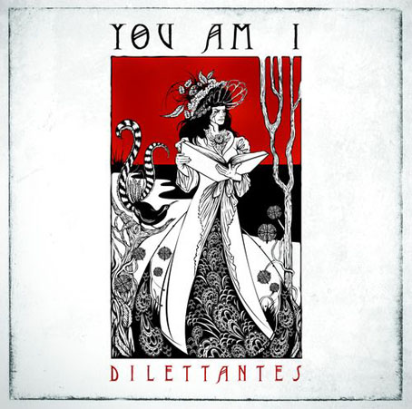
Dilettantes by You Am I (2008). Illustration and design by Ken Taylor.

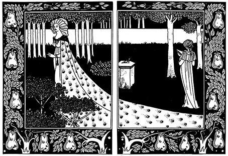
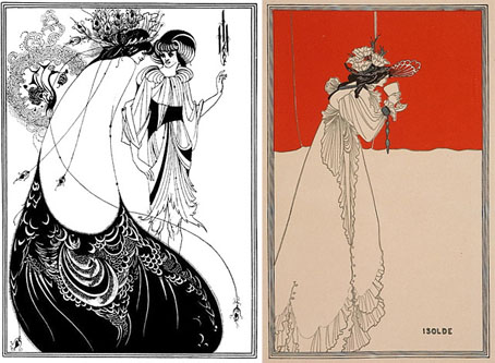
Dilettantes is the eighth studio album from Australian band You Am I which is released this week sporting a very creditable Beardsley pastiche by illustrator Ken Taylor. Sleevage has more details about the creation of the CD package, including preliminary sketches. Those familiar with Beardsley’s work may see in the cover drawing references to The Peacock Skirt and the colour print of Isolde. I like the way Beardsley’s peacock has been exchanged for a more suitably antipodean lyrebird. This isn’t Beardsley’s only influence in the musical world, of course. A few more examples follow.
beardsley1.jpg

left: The Peacock Skirt from Salomé (1894); right: Isolde (1895).

revolver.jpg

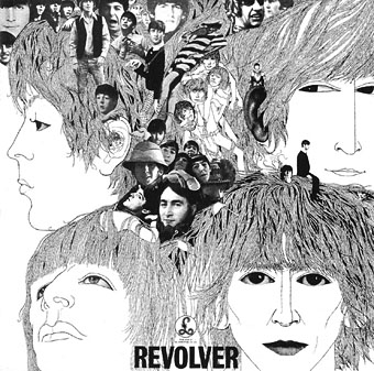
Revolver cover by Klaus Voorman (1966).

The over-familiarity of Klaus Voorman‘s collage/drawing for the cover of Revolver by The Beatles tends to obscure its Beardsley influence but that influence is certainly present in the stylised faces, the figure details and the rendering of the hair. The Beatles themselves were enthused enough with Aubrey to put his face among the pantheon of “people that we like” on the sleeve of Sgt. Pepper a year later. I’d thought for a while that Voorman might have been inspired by the landmark Beardsley exhibition which ran at the V&A in London from May–September 1966. Some correspondence with Raymond Newman, author of Abracadabra, a book about the album, disabused me of that when Raymond confirmed that Voorman in 1966 had already been a Beardsley enthusiast for a number of years.

As well as being possibly the first Beardsleyesque album cover, I wonder whether this was also the first major album release to drop the name of the artist from the front of the sleeve.
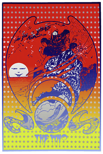
see_for_miles.jpg

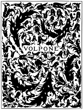
Everyone went psychedelic in 1967, even tough mods like The Who. This Hapshash and the Coloured Coat promo poster for I Can See For Miles (incidentally my favourite Who song) is one of Hapshash’s more overt Beardsley borrowings. The sun (or moon) in the background is a variation on Beardsley’s The Woman in the Moon from Salomé (the face is Oscar Wilde’s) while Pete Townshend’s florid sorcerer’s cloak owes much to Aubrey’s incredible cover design (blocked in gold on the book) for Volpone.
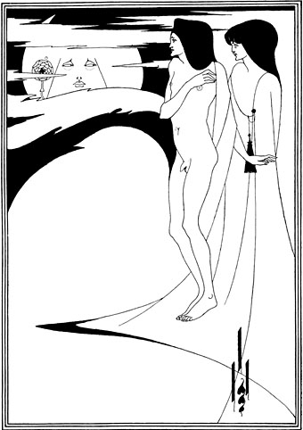
beardsley2.jpg

The Woman in the Moon (1894).

volpone.jpg

Volpone (1897).

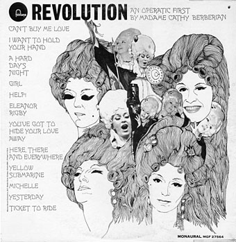
revolution.jpg

From the sublime to the ridiculous. Cathy Berberian was the mezzo-soprano wife of avant garde composer Luciano Berio, with a long career as a singer of serious classical and contemporary classical works. Her rendition of Berio’s Thema (Omaggio a Joyce)–an electroacoustic setting of the “Sirens” prelude from Ulysses–was one of the tracks on the 1967 electroacoustic compilation Electronic Music III discussed here in April. She also had a separate career as an operatic interpreter of pop music and this collection of Beatles songs dates either from 1968 or 69, depending on which source you choose to believe. Whatever the year, the designer pulled off a decent enough copy of the Revolver sleeve. For a taste of the Berberian style, there’s a sample here. And if you’re desperate for the entire album, this page has a copy.

I’m sure this doesn’t exhaust the Beardsley influence in sleeve design, there must be others between 1968 and 2008. Once again, if you know of any further examples, please leave a comment.
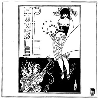
humble_pie.jpg

Humble Pie by Humble Pie (1970).

Update: Added Humble Pie’s self-titled third album. The illustration this time is Beardsley’s own, The Stomach Dance from Salomé.
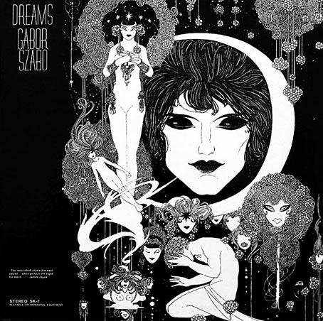
szabo.jpg

Dreams by Gabor Szabo (1968). Design by David Stahlberg.

Update 2: Therese discovered this great sleeve for an album by the Hungarian jazz guitarist. Closer in style to John Austen’s illustrations for Hamlet 1922) but Austen’s use of black-and-white at the time was very influenced by Beardsley’s work.
witchcraft.jpg

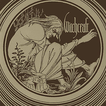
Witchcraft by Witchcraft (2004).

Update 3: Another addition, the debut album from Swedish metal band Witchcraft which uses Beardsley’s Merlin vignette from the Morte Darthur. Thanks to Cyphane for the tip.
coach_fingers.jpg

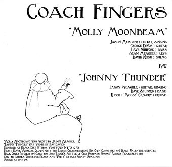
Molly Moonbeam by Coach Fingers (2007).
17th_pygmy.jpg

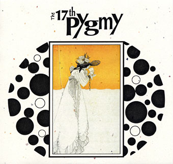
Ballade Of Tristram’s Last Harping by The 17th Pygmy (aka 17 Pygmies) (2007).

Update 4: Added a couple of new discoveries. The 17th Pygmy album apparently includes further Beardsley pieces in its booklet while the Coach Fingers single also has a label featuring designs by Beardsley’s contemporary, Sidney Sime.

isoud.jpg

La Beale Isoud at Joyous Gard. (1894).
flowers.jpg

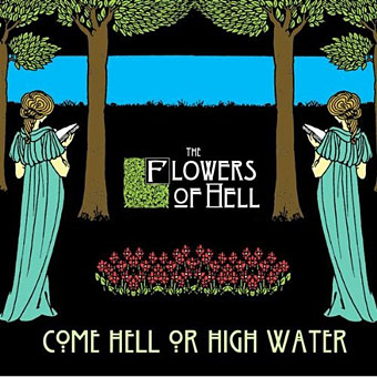
Come Hell Or High Water by The Flowers of Hell (2009).

Update 5: Added the Flowers of Hell cover which is based on La Beale Isoud at Joyous Gard. from Le Morte Darthur. The band also has a video which works variations on the same picture.
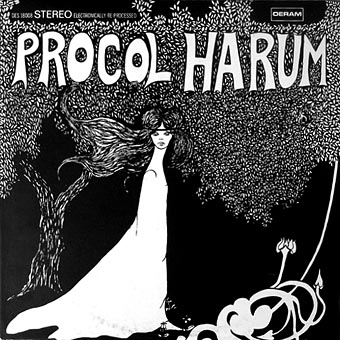
procol.jpg

Procol Harum by Procol Harum (1967).

Update 6: Another one I’d missed, Procol Harum’s debut album doesn’t have a credit for the cover art which is perhaps just as well since it doesn’t stand comparison with some of the works above. The same artwork appeared on later reissues when the album was re-titled A Whiter Shade of Pale.

Elsewhere on { feuilleton }
The album covers archive
The Aubrey Beardsley archive
The illustrators archive

Arthur Zaidenberg’s À Rebours

arebours1.jpg

“It had not been able to support the dazzling splendour imposed on it…”

It was a novel without a plot and with only one character, being, indeed, simply a psychological study of a certain young Parisian who spent his life trying to realize in the nineteenth century all the passions and modes of thought that belonged to every century except his own, and to sum up, as it were, in himself the various moods through which the world-spirit had ever passed, loving for their mere artificiality those renunciations that men have unwisely called virtue, as much as those natural rebellions that wise men still call sin. The style in which it was written was that curious jewelled style, vivid and obscure at once, full of argot and of archaisms, of technical expressions and of elaborate paraphrases, that characterizes the work of some of the finest artists of the French school of Symbolistes. There were in it metaphors as monstrous as orchids and as subtle in colour. The life of the senses was described in the terms of mystical philosophy. One hardly knew at times whether one was reading the spiritual ecstasies of some mediaeval saint or the morbid confessions of a modern sinner. It was a poisonous book.

The corrupting French novel which Lord Henry Wotton gives to Dorian Gray is never named by Oscar Wilde but its identity is no secret. À Rebours (Against Nature) by Joris-Karl Huysmans was published in 1884 and Wilde, Whistler and others were immediately impressed by what amounts to a manual for the lifestyle of a Decadent Aesthete. Wilde fell sufficiently under its spell to have Dorian Gray in the later chapters of his own novel indulge his senses much like Huysmans’ protagonist, Des Esseintes; where Des Esseintes grows poisonous blooms and fills his room with exotic perfumes, Dorian Gray luxuriates over a hoard of precious stones.

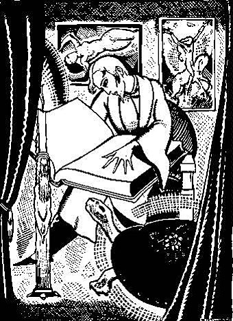
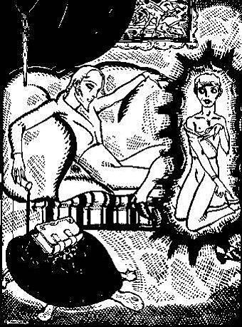
À Rebours features lengthy descriptions of Symbolist art, with particular attention given to Gustave Moreau and Odilon Redon. Yet despite the visual description Arthur Zaidenberg’s illustrations are the only ones I’ve come across to date. The book may be influential but it seems too obscure to have attracted illustrators. Zaidenberg’s drawings from a 1931 edition are executed in a woodcut style not far removed from Frans Masereel’s earlier work in books such as Die Stadt (1925), and as such the style is fashionably spare, not necessarily the right choice for a work concerned with sensory delirium. (This Zaidenberg street scene from 1937 shows a definite Masereel influence.) I’d much rather have seen Harry Clarke illustrate Huysmans. Zaidenberg’s drawings are also curious for their foregrounding of the sexual content which makes me think this edition may have been sold on the basis of a salacious reputation. The scene below, for example, doesn’t occur in the novel but can be implied from the description of Des Esseintes meeting a schoolboy in the Avenue de Latour-Maubourg.

arebours2.jpg

“Never had he experienced a more alluring relationship.”

The complete (?) set of Zaidenberg’s illustrations can be seen here. Pages from a later artists’ manual, Anyone Can Draw, are at VTS.

Elsewhere on { feuilleton }
The illustrators archive

Previously on { feuilleton }
John Osborne’s Dorian Gray
Because Wilde’s worth it
Whistler’s Peacock Room
Dorian Gray revisited
Frans Masereel’s city
The Poet and the Pope
The Picture of Dorian Gray I & II

Rene Beauclair

beauclair.jpg

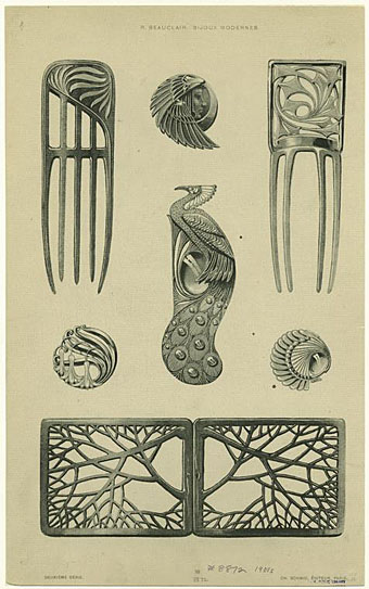
Bijoux modernes (c. 1900) from a series of Art Nouveau designs by Rene Beauclair. As usual the peacock caught my attention on this page. There’s more by Beauclair at the NYPL Digital Gallery

Previously on { feuilleton }
Elizabetes Iela 10b, Riga
The Divine Sarah
Whistler’s Peacock Room
Lalique’s dragonflies
Lucien Gaillard

Aubrey by John Selwyn Gilbert

aubrey00.jpg

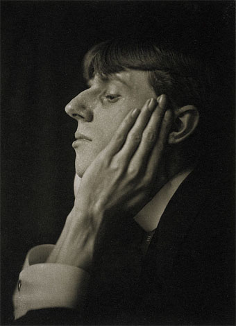
Aubrey Beardsley photographed by Frederick Evans (1894).

I’ve been going through the Coulthart VHS library recently, transferring to DVD recordings which can’t be purchased or found online. Among these is a drama from the BBC’s Playhouse strand, Aubrey by John Selwyn Gilbert, broadcast in 1982. This follows the life of artist Aubrey Beardsley from the time of Oscar Wilde’s arrest in April 1895—which event resulted in Beardsley losing his position at The Yellow Book—through the foundation of The Savoy magazine, to his tubercular death in March 1898.

aubrey01.jpg

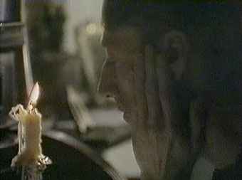
John Dicks as Aubrey.

Playhouse was a BBC 2 equivalent of Play for Today (which usually ran on BBC 1) and Aubrey like many other dramas of the period was shot on video in the studio. This was done for convenience as well as being cheaper than shooting on film, since scenes could be filmed using several cameras simultaneously. The drawback is that the image looks very harsh, and historical works such as this often seem unreal and artificial as a result. That aside, this was an excellent production with some great performances, especially Ronald Lacey as Leonard Smithers and Rula Lenska as Aubrey’s sister, Mabel. The details of Beardsley’s life are very accurate, down to his beloved Mantegna prints on the walls, and many of the scenes are arranged to correspond with his drawings, the production design being largely monochrome.

Continue reading “Aubrey by John Selwyn Gilbert”

Robert Rauschenberg, 1925–2008

rauschenberg.jpg

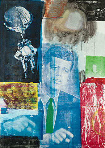
Retroactive I (1964).

My youthful enthusiasm for art acquainted me with the name of Robert Rauschenberg (who died two days ago) earlier than most. Surrealism and Pop Art held an appeal that was immediate, if rather superficially appreciated at the time, and it was seeing works from both those movements which were the most memorable aspect of my first visit to the Tate Gallery when I was 13. Later on when I was reading JG Ballard’s stories and essays in back numbers of New Worlds, Rauschenberg was one of a handful of artists who seemed to depict in visual terms what Ballard was describing in words. In this respect Robert Hughes’s discussion of the “landscape of media” (Ballard’s common phrase would be “media landscape”) below is coincidental but significant. Retroactive I was painted a couple of years before Ballard began the stories that would later become The Atrocity Exhibition and it could easily serve as an illustration for that book.

There are and will be plenty of words written elsewhere about Rauschenberg’s work and influence. I’ll note here his inclusion in the list of gay artists at GLBTQ for his creative and personal partnership with another great Pop artist, Jasper Johns.

One of the artists (television) most affected in the Sixties was Rauschenberg. In 1962, he began to apply printed images to canvas with silkscreen—the found image, not the found object, was incorporated into the work. “I was bombarded with TV sets and magazines,” he recalls, “by the refuse, by the excess of the world … I thought that if I could paint or make an honest work, it should incorporate all of these elements, which were and are a reality. Collage is a way of getting an additional piece of information that’s impersonal. I’ve always tried to work impersonally.” With access to anything printed, Rauschenberg could draw on an unlimited bank of images for his new paintings, and he set them together with a casual narrative style. In heightening the documentary flavour of his work, he strove to give canvas the accumulative flicker of a colour TV set. The bawling pressure of images—rocket, eagle, Kennedy, crowd, street sign, dancer, oranges, box, mosquito—creates an inventory of modern life, the lyrical outpourings of a mind jammed to satiation with the rapid, the quotidian, the real. In its peacock-hued, electron-sweetbox tints, this was an art that Marinetti and the Berlin Dadaists would have recognized at once: an agglomeration of memorable signs, capable of facing the breadth of the street. Their subject was glut.

Rauschenberg’s view of this landscape of media was both affectionate and ironic. He liked excavating whole histories within an image—histories of the media themselves. A perfect example is the red patch at the bottom right corner of Retroactive I. It is a silkscreen enlargement of a photo by Gjon Mili, which he found in Life magazine. Mili’s photograph was a carefully set-up parody, with the aid of a stroboscopic flash, of Duchamp’s Nude Descending a Staircase, 1912. Duchamp’s painting was in turn based on Marey‘s photos of a moving body. So the image goes back through seventy years of technological time, through allusion after allusion; and a further irony is that, in its Rauschenbergian form, it ends up looking precisely like the figures of Adam and Eve expelled from Eden in Masaccio’s fresco for the Carmine in Florence. This in turn converts the image of John Kennedy, who was dead by then and rapidly approaching apotheosis as the centre of a mawkish cult, into a sort of vengeful god with a pointing finger, so fulfilling the prophecy Edmond de Goncourt confided to his journal in 1861:

“The day will come when all the modern nations will adore a sort of American god, about whom much will have been written in the popular press; and images of this god will be set up in the churches, not as the imagination of each individual painter may fancy him, but fixed, once and for all, by photography. On that day civilization will have reached its peak, and there will be steam-propelled gondolas in Venice.”

Robert Hughes, The Shock of the New (1980).

Previously on { feuilleton }
Transfer drawings by Robert Rauschenberg
Jasper Johns
Michael Petry’s flag
JG Ballard book covers