“The game is afoot!”

holmes.jpg

Jeremy Brett in The Adventure of the Blue Carbuncle.

A few words of praise for Jeremy Brett is his role as the world’s greatest detective, for my money the definitive screen Sherlock Holmes. I’ve spent the past few weeks working my way through the complete run of TV adaptations that Granada Television produced from 1984 to 1993, being bowled over again by Brett’s mastery of the role. It took me a while to notice these when they were first screened, British television was churning out a lot of costume drama at the time and the sight of more Hansom cabs and gas lamps paled beside the audacity and excitement of contemporary thrillers such as the BBC’s Edge of Darkness. I think I caught on during the second season that Brett’s performance was something special, and that these adaptations were treating the Holmes stories with a veracity rarely seen before.

Continue reading ““The game is afoot!””

Deaf Center in Manchester

deaf_centre.jpg

Out this evening to Trinity Church again to see Deaf Center as part of a Type Records-themed event. Greg Haines set things rolling with a mysterious e-bow/autoharp performance where he managed to coax from a stringed instrument the kind of sounds more usually associated with electronic music.

Deaf Center are Norwegians Erik Skodvin and Otto Totland who were assisted this evening by Kristin Evensen Giæver on wordless vocals. Much of their set seemed to be versions of their Pale Ravine album which sounded a lot more substantial played live. Especially good were the clouds of noise with shifting harmonic layers, the kind of thing Boards of Canada do then often spoil by introducing a plodding rhythm. Deaf Center avoid plodding rhythms and are all the better for it.

Previously on { feuilleton }
Machinefabriek in Manchester
Trinity rendezvous
Helios in Manchester

Strange cargo: things found in books

books1.jpg

The Secret Oral Teachings in Tibetan Buddhist Sects by Alexandra David-Neel & Lama Yongden, City Lights Books (1972).

One of the additional pleasures of buying old books besides finding something out-of-print (or, it has to be said, something cheap) occurs when those books still possess traces of their previous owners. A recent posting on The Other Andrew’s page concerned book inscriptions, something any book collector will be used to seeing. Less common are the objects which slip from the pages when you’ve returned home. There are several categories of these.

1: Bookmarks

I have a substantial collection of bookmarks proper, from embossed strips of leather to the more mundane pieces of card of the type that bookshops frequently give away. But I also make a habit of using odd inserts to mark a place as did the previous owners of these volumes. The City Lights book (above) came with a very fragile leaf inside it which may well be as old as the book. Another City Lights book I own, the Artaud Anthology from 1965, included a newspaper article about Artaud. Newspaper clipping inserts are discussed below.

Continue reading “Strange cargo: things found in books”

Design as virus 1: Victorian borders

bookplate.jpg

There’s nothing new about drawing attention to the viral nature of design, whether in the repeated use of motifs and styles or the way in which typefaces breed and proliferate; Jonathan Barnbrook alludes to this process directly by calling his font house Virus.

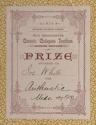
The plate above comes from a Victorian book I bought several years ago, The Pictorial Cabinet of Marvels, a reasonably lavish volume for children concerning places and things of interest around the world. Since I like playing with excessive Victorian flourishes now and then I’m always on the look out for new examples and the border here immediately caught my eye. I have a decent selection of clip art books from Dover and Pepin containing this kind of thing but nothing quite like this particular design. When I was putting the Damnation and A Day album together for Cradle of Filth I took one of the corner pieces as a starting point for a border design I used on the front and back of the booklet and the tray.

damncov.jpg

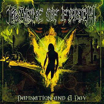
The poor old Xaverian Brothers of Manchester’s Catholic Collegiate Institute would no doubt be mortified to see part of their prize bookplate being used to decorate such a blasphemous artefact. The album was released by Sony Music in 2003 so this little border motif has travelled the world by now. I seem to recall sending the record company the border design separated from the artwork so they could make up some posters.

And so we come to what I’m assuming is its latest manifestation, a poster design for Manifest Destiny, a Los Angeles music event organised by Tee Pee Records.

tee-pee.jpg

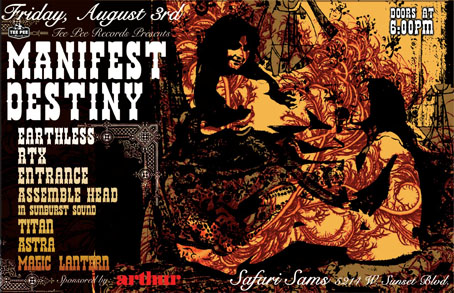
I say “assuming” since I’ve no idea whether this example is from my design or not. But it seems a safe bet seeing as the original is from such an obscure source. Not that I mind if it is, of course. I can’t very well complain when I swiped the thing in the first place, now can I?

Update: Tee Pee designer Sarah MacKinnon writes to say her Victorian motif is from one of Dover’s clip art books. Now I know that I wouldn’t mind finding the book for my own collection. This makes the occurrence of the original more unusual, at least from my point of view, since it’s the only time I’ve spotted one of these reprinted elements in its period setting.

Previously on { feuilleton }
Masonic fonts and the designer’s dark materials