The Resurrectionist of Caligo by Wendy Trimboli & Alicia Zaloga

resurrectionist.jpg

My latest cover for Angry Robot Books was unveiled this week on the Barnes & Noble blog. The Resurrectionist of Caligo is an atmospheric Gothic fantasy for which the cover art veers close to the illustration work I was doing recently for Editorial Alma, Frankenstein in particular:

With a murderer on the loose, it’s up to an enlightened bodysnatcher and a rebellious princess to save the city, in this wonderfully inventive Victorian-tinged fantasy noir.

“Man of Science” Roger Weathersby scrapes out a risky living digging up corpses for medical schools. When he’s framed for the murder of one of his cadavers, he’s forced to trust in the superstitions he’s always rejected: his former friend, princess Sibylla, offers to commute Roger’s execution in a blood magic ritual which will bind him to her forever. With little choice, he finds himself indentured to Sibylla and propelled into an investigation. There’s a murderer loose in the city of Caligo, and the duo must navigate science and sorcery, palace intrigue and dank boneyards to catch the butcher before the killings tear their whole country apart.

Some covers present more difficulties than others, this one being an awkward layout in its early stages due to the multiple demands of the brief. Not only was the book title a lengthy one, there were also two author names to accommodate plus a variety of pictorial detail that required placing in a harmonious arrangement. I don’t always begin a design with the title layout but in this case this was the first priority, so the cover is designed around the title rather than the title being applied to the cover at a later stage. All of this caused me some headaches for a few days while I tried to find a type layout that would look pleasing, be readable from a distance and also not interfere too much with the background. None of the struggle is evident in the final work, of course, which is as things should be.

The Resurrectionist of Caligo will be published in September.

A Pictorial History of Horror Movies by Denis Gifford

gifford01.jpg

Cover art by Tom Chantrell.

Halloween approaches so here’s a book that suits the season. Denis Gifford’s A Pictorial History of Horror Movies was published in Great Britain by Hamlyn in 1973. A large-format hardback of just over 200 pages, this was a cheap production for wide distribution, and evidently sold well: my edition from 1980 is the 12th reprint, and the book was still in print in 1983, in a slightly longer edition with a new cover.

gifford17.jpg

For a generation of British kids Gifford’s book made an indelible impression, not least because of its ubiquity. It was always easy to find—for years I didn’t have a copy of my own because I invariably seemed to know someone who did—and its mostly black-and-white pictures featured a great deal of imagery that was generally forbidden to those of us under the age of 18. This may seem surprising to Americans, or those in more liberated European countries, but Britain has always had an uneasy relationship with the horror genre despite the legacy of Gothic novels and ghost stories, never mind Dracula, Frankenstein and the rest. Literary manifestations command a grudging acceptance if enough years have passed since first publication but Britain’s moralists and censors have fretted over pictorial horror for decades, especially the film and comic-book variety.

gifford02.jpg

La Belle et la Bête (1946).

Almost all horror films screened in Britain over the past century were for audiences of 18 or over, while horror films on TV were never shown before 10pm. That scene in Halloween (1978) where the kids are watching The Thing From Another World on television in the early evening would have been impossible here. In 1982 we had the start of the “video nasties” panic, a particularly disgraceful episode for those eager to interfere in other people’s entertainment, and an issue that rumbled on for the rest of the decade. As for print media, I still have a leaflet from the late 1980s given to all applicants of UK passports which lists “horror comics” along with weapons, drugs, poisons, etc, among the items forbidden from import into Britain. This climate gave Gifford’s guide an illicit charge it might not have had if published elsewhere: the book delivered a concentrated dose of the forbidden.

gifford03.jpg

Vincent Price as Doctor Phibes.

Denis Gifford (1927–2000) was, among other things, a comics artist, a comics and film historian, and a collector of comic books and horror ephemera. Most of the material in A Pictorial History of Horror Movies is from his own collection, and an excellent collection it was. More than 300 stills run through the entire history of horror cinema from the earliest Méliès shorts to German Expressionism, Universal horror, Hammer horror, AIP monster movies, Toho monster movies, and on to the garish efforts of the late 1960s; he even manages to get in a still from Carry On Screaming. The accompanying text is concise but authoritative, although I doubt anyone ever used the book as a serious study. Yet for a 12-year-old this was a perfect introduction to the genre, as well as a dizzying intimation of hundreds of films yet to be seen. In place of the films you had pictures implying entire worlds of mystery and terror, many of which are so good they give very unrealistic expectations of the films from which they originate. Some of the most memorable examples for me have been those which are more atmospheric or eerie than horrific, like the sinister child at the window in Mario Bava’s Operazione Paura (1966) aka Curse of the Dead. (See this post for more about the extended life of Gifford’s still.) But there were also plenty of monsters, grotesque makeup effects and even some gore; a female friend of mine was obsessed with the picture of a blonde and bloodied young woman with an axe buried in her head (see below). Looking at the book today I suspect Gifford’s punning captions may have been a nod to Famous Monsters of Filmland, a magazine with a devoted readership but not a title I ever read myself.

gifford04.jpg

Peter Cushing (The Skull; 1965).

All the pictures here are from an upload of the entire book at the Internet Archive. Gifford isn’t around to complain about this but the book may not remain there for long so enjoy it while you can. A few more pages follow. For an earlier appraisal of the book’s impact on impressionable minds, there’s this piece by Dave Tompkins.

Continue reading “A Pictorial History of Horror Movies by Denis Gifford”

Illustrating Dracula

holloway.jpg

Cover art by Edgar Alfred Holloway for the Rider edition of Bram Stoker’s novel, an edition reprinted many times during the early 20th century. Holloway’s Count is shown as Stoker describes him in the early chapters of the book, white-haired and bearded.

Last year I illustrated a number of stories by Edgar Allan Poe, and the entirety of Mary Shelley’s Frankenstein for Spanish publisher Editorial Alma. Earlier this year I was illustrating Dracula for the same publisher; now the book is in print I can show the results here. This was another difficult task since I had a few weeks to illustrate all 27 chapters of the novel while trying to do something new (or at least slightly different) with a very familiar story.

As with Frankenstein, I opted for fidelity to the text and period details. Despite its epistolary form, Dracula is much more readable (in a contemporary sense) than Frankenstein, so more people will have read Stoker than Shelley; but the sheer scale of cultural mauling that Dracula has been subject to means that—as with Frankenstein—even the allegedly faithful adaptations often deviate from the novel. The lounge-lizard vampire that everyone knows was a creation of Hamilton Deane’s 1924 stage adaptation, the success of which led to Tod Browning’s film and Bela Lugosi’s performance (which I’ve never liked); film and theatre may have made Dracula universally popular but the Lugosi stereotype has overshadowed the more powerful and violent character that Stoker gives us, with his bearded face, hairy palms and glowing eyes. So that’s who you see here, although the restrictions of time and brief (one picture per chapter) meant that some of the moments I’d have liked to illustrate had to be forfeit. Poor old Renfield gets short shrift, and some of the minor male characters are out of the picture altogether.

dracula01.jpg

On the plus side (I hope), many of the background details are well-researched even if they’re not at all obvious. The castle in the first picture (above) is Bran Castle, known today as “Dracula’s Castle” even though the building in the novel is Stoker’s invention; it certainly looks the part. As before, the full run of pictures follows below. All may be seen at a larger size here.

dracula02.jpg

dracula03.jpg

dracula04.jpg

Continue reading “Illustrating Dracula”

Weekend links 402

hodgson.jpg

Cover art for the 1921 edition by W. Otway Cannell.

• “An exiled recluse, an ancient abode in the remote west of Ireland, nightly attacks by malevolent swine-things from a nearby pit, and cosmic vistas beyond time and space. The House on the Borderland has been praised by China Miéville, Terry Pratchett, and Clark Ashton Smith, while HP Lovecraft wrote, ‘Few can equal [Hodgson] in adumbrating the nearness of nameless forces and monstrous besieging entities through casual hints and significant details, or in conveying feelings of the spectral and abnormal.’

“‘Almost from the moment that you hear the title,’ observes Alan Moore, ‘you are infected by the novel’s weird charisma. Knock and enter at your own liability.’ The House on the Borderland remains one of Hodgson’s most celebrated works. This new edition features an introduction by Alan Moore, an afterword by Iain Sinclair, and illustrations by John Coulthart.” The long-gestating illustrated edition of William Hope Hodgson’s The House on the Borderland is now available for pre-order from Swan River Press. This is limited to 350 copies so I’d advise anyone interested to order as soon as they can; there’s been a lot of interest in the edition, and with the print run being a small one it’s liable to sell out quickly.

• “Art et Liberté was a movement that came into being in 1938 in Cairo. It was affiliated to Surrealism through contact with André Breton in Paris, and shared Surrealism’s spirit of rebellion and provocation, its desire for dream knowledge and penchant for manifestos.” Marina Warner on the neglected history of Egyptian Surrealism.

• Titan Comics follow their recent collection of Philippe Druillet’s first six Lone Sloane stories with Gail, a book which I don’t think has received an English translation until now.

• Mixes of the week: FACT mix 641 by Alva Noto, a mix by Chris Carter for Bleep/NTS, and Through A Landscape Of Mirrors Vol. I: Sweden by David Colohan.

• 200 years after the first publication of Frankenstein, the city of Bath is to unveil a plaque commemorating Mary Shelley‘s time spent there while writing the book.

• Southern Lord co-founder Gregg Anderson talks to Red Bull Radio about running a record label devoted to avant-garde metal.

• Twelve illustrated dust jackets from Martin Salisbury’s The Illustrated Dust Jacket: 1920–1970.

• At MetaFilter: Links to Hokusai’s drawing guides and similar books.

Canada Modern

Grief (1999) by Tactile | In The Cellar (2005) by Nostalgia | The House On The Borderland (2008) by Electric Wizard

Illustrating Frankenstein

holst.jpg

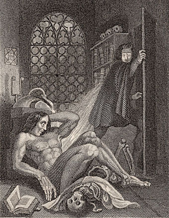
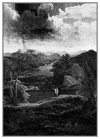
Frontispiece by Theodore Von Holst of the 1831 edition of Frankenstein. The monster in this illustration, which Mary Shelley would no doubt have seen, is closer to the description in the text than the myriad shambling figures that came later.

It’s a recurrent feature of commissioned work that you sometimes find yourself illustrating novels or stories you might otherwise have never attempted. Spanish publisher Editorial Alma have just added a new edition of Mary Shelley’s Frankenstein to their series of illustrated classics, convenient timing with this year being the bicentenary of the book’s first publication. Last year I produced 33 illustrations for Alma’s collection of Poe stories, as well as 3 new illustrations for a small Lovecraft collection. For their edition of Frankenstein I’ve created 24 full-page pictures, one for each chapter. (I produced 25 in total, 24 for the chapters and one for the letters at the front, but the Spanish translation is arranged slightly differently so one of the drawings has been omitted.) In the past I’ve given little consideration to illustrating classic books, preferring to look for subjects which were less familiar. Frankenstein is a book that isn’t illustrated as much as some but Lynd Ward in 1934, and Berni Wrightson in 1977/78 both produced sufficiently exceptional sets of drawings for me to regard the novel as almost unassailable. Until last year, that is.

ward1.jpg

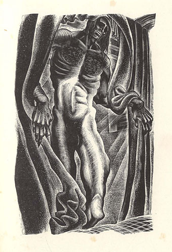
Frankenstein by Lynd Ward (1934).

Despite such formidable predecessors, I felt that with this book at least I might be able to offer something new using the blend of collage and drawing that I’ve been evolving recently. There was additional promise in that the story as it’s written is less familiar than the Poe stories, and much less familiar than its fellow horror classic, Dracula. People think they know Frankenstein but what they often know is the manglings the novel has received in various film and TV adaptations. The Ward and Wrightson illustrations stay close to the text, the latter being replete with period detail, and rendered in a style reminiscent of 19th-century wood engravings. Wrightson even copied two of Gustave Dore’s pictures from The Rime of the Ancient Mariner for the opening scenes on the ship, one of which went unused. But Wrightson’s drawings are closer still to Franklin Booth‘s pen-and-ink style which was also derived from wood engraving yet which achieves its effects in a different manner to the engraving process.

frankenstein2.jpg

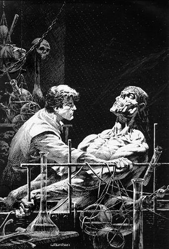
Frankenstein by Berni Wrightson (1977/78).

Even when artists follow the text of Frankenstein more closely than the screenplay adapters, personal tastes can’t help manifest themselves. So Ward’s drawings reflect the angular and stylised compositions of his “novels in woodcuts”, while Wrightson’s work still shows evidence of his earlier career as a comic artist. With my illustrations I wanted to reflect the artistic spirit that gave birth to the novel, namely Romanticism. Frankenstein is very much a Romantic tragedy with violent passions set against the overwhelming landscapes of the Swiss Alps, the Rhine valley and the Arctic seas. Three of the illustrations below allude to Caspar David Friedrich’s paintings, while many of the others have had their mundane cloudscapes exchanged for gloom and tumult.

I’ve said before that one of the things I enjoy about the collage technique is being able to use engravings and other graphics from the same period (give or take a few decades) as the story itself. The disadvantage of relying on pre-existing sources is that you’re always limited by the available material, so recently I’ve been pushing the technique further to achieve a hybrid style, something midway between the Ernst/Sätty engraving-collage technique and the very laborious, heavily-shaded pen-and-ink style I used when I was drawing comics. The approach isn’t so different to the one I used in my Lovecraft comics many of whose backgrounds and other details were copied from photographs. The difference is that where I used to spend several days working on a single panel (and two weeks working on a page) I can now create an entire picture in half the time. In these new illustrations I feel the hybrid style is working as I intended, allowing me greater freedom to create the picture I have in mind rather than a picture dictated by the source material. Without incorporating original figures and other drawn elements into the compositions it would have been difficult to illustrate a story with the same characters in so many scenes, a problem I encountered when I was illustrating Lewis Carroll’s Alice books and ran out of pictures of Victorian girls.

The full run of pictures follows below, including the one which was omitted from the print edition. All may be seen at a larger size here. Since the scenes aren’t always self-explanatory I’ve included fragments of text from each chapter.

frankenstein00.jpg

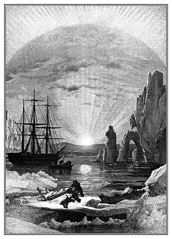
“In the morning, however, as soon as it was light, I went upon deck and found all the sailors busy on one side of the vessel, apparently talking to someone in the sea. It was, in fact, a sledge, like that we had seen before, which had drifted towards us in the night on a large fragment of ice.”

frankenstein01.jpg

“During one of their walks a poor cot in the foldings of a vale attracted their notice as being singularly disconsolate, while the number of half-clothed children gathered about it spoke of penury in its worst shape.”

This one was omitted from the Alma edition. No loss, really, since the scene doesn’t add much to the story.

frankenstein02.jpg

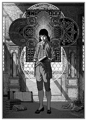
“When I returned home my first care was to procure the whole works of this author, and afterwards of Paracelsus and Albertus Magnus. I read and studied the wild fancies of these writers with delight; they appeared to me treasures known to few besides myself.”

The diagrams here are taken from some of the books the young Victor Frankenstein is reading. There’s an allusion to this in the magic square on the wall in the back of Theodore Von Holst’s frontispiece, the square being the kind of thing seen in books like this one by Cornelius Agrippa, one of the occult philosophers mentioned in the novel.

Continue reading “Illustrating Frankenstein”