
Pasticheur’s Addiction
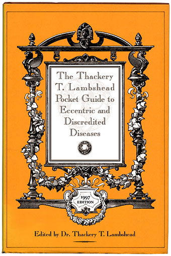
The Boojum Press edition of the Guide (1997).
(Frame supplied by Mark Roberts.)
A few days ago we had the CD cover meme which encourages people to create cover designs for invented groups generated by random means. In a similar vein but minus the random element there’s the growing selection of books by reclusive author Constance Eakins. A Flickr pool has been established for newly-discovered Eakins volumes and you can read more about the mysterious writer here.
This flourishing of pasticheury encourages me to post some of the cover designs I created for the various editions of The Thackery T Lambshead Pocket Guide to Invented and Discredited Diseases, a fake disease guide published in 2003 and edited by Jeff VanderMeer and Mark Roberts. The anthology featured a host of notable contributors and was great fun to work on. Although these were done in colour, they were all printed in black & white inside the book, with a shrunken glimpse of the colour versions on the rear of the dust jacket. My jacket design wasn’t used on subsequent printings so this is the first many people will have seen of these.
The Avant Garde Project
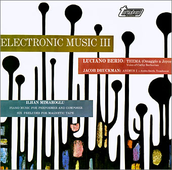
One of the great electroacoustic compilations, Electronic Music III: Berio/Druckman/Mimaroğlu, Turnabout Records (1967).
I’ve spent the past week or so immersed in the world of electroacoustic composition courtesy of torrents provided by the Avant Garde Project. Wikipedia attempts a definition of electroacoustic music and thus saves me the trouble:
While all electroacoustic music is made with electronic technology, the most successful works in the field are usually concerned with those aspects of sonic design which remain inaccessible to either traditional or electronic musical instruments played live. In particular, most electroacoustic compositions make use of sounds not available to, say, the traditional orchestra; these sounds might include pre-recorded sounds from nature or from the studio, synthesized sounds, processed sounds, and so forth.
Much of it is early electronic music, in other words, produced either with tape machines or rudimentary synth modules or a combination of the two. The Avant Garde Project is devoted to making available 20th century classical-experimental-electroacoustic recordings that are unavailable on CD. I’m less interested in the orchestral end of the project, unless it’s work by favourites such as Penderecki or Iannis Xenakis, but it’s good to know that they’re making the effort especially when much of this work remains on vinyl albums that are forty years old. The releases are listed as AGP1 onwards up to the most recent, AGP99, which happens to be music by Xenakis.
To say this stuff is challenging is something of an understatement, most people have little patience for lengthy compositions of artificial shrieks, squawks and blips, trombones fed through ring modulators or trained singers burbling extracts from Finnegans Wake. Despite the fact that many of these experiments form the foundation of today’s electronic music culture, the popular conception of the electroacoustic composer has been that he must be either a psycho rapist, like Chris Sarandon’s character in Lipstick, or a loveless neurotic, like John Hurt’s character in The Shout; decent people dig the Beatles and play guitars like, er…Charles Manson. Stereotypes aside, not all of it is necessarily alienating. Most people wouldn’t realise it but much of the early music for Doctor Who was electroacoustic, including Delia Derbyshire‘s rendering of the famous theme tune.
 Some of this work offers little today beyond curiosity value since a great deal of it was the product of a particular moment in the development of recording and electronic technology, a moment that passed as technology and tastes changed and many of the experiments became absorbed by pop music. Some of the composers were mere doodlers compared to later electronic artists but among the better practitioners in the AGP haul there’s Turkish composer İlhan Mimaroğlu, an expert audio collagist whose rare work is collected in three sets covering the years 1964–1983 (AGP30–32).
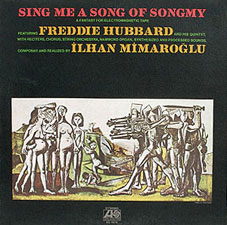
Mimaroğlu stands with one foot in the academic world and the other in the more popular areas of jazz and soundtrack composition. Together with another electroacoustic composer, Tod Dockstadter, he provided music for the score of my favourite Fellini film, Satyricon, and his position at Atlantic Records enabled him to collaborate with trumpet player Freddie Hubbard on one of the more bizarre jazz albums of a decade full of bizarre jazz works, Sing Me a Song of Songmy from 1971. Subtitled “A Fantasy for Electromagnetic Tape”, this anti-Vietnam war polemic mixes electroacoustic passages combining spoken word and musical quotes, poetry and sound effects with Hubbard’s Quintet grooving away as though they’d wandered in from the studio next door. The opening piece is always a good conversation stopper, “Threnody for Sharon Tate”, which features two women reading quotes about murder from associates of the aforementioned Mr Manson while electronic shrieks build unnervingly in the background.
Nothing on the AGP releases is this dramatic, unfortunately, but if you want a taste of Mimaroğlu’s lighter side, his Prelude for Magnetic Tape XI on AGP30 is three minutes of processed sounds from plucked rubber bands. And if the human music is too much, you could always try the cetaceans; AGP28 is the original collection of whale recordings, Songs of the Humpback Whale. The AGP page says they had to remove a few tracks that are now back in print but the copy I found on a torrent site was the complete album.
Previously on { feuilleton }
• Electric Seance by Pram
• White Noise: Electric Storms, Radiophonics and the Delian Mode
• Ghost Box
• The Photophonic Experiment
• The music of Igor Wakhévitch
The ballad of Sandy Denny: Return of the folk queen
The ballad of Sandy Denny: Return of the folk queen
| Another overdue reappraisal.
The art of Jo Whaley
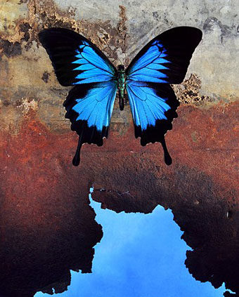
Papilio ulysses (2000).
Best. Insect Art. Ever. From a series entitled The Theater of Insects, also the name of a book devoted to Ms Whaley’s photographs which will appear from Chronicle Books later this year.
The photographs in this book are fantastic field illustrations. While the insects in these images are real, the backgrounds are imaginary altered habitats of my devising. Inspired by the old dioramas found in natural history museums, the pinned insects are arranged in constructed environments. The studio where I create the images is as much a theatrical scene shop as it is a photography studio. The prop room looks like an eighteenth-century cabinet of curiosities, in that it is filled with specimens of natural history and visual oddities of manufacture. I use free association and intuition to make decisions about arranging the insect with a particular backdrop. Looking at color, shape, and form, I move the elements about until the magic of the image appears. Lighting the scene is challenging as the sets are only about five by seven inches across with a depth of about an inch and a half. Yet the studio lighting is key to breathing a spirit into these pinned specimens and unifying the disparate elements within the mise-en-scène Finally, the performance of the image is concluded with a single click of the camera’s shutter. (More.)
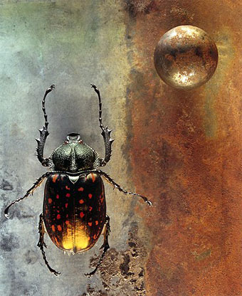
Coleoptera (2003).
Via Fabulon.
Previously on { feuilleton }
• Endangered insects postage stamps
• Robert Lang’s origami insects
• Lalique’s dragonflies
• Lucien Gaillard
• Wesley Fleming’s glass insects
• Insect Lab