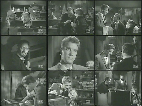
The Magic Shop (1964).
I discovered this TV adaptation by accident while looking for something else (more about the something else tomorrow). The Magic Shop is a 45-minute drama directed by Robert Stevens in 1964 for The Alfred Hitchcock Hour. Writer John Collier adapted a script by James Parish that’s loosely based on the short story by HG Wells. The story is one I know very well, having read it many times, but I hadn’t come across this TV version before. It’s a surprise finding it so close to Christmas since I first read the story in the only Christmas present that’s survived from childhood, a hefty collection of HG Wells’ short stories that I pestered my parents into buying me in 1973. I mostly wanted to read The Time Machine but the other stories seemed promising, especially the ones illustrated by Richard Gilbert on the (miraculously intact) dustjacket: The Sea Raiders (sailors attacked by octopuses), The Flowering of the Strange Orchid (man attacked by tentacular plant), The Valley of Spiders (attacking spiders falling from the sky), and so on. The book as a whole runs to over 1000 pages, and proved to be a revelation with Wells ranging through fantasy, science fiction, horror, and oddities which don’t fit any category other than Robert Aickman’s indispensable label, “strange stories”. The book made me a lifelong Wellsian, and also spoiled me a little when I moved on to more recent science fiction and found many of the alleged greats to be appalling writers. Wells’ prose can’t compete with Robert Louis Stevenson but it’s still well-crafted in that no-nonsense late Victorian manner familiar to readers of Arthur Conan Doyle.
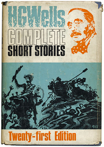
Design and illustration by Richard Gilbert (1970).
The Magic Shop is one of the strange stories, the shop in question being a mysterious establishment somewhere in Regent Street, London, one of those premises one discovers by accident then can’t find again. The narrator is informed by the proprietor that this is a Genuine Magic Shop, as distinct from the kind selling mere conjuring tricks. The meaning of this isn’t clear at first but while the narrator’s young son is being beguiled by the marvels on display we follow his father’s growing alarm when he realises there’s more to the shop than he anticipated, not all of it pleasant or fun. The story was published in Twelve Stories and A Dream in 1903, and can be read here.
The TV version takes the bare bones of the tale—curious shop, indeterminate location, friendly yet sinister proprietor—and blends it with the nasty-child-with-magic-powers theme that was dramatised so memorably by The Twilight Zone in It’s A Good Life. The Hitchcock show was made three years after the Twilight Zone episode so it’s easy to see It’s A Good Life as an influence. Leslie Nielsen is the father who takes his son, Tony (John Megna), to the fateful shop on his birthday. The proprietor informs the pair that Tony is “the right boy” since he found the shop in the first place, the subtext being that he’s also possesses the right character to be the recipient of some heavy voodoo abilities. The boy’s bad seed status has been telegraphed from the outset by a birthday gift from an uncle of a black leather jacket; throughout the scene in the shop he looks like a miniature hoodlum. More American anxiety about its troublesome youth? Maybe, although the episode ends so poorly that the whole thing comes across as a lazy piece of filler. This is, of course, a long, long way from the Wells story which is all the more effective for being elusive, understated and, yes, magical.
Previously on { feuilleton }
• HG Wells in Classics Illustrated
• The night that panicked America
• The Door in the Wall
• War of the Worlds book covers