Compilation albums: on the one hand they’re in the lowest echelon of the musical world, all those cheap pop collections you see in any supermarket; on the other they provide an introduction to zones of activity which might seem too rich or too obscure to easily investigate; Soul Jazz Records is a master at this kind of collection.
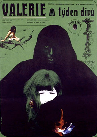
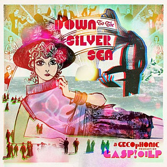
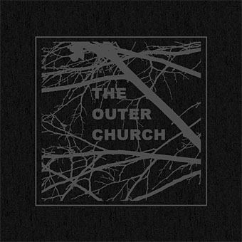
There’s also another level of compilation album where the collection becomes an opus in its own right, and which can also help to define a new movement or moment. In this category I’d think of favourites such as Kevin Martin’s Isolationism set from 1994 which first identified the emergence of what we now think of as Dark Ambient music; and Devendra Banhart’s The Golden Apples of the Sun (2004) which showcased a new generation of American folk artists. To these I’d add Joseph Stannard’s The Outer Church, a 2-CD set compiled for Front & Follow which is released this month. My hand-crafted, letterpressed edition just arrived so I’ve been relishing the new music after forcing myself to avoid the preview tracks which have been available for the past couple of weeks. Regular readers won’t be surprised to learn that the emphasis is very much on the Hauntological end of things; this blog nurses a Ghost Box fetish, and there are Ghost Box connections in the presence of Pye Corner Audio, Hong Kong In The 60s, and Baron Mordant. The latter pair and another artist, Robin The Fog, all provided tracks for the recent Restligeists, the cassette compilation that came with The Twilight Language of Nigel Kneale. Of the new collection, Joseph Stannard says in his notes:
Wind the tape all the way back to Brighton in 2009. The uncanny influence seeping into contemporary music from ‘elsewhere’ had become impossible to ignore. Magazine pieces I had written in my capacity as a music critic were revealed to contain subliminal memos for my own attention. Unusually vivid dreams and unsettling anonymous telephone calls imparted curious instructions. I was to establish a space in which various forms of unheimlich audio would converge with moving images of a similarly anomalous nature. Equipped only with a well-thumbed copy of The Beginner’s Guide To Psychic Architecture, I resolved to build a Church.
This compilation presents a selection of the artists who have performed at The Outer Church, with the exception of illustrious filmmaker and composer Graham Reznick, who lives in faraway Brooklyn and kindly permitted us to screen his tremendous psychedelic campfire tale, I Can See You, in Brighton and Dublin. All of the recordings here are previously unreleased. Together they advance the argument that something weird is stirring in modern music which resists categorisation, manifesting itself in unsettling cadences and temporal distortions across a wide variety of occult strategies.
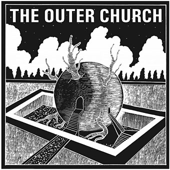
Illustration by Alexander Tucker.
And they aren’t the only ones exploring this territory: Demdike Stare and the very excellent Haxan Cloak might also have been included here. I am, of course, especially partial to any kind of doom-laden timbres, whether electronic, orchestral or guitar-oriented, so I can’t be an unbiased reviewer. But it has been a relief to see contemporary electronica (in the UK at least) find a way out of the rut of abstraction into which it had fallen in the late 1990s. That’s it’s done this by delving into our nation’s long history of ghost and folk mythology is no bad thing. Not all the artists on The Outer Church are attempting to spook their audience; there are songs as well as drones. Hong Kong In The 60s produce the kind of uptempo pop you’d expect from a band with that name. It’s to Stannard’s credit that he manages to sequence things without the mix of styles being too disjunctive.
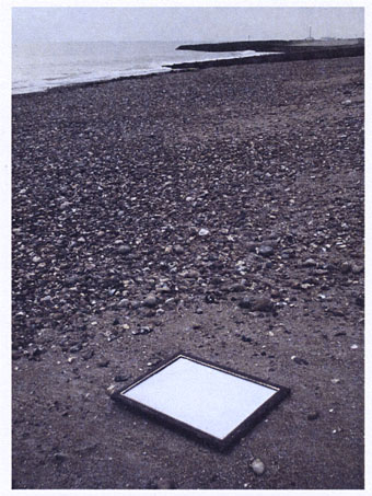
One of the mini-postcards inside the limited edition. Photo by Joseph Stannard.
The first edition of The Outer Church has been selling well so anyone looking for a copy is advised to make haste and use the links on this page. There’s a related event in Brighton this (Friday) evening, and another in Manchester on Saturday. I’m now looking forward to following some of the paths revealed by this opening of the portals.
Previously on { feuilleton }
• The Ghost Box Study Series
• A playlist for Halloween: Hauntology
• The Séance at Hobs Lane
• Ghost Box