The Cremator, a film directed by Juraj Herz, missed out on the attention given to other Czech films in the late 1960s, something the Brothers Quay note in their enthusiastic introduction to the Second Run DVD. Unlike other films made during the Czech New Wave, Herz’s film premiered in 1969 then was promptly banned, and didn’t receive a wider distribution until 1989.
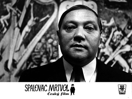
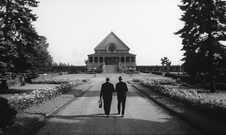
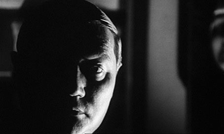
It’s easy to see why the Communist authorities would have a problem with a film about a Prague crematorium director in the 1930s, a man who not only delights in his ability to efficiently turn human beings into ash in 75 minutes, but also has no problem siding with the invading Nazi regime when it becomes apparent that this will further his obsession with incineration. Rudolf Hrušínský dominates the proceedings as cremator Kopfrkingl, a stout and ebullient presence who Herz directs without resorting to any clichés of macabre or morbid characterisation. We’re with Kopfrkingl in every scene, and for the most part he remains cheerful and reasonable, whether showing new workers around the crematorium, dealing with his family (or the prostitutes he visits), or happily shopping all the Jews he knows to his collaborationist associates. A Holocaust subtext becomes overt when Kopfrkingl is asked to lend his incineration skills to a “secret project” the new authorities have in mind, an offer which sends the cremator into a fantasising rant (filmed against Hieronymus Bosch’s painting of Hell) in which he realises he might be allowed to turn many thousands of bodies into ash.
Described like this the film is a blackly comic satire at the expense of all those Czechs who collaborated with the Nazis during the war. What attracts the praise of viewers such as the Brothers Quay, and puts the film in the essential category, is the additional details of Herz’s direction. Anyone familiar with the early films of Jan Švankmajer will feel quite at home with the sequences of rapid editing, with the scenes introduced by unexpected close-ups, and with the grotesquery of a visit to a chamber of horrors which includes a special area showing bottled foetuses and the consequences of disease. The Švankmajer atmosphere is reinforced by a marvellous score from Zdeněk Liška whose music can be heard in many of Švankmajer’s early films. One of these, The Flat (1968), features Juraj Herz in an acting role, while The Ossuary (1970) would be ideal for a screening with The Cremator even if Kopfrkingl would disapprove of all those unburnt bones. Liška’s score is as idiosyncratic as in the Švankmajer films, and helps augment a sense of disquiet that shades to outright horror.
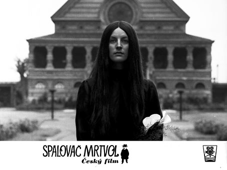
There’s more: the skilful way that Herz and screenwriter Ladislav Fuks (whose novel provides the basis of the story) link otherwise disconnected scenes; Kopfrkingl’s obsession with Tibet which gradually descends into mania; and the mysterious and silent dark-haired woman whose presence in so many scenes is never explained. Given all this, and the successful way that Herz blends his outré material, I’m surprised this film isn’t better known. Herz’s later Morgiana (1972) has more of an audience, and is also worth seeking out. It’s also very different to The Cremator, to such a degree that it might be the work of a different director altogether. Both films can be found on Region 2 DVD at Second Run.
Previously on { feuilleton }
• Sedlec Ossuary panoramas
• The Hourglass Sanatorium by Wojciech Has
• Jan Svankmajer: The Complete Short Films