How does this sound? 100 minutes of solidly informative documentary about the use of drugs by artists from the early 19th century on; a production that calls upon a remarkable cast of contributors (see below), with music by David Gilmour, and the whole thing “devised and directed” by Storm Thorgerson, better known as one third of the great Hipgnosis design team.
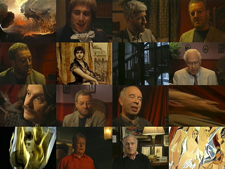
The Art of Tripping was broadcast in two parts in 1993 during the Without Walls arts strand on Channel 4 (UK). David Gale was the writer, with actor Bernard Hill playing the part of the narrator and guide. The programme managed to deal with a contentious subject without indulging in hysteria or insulting the intelligence of the audience, a rare thing today. Twenty years ago it was still possible to make a documentary about a popular subject without having any low-grade celebrity-du-jour offering their wretched opinion. The contributors here who aren’t medical people are almost all writers of one kind or another; Thorgerson and Gale punctuate the proceedings with a few actors who impersonate various historical figures.
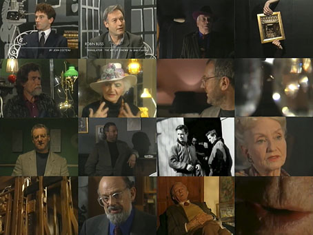
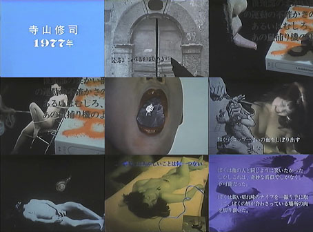
Without Walls was a very good series on the whole but this for me was a real highlight (no pun intended). In addition to it being a rare example of Storm Thorgerson working in television, the direction showed how it was possible to match the theme without recourse to cliché or flashy visuals. There isn’t a single moment of archive footage either. Thorgerson’s history of “socially unacceptable” drugs is structured as a journey through the levels of a multi-storey building, from ground floor to roof; being familiar with the director’s free-associative working methods I can imagine this being a result of thinking about getting high. Bernard Hill encounters the various commentators in successive rooms, each of which is furnished and lit to suggestively imply the drug in question. The use of lighting as a key motif is a smart one, and another metaphor, of course, for literal and symbolic (or spiritual) illumination. Editing effects are also deployed to thematically correspond to the different substances.
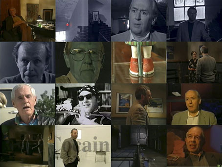
This would be very successful even without a wide range of contributors but Thorgerson and company assembled a stunning array of different writers, many of whom I’d never seen on TV before, and many of whom didn’t turn up again. Some of them fill dual roles, so JG Ballard is on hand to enthuse about Naked Lunch, and appears later talking about his bad LSD trip. Similarly, Brian Aldiss talks about Anna Kavan, and also about Philip K Dick. Below there’s a rough list of the drugs covered and the people involved. In the two decades since this was made many of the people involved have since died, the director included, so the film now has the feel of a historical artefact. The Art of Tripping can be see in full at YouTube. This is how good British television used to be.
Opium
Dr Virginia Berridge (author), Grevel Lindop (author), Marek Kohn (author), Dr EMR Critchley (author), Phil Daniels (as Thomas De Quincey), Dr Tony Dickenson (neuropharmacologist), Dr Ian Walker (author), Thom Booker (as Edgar Allan Poe), Dr Peggy Reynolds (author)
Hashish
Prof John Hemmings (author), Ronald Hayman (author), Patrick Barlow (as Theophile Gautier), John McEnery (as Charles Baudelaire), Jon Finch (as Gérard de Nerval), Bernard Howells (lecturer, King’s College, London), June Rose (author), John Richardson (author), Margaret Crosland (author), Danny Webb (as Jean Cocteau), Robin Buss (translator), David Gascoyne (poet), George Melly (collector, Surrealist art)
Mescaline
Prof Eric Mottram (University of London), Francis Huxley (nephew of Aldous Huxley), Jay Stevens (author), Laura Huxley (widow of Aldous Huxley),
Psilocybin
Brian Cory (as Robert Graves), Paul O’Prey (author)
Marijuana / Nitrous Oxide
Harry Shapiro (author), Carolyn Cassady (author), Prof Ann Charters (author), Allen Ginsberg (poet)
Kief
Paul Bowles (author)
Heroin
JG Ballard (author), Prof Avital Ronell (author), Hubert Selby Jr (author), Brian Aldiss (author)
LSD
Dr Oscar Janiger (experimental psychiatrist), Diana Quick (as Anaïs Nin), Prof Malcolm Lader (psychopharmacologist), Dr Timothy Leary (author), Todd Boyco (as Andy Warhol)
Amphetamine
Lawrence Sutin (author)
Cocaine
Robert Stone (author), Prof. Annette Dolphin (neuropharmacologist)
MDMA
Previously on { feuilleton }
• Storm Thorgerson, 1944–2013
• Hipgnosis turkeys
• Enter the Void
• Opium fiends
• La Morphine by Victorien du Saussay
• In the Land of Retinal Delights
• Haschisch Hallucinations by HE Gowers
• Storm Thorgerson: Right But Wrong
• Demon rum leads to heroin
• The art of LSD
• Hep cats
• German opium smokers, 1900