In Alan Moore’s recent novel, Jerusalem, the ghosts of Northampton travel to different ages of the town by pulling up the concentrated layers of time which they peel back like the pages of a book. The passage of time as an accumulation of layers was materially evident in 18th-century Rome even before geology became an established science. Piranesi’s most popular series of prints, the Vedute di Roma, show how centuries of wind-blown dust and soil had raised the level of the city several feet above its ancient ruins. Before antiquarians began to remove the soil the city was a place of curious juxtapositions, with truncated Corinthian columns growing from the earth, surrounded by—or even forming part of the structure of—the rougher buildings where contemporary Roman citizens were living or sheltering their livestock.
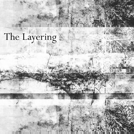
Layers of time and history are the subject of the new compilation from A Year In The Country:
The album explores the way that places are literally layered with history, and is an audio slicing through the layers of time. It journeys amongst the stories and characters of these layers, including, amongst other aspects, the structures built, events which took place and different era’s technologies and belief systems.
Such layering can go far back into pre-recorded history. Much of the earth is thought to have once been underwater, and it is likely that the majority of cities, towns and villages are built in former ocean areas. Current land masses have come to be formed, in part, through a layering of past marine, other life and plants, which in turn are then quarried or mined, subsequently being used to create the infrastructure of contemporary civilisation, and creating something of a cyclical, time-out-of-joint nature to the layers of time.
Track list:
1) A Year In The Country — Cross Sections Of Time
2) Circle/Temple — The Hollow Stream Buried
3) The Heartwood Institute — Beneath The City Streets
4) Sproatly Smith — Chapel Still Stands
5) Field Lines Cartographer — Layers Of Belief
6) Howlround — A Heart Shaped Forest
7) Folclore Impressionista — The Problem Of Symmetry
8) Handspan — At The End Of The Aerial Flight
9) Widow’s Weeds — Gilmerton Cove
10) Listening Center — Wattle And Daub Office Blocks
11) Vic Mars — Once There Were Houses
12) Pulselovers — Brodsworth
13) Grey Frequency — Tigguo Cobauc
As with some of the earlier releases in this series, the accompanying notes are essential to flesh out the substance of the instrumentals; so The Hollow Stream Buried follows Coil in charting the lost rivers of London, Tigguo Cobauc deals with the labyrinth of caves under the city of Nottingham, Chapel Still Stands concerns a place of worship marooned inside an industrial estate, and so on. Without a description, Howlround’s evocation of a Cumbrian landmark might be another example of stone-tape clairaudience. The tape distortions, however, turn out to be the tape feedback playing itself; if there are any ghosts here their origin is presumably rural, not mineral. Handspan combine a traditional tune from the North-East of England with outdoor percussion, a piece whose jauntiness is undermined (somewhat literally) by thoughts of the collieries of Northumberland and the “aerial flight” itself, the cable conveyor at Blackhall Rocks that makes such a memorable backdrop to the final scenes of Get Carter (1971). Relying on notes in this manner may seem like a flawed approach but it’s the nature of all programme music to be accompanied by some kind of description. Several of the more ambient pieces aren’t too far removed from Brian Eno’s On Land, an album that also concerns itself with place and memory, and which contains its own lengthy contextualising note. Delve beneath the layers here.
Previously on { feuilleton }
• The Quietened Journey
• Echoes And Reverberations
• The Watchers
• The Corn Mother
• The Quietened Mechanisms
• The Shildam Hall Tapes
• Audio Albion
• A Year In The Country: the book
• All The Merry Year Round
• The Quietened Cosmologists
• Undercurrents
• From The Furthest Signals
• The Restless Field
• The Marks Upon The Land
• The Forest / The Wald
• The Quietened Bunker
• Fractures