Another week, another cover design. This is the third cover of mine for the Arkham Horror line from Aconyte Books, a fiction series which complements the Lovecraftian Arkham Horror game:
Something monstrous has come to Arkham, Massachusetts. There have always been shadows here, but now a new hunger has risen from the depths and threatens those who dwell here. But there are heroes too—people who stand up and fight to stem the tide, even when it costs them everything. Explore eight shocking new tales of occult horror, captivating mystery, and existential fear—from a zealous new heroine to conniving cultists, bootleg whiskey to night terrors, and fiends that crawl from open graves. A nightmare has fallen across Arkham, and it will devour all.
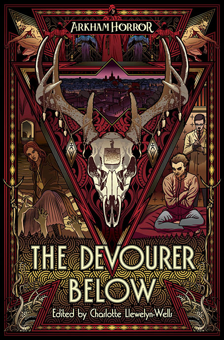
As with the earlier titles I’ve worked on, The Last Ritual and Litany of Dreams, the general style is Art Deco in keeping with the period in which the game and the stories are set. The new cover worked out especially well thanks to the brief which suggested extending the triangle that appears on the previous covers so that it became a frame for a deer skull bedecked like a ritual artefact. This created a little more space for the requisite character panels, the figures here being an underworld investigator and a lycanthropic asylum inmate, both of whom feature in the game. The brief also requested that Arkham be represented somewhere, so I spent a lot of time drawing a view over the gambrel rooftops of the haunted town, only to shrink the panel down to a size which loses much of the detail. It may be a miniature view but it’s like one of those special effects shots you see in a film, something you know must have taken a lot of work to achieve but which is only visible for a few seconds; a minor presence that adds to the texture of the whole. And the view of nocturnal architecture provides a further link with the previous covers.
The Devourer Below will be available in ebook and US paperback in July, with a UK paperback following in September.
Elsewhere on { feuilleton }
• The Lovecraft archive
Previously on { feuilleton }
• Litany of Dreams
• The Last Ritual