French fables by Japanese hands

fontaine01.jpg

The fin-de-siècle interest in Japanese art is given a twist by four small books in which a group of Japanese artists illustrate well-known fables for a French readership. The books were commissioned circa 1890 by Pierre Barboutau, an art collector who specialised in Japanese arts and crafts. Barboutau’s volumes would have been intended to broaden the interest in Japanese art which had been fuelled a few years before by Le Japon Artistique, a magazine edited by a German art dealer with a business in Paris, Siegfried Bing. Le Japon Artistique was criticised for its inaccuracies by Japanese readers but it did feature colour reproductions of prints which otherwise might only be seen as monochrome reproductions. (Bing’s Paris shop, L’Art Nouveau, is also historically significant for giving a name to the predominant mode of fin-de-siècle design.)

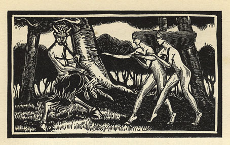
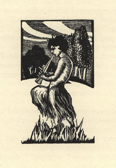
Barboutau’s books take the French interest in Japonisme a stage further, allowing readers to experience familiar stories through Japanese eyes. Each book was printed in a limited run on Japanese paper. Of the four, I’m only familiar with the fables of La Fontaine where the emphasis on animal characters in rural settings means there are few explicitly Japanese details. Some of the landscapes are more Japanese than French, however, especially the drawing that includes a Fuji-like mountain in the background. There’s also a drawing of a group of foxes where the background details of a shrine and torii gate seem intended more for Japanese readers. Foxes in Japan are associated with the Shinto deity, Inari, to a degree that fox statues are a common site in Shinto shrines. None of this is mentioned in the book but if you’re aware of the significance it adds an additional layer to the cultural intersections.

All these books may be seen at Gallica, a valuable site whose interface is still woefully bad, especially on mobile devices. My advice, as always, is to download the PDFs.


Choix de fables de La Fontaine, Tome 1 (1894)

fontaine02.jpg

fontaine03.jpg

fontaine04.jpg

fontaine05.jpg

Continue reading “French fables by Japanese hands”

Weekend links 738

rossetti.jpg

How They Met Themselves (1860) by Dante Gabriel Rossetti.

• At Igloo magazine: Justin Patrick Moore interviews inventor and electronic music composer Don Slepian about his life and work.

• At The Washington Post (archived link): Michael Dirda in praise of weird fiction, horror tales and stories that unsettle us.

• At The Daily Heller: Tina Touli’s explosively twirling typography. Steven Heller’s font of the month is Doublethink.

• At Colossal: Dreams and memories form and dissipate in Tomohiro Inaba’s delicate iron sculptures.

• At Unquiet Things: Jerome Podwil’s captivating cover art.

• New music: Strangeness Oscillation by 137.

• At Dennis Cooper’s: Craig Baldwin’s Day.

Brìghde Chaimbeul’s favourite albums.

Penguin Series Design

Double Image (1971) by Joe Zawinul | Double Flash (1999) by Leftfield | Double Rocker (2001) by Stereolab

Frank C. Papé’s The Well of Saint Clare

pape01.jpg

I was asked recently if I’d ever written anything about British illustrator Frank C. Papé (1878–1972). The answer was no for two reasons, the first being that where book illustration is concerned I like to be able to point to whole books, and until recently there hasn’t been much of Papé’s work available in complete editions. The second reason is that Papé’s illustration is often broadly comic, to a degree that had he been born a generation or two later he might have been drawing humorous comic strips or editorial cartoons. Papé was very adept on a technical level but his drawings aren’t always to my taste so I’ve never spent much time looking for his books.

pape02.jpg

The first of those caveats has been ameliorated by recent uploads at the Internet Archive which include this volume, one of several Anatole France editions with Papé illustrations. The Well of Saint Clare (1928) is a collection of religious stories set in the medieval era. The book appeared a few years after Papé had illustrated James Branch Cabell’s Jurgen: A Comedy of Justice, a quasi-medieval fantasy which was the subject of a celebrated obscenity case in the USA. Anatole France’s satires were almost as contentious for a time—the Vatican put his books on their prohibited list—which leaves me wondering whether Papé had a natural inclination for risqué material or whether his publishers pushed him in this direction. Probably a little of both.

pape03.jpg

pape04.jpg

pape05.jpg

Continue reading “Frank C. Papé’s The Well of Saint Clare”

Weekend links 735

wyeth.jpg

The Adventure of the Giant Squid (c.1939) by NC Wyeth.

• Mix of the week is a superb XLR8R Podcast 860 by Kenneth James Gibson. Elsewhere there’s DreamScenes – July 2024 at Ambientblog, and Deep Breakfast Mix 267 at A Strangely Isolated Place.

• A trailer for a restored print of Time Masters (1982), the second animated feature by René Laloux, with character designs/decor by Moebius. Now do Gandahar.

• Coming soon from Strange Attractor: Music From Elsewhere: Haunting Tunes From Mythical Beings, Hidden Worlds, and Other Curious Sources by Doug Skinner.

Not only a prolific lyricist, Lovecraft considered his main vocation to be poetry. And at its best, his verse can be judged an apt expression of his philosophical vision, in which cosmic horror embodies the predicament of all sentient beings in a meaningless universe. That Lovecraft’s poetry never reaches the heights attained by such Modernists as T.S. Eliot or Ezra Pound should not diminish the fact that his is verse that, in the most archaic of ways, advances a startlingly modern metaphysic, a poetic encapsulation of what Thomas Ligotti in The Conspiracy Against the Human Race describes as an affirmation that the universe is a “place without sense, meaning, or value.” Lovecraft, with his antiquated prosody and his anti-human ethics, presented readers with a type of counter-modernist poetry. Ironically, he is the radical culmination of William Carlos Williams’s injunction of “No ideas but in things;” he is an author for whom there are only things. Graham Harman in Lovecraft and Philosophy describes Lovecraft as a “violently anti-idealist” who “laments the inability of mere language to depict the deep horrors his narrators confront.” Unpleasant stuff, for sure. It is verse that at best exemplifies something that controversial poet Frederik Seidel called for in the Paris Review: “Write beautifully what people don’t want to hear.”

Ed Simon on The Unlikely Verse of HP Lovecraft

• Among the new titles at Standard Ebooks, the home of free, high-quality, public-domain texts: The Case of Charles Dexter Ward, by HP Lovecraft.

• At Spoon & Tamago: An ethereal bubble emerges from a Japanese townhouse.

• New music: The Head As Form’d In The Crier’s Choir by Sarah Davachi.

Mabe Fratti’s favourite albums.

Bubble Rap (1972) by Can | Bubbles (1975) by Herbie Hancock | Reverse Bubble (2014) by Air

Thomas Mackenzie’s Crock of Gold

mackenzie13.jpg

Thomas Mackenzie (1887–1944) was an English illustrator whose work has appeared here before via his illustrations for a verse rendering of the Aladdin story by Arthur Ransome, a typical product of the 1920s’ boom in illustrated children’s books. James Stephens’ The Crock of Gold (1912) is a vessel of a different kind, too sophisticated for children yet suffused with a fairy-tale quality, this is more like a fable for adults:

A mixture of philosophy, Irish folklore and the “battle of the sexes”, it consists of six books, Book 1 – The Coming of Pan, Book 2 – The Philosopher’s Journey, Book 3 – The Two Gods, Book 4 – The Philosopher’s Return, Book 5 – The Policemen, Book 6 – The Thin Woman’s Journey, that rotate around a philosopher and his quest to find the most beautiful woman in the world, Cáitilin Ni Murrachu, daughter of a remote mountain farm, and deliver her from the gods Pan and Aengus Óg, while himself going through a catharsis. (more)

The illustrations, which Mackenzie created for a 1926 edition, are a little different to his earlier work, tending in places towards that Hellenic stylisation that became increasingly popular in the graphic art of the 1920s and 30s. The depictions of Pan remind me that I once tried to catalogue all the appearances of the god in prose and poetry from the 1890s on. The years from 1890 to 1930 saw Pan become a persistent presence in English literature, while also giving a title to one of the leading Jugendstil journals. The idea of trying to document all this activity is an attractive one until you set to work and find that there are many more examples than you imagined, not all of them indicated in the titles of the works.

mackenzie14.jpg

mackenzie01.jpg

mackenzie02.jpg

mackenzie03.jpg

Continue reading “Thomas Mackenzie’s Crock of Gold”