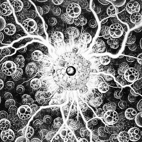
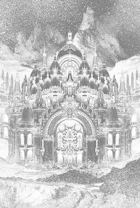
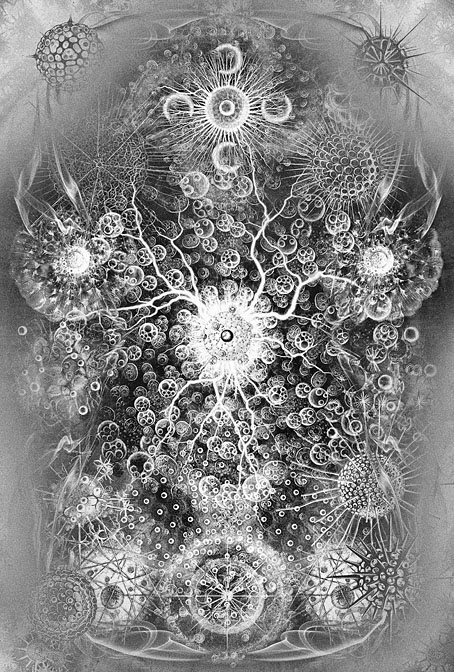
Weekend links 761

agate.jpg

• At Bandcamp: Marc Masters on The Curious Case of the Channeled New Age Tape; and Erick Bradshaw’s guide to Nurse With Wound.

• At Public Domain Review: Designing the Sublime – Boullée and Ledoux’s Architectural Revolution by Hugh Aldersey-Williams.

• The fifth installment of Smoky Man’s exploration of The Bumper Book of Magic has been posted (in Italian) at (quasi).

It does not follow that the scientific spirit of empirical inquiry runs against dreaming, and [André] Breton was wrong to think [Roger] Caillois’s investigative methods opposed wonder. Material mysticism led Caillois back to magical thinking, which he expanded further than the Surrealist interest in chance and coincidence as he probed for insights into the order of things. Caillois was equally, perhaps even more, fascinated with magic than the Surrealists, but he wanted to probe what might exist as phenomenally marvelous, beyond the subjective self—he was a scholar of the sacred, and from the episode of the jumping beans onwards, he looked for its character and its workings in actual phenomena. In this sense he was more of a believer—though not in a personal god or a religion. Where Breton exalted the perceiver, Caillois wanted to go beyond these anthropocentric limits.

Marina Warner on the imaginary logic of Roger Caillois

• Mixes of the week: DreamScenes – January 2025 at Ambientblog, and Unrush 093 at A Strangely Isolated Place.

• At Criterion.com: Reincarnations of a Rebel Muse – David Hudson on Delphine Seyrig.

• Old music renewed: Angherr Shisspa (Revisited) by Koenjihyakkei.

• At Dennis Cooper’s it’s Laura Dern’s Day.

Jussi Lehtisalo’s favourite music.

• Lynch music: The Beast (1956) by Milt Buckner | Honky Tonk (Part 1) (1958) by Bill Doggett | Something Wicked This Way Comes (1996) by Barry Adamson

Weekend links 758

laloy.jpg

Monstrum in animo (1955) by Yves Laloy.

• This week’s obligatory Bumper Book of Magic links: Alan Moore World has more of my ongoing comments about the creation of the book, while Séamas O’Reilly talked to Alan about the book itself and its connections with The Great When. The latter piece lowered my already low opinion of the late Genesis P-Orridge.

• At Timeless: A reprint of Bright Lights and Cats With no Mouths by John Balance. Still in print is The Cupboard Under the Stairs, a selection from JB’s notebooks.

• If you enjoy sleight-of hand magic—and I most certainly do—then Ricky Jay & His 52 Assistants (1996) is 58 miraculous minutes by a master of the art.

• Mixes of the week: Winter Solstice 6 at Ambientblog; a mix for The Wire by Rafael Toral; and Reflection on 2024 at a Strangely Isolated Place.

• “Whatever the reason, there is something sorrowful about the disposal of art, whatever the perceived quality,” says Steven Heller.

• New music: The Path Of The Elder Ones by Nerthus.

Bright Lights (1959?) by Wade Curtiss & The Rhythm Rockers | Bright Lights, Big City (1961) by Jimmy Reed | I Want To See The Bright Lights Tonight (1974) by Richard & Linda Thompson

In the Hands of Madmen

madmen.jpg

My latest cover for the Arkham Horror series from Aconyte continues the Art Deco trend of the other books in this series while also recycling some of the art from the previous covers. In the Hands of Madmen is an omnibus collection of three previously-published novels for which I was given the tricky task of combining portions of three covers into a single design. This wouldn’t be so difficult in other cases but my Arkham Horror covers have been heavily structured, with borders within borders, background patterns and isolated details. I was fortunate that two of the books in the new volume had cover designs that were reflections of each other which could be welded together and laid over the third cover without too much trouble. The original covers are presented below for comparison.

sidor.jpg

litany.jpg

coils.jpg

My last Arkham Horror cover, Herald of Ruin, featured a drawing of a fantastic city which was mostly covered over in the final assembly. The new one does the same with a Deco grille design that I worked up from a photo of a grille in the Squibb Building in New York City.

squibb.jpg

The design is more visible on the back cover so the effort wasn’t entirely wasted. When I’m working on covers like these I prefer to copy (or adapt) authentic period designs when I can. You can find no end of Deco motifs in the form of clip-art but they tend to be Deco-ese, lacking the invention you find in the original designs. I like this grille, it reminds me of a printed circuit. I may use it again one day.

Elsewhere on { feuilleton }
The Lovecraft archive

Previously on { feuilleton }
Herald of Ruin
The Ravening Deep
Diamonds
The Devourer Below
Litany of Dreams
The Last Ritual

Weekend links 755

emsh.jpg

A painting by Ed Emshwiller for the cover of Fantastic Stories of Imagination, July 1962, illustrating The Singing Statues by JG Ballard .

• This week in the Bumper Book of Magic: my comments about the creation of the book’s cover and magical alphabet have been posted at Alan Moore World. At (Quasi), Smoky Man (in Italian) looks at other parts of the book, and includes my answers to his questions about the creation of The Soul, a character originally planned for a comic strip that Alan Moore and I were working on. I’ve been trying recently to find the first sketches I made of The Soul back in 2000 or 2001, without success. If I do find any of them I’ll post them here.

• New music: Juk-Shabb by Cryo Chamber Collaboration is this year’s installment in the Lovecraft-themed album series (previously) from Cryo Chamber. Also this week: Xerrox Vol. 5 by Alva Noto; Nocturne (Soundtrack for an Invisible Film) by Avi C. Engel; and Cat Location Conundrum by Moon Wiring Club.

Code: Damp: An Esoteric Guide to British Sitcoms by Sophie Sleigh-Johnson, being “an alternative occult and esoteric history of England told through one of its most popular cultural forms: the comedy sitcom”.

…the joy of art isn’t only the pleasure of an end result but also the experience of going through the process of having made it. When you go out for a walk it isn’t just (or even primarily) for the pleasure of reaching a destination, but for the process of doing the walking. For me, using AI all too often feels like I’m engaging in a socially useless process, in which I learn almost nothing and then pass on my non-learning to others. It’s like getting the postcard instead of the holiday.

Brian Eno at Boston Review

• “The typographic choices that Godard made were thematic and not only chosen for their stylistic properties.” Arijana Zeric looks inside the design world of Jean-Luc Godard.

• Coming soon from Strange Attractor: The Stammering Librarian: Essays by Timothy D’Arch Smith, edited by Edwin Pouncey & Sandy Robertson.

• At Public Domain Review: Fantastic Planet: The Microscopy Album of Marinus Pieter Filbri (1887–88).

• At the BFI: Michael Brooke offers suggestions for where to begin with Guy Maddin.

• At The Quietus: The Strange World of…Dennis Bovell.

• Mix of the week: A mix for The Wire by KMRU.

• Steven Heller’s font of the month is Gigafly.

Fantastic Cat (1996) by Takako Minekawa | Fantastic Analysis (2001) by Mouse On Mars | Fantastic Mass (2016) by Time Attendant

Lettres et Enseignes Art Nouveau

mulier1.jpg

These lettering designs were posted at Wikimedia Commons in the summer but I’ve only just noticed them this week. I’d been searching for Étienne Mulier’s designs while working on the six-part story about Miss Adeline Carr, aka “The Soul”, in the Bumper Book of Magic, the idea being to have each chapter open with the character’s name in a different Art Nouveau lettering style. If you look at enough bookselling sites you can eventually find one or two large photos of Mulier’s pages which is what I used when creating the heading for the second chapter of the story; but I still would have preferred to have had access to the whole collection. As it happens, most of the Wikimedia plates have also come from bookselling sites but they’re a slightly better collection than the ones I found.

soul.jpg

Mulier’s plates were published in 1901, presented not in book form but as a collection of loose lithographs in a card portfolio; the “Enseignes” in the title are suggestions for shop signs. Mulier also throws in a couple of less practical designs showing alphabets created by posing flamingos. The loose-leaf format is a useful one for something intended to be consulted by artists and craftspeople. Books could be awkward things in the days before digital scanning and photography if you wanted to trace something from a page which wouldn’t lie flat. The Mulier design I used for The Soul isn’t a perfect alphabet—the letters K and M could do with improving—but it’s a good example of the French approach to Art Nouveau lettering (and Art Nouveau design in general) which tends to be more loose and plant-like than equivalents from Germany or the Netherlands. The organic appearance of the letterforms suited the chapter I was illustrating which opens with a hunt for magic mushrooms.

mulier2.jpg

Mulier’s plates don’t appear to have been turned into printable fonts until the 1960s when the revival of interest in Art Nouveau prompted the creation of filmtype adaptations. Fontsinuse shows a rare print example on the cover of an album by Scottish prog band Beggar’s Opera, a version of the typeface which filled in the bi-chromatic letters and slightly altered their forms. “One of the ugliest typefaces ever created,” says Mr Hardwig. I can think of worse. More recently we have the inevitable digitisations, with Art Nouveau Caps being the closest to Mulier’s original. I was tempted to use a digitised version for the story but I find that many amateur (or semi-professional) digitisations of old typefaces are often crude things compared to the originals. I also liked the bi-chromatic effect so I ended up drawing my own copies of the letters I needed.

Previously on { feuilleton }
Bergling’s Art Alphabets
Typefaces of the occult revival