Cthulhu playing cards

cthulhucards.jpg

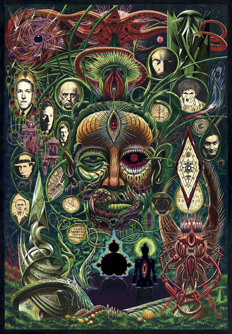
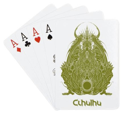
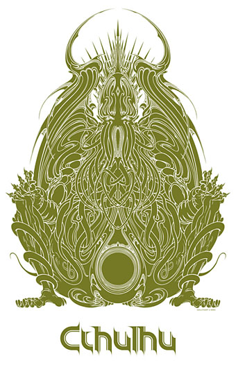
You know, there was a time when HP Lovecraft’s dreaming monster was a rare entity known only to aficionados. Cthulhu may not have achieved Hello Kitty-style ubiquity yet but it’s only a matter of time (or strange aeons).

Adding some new products to my CafePress pages recently I noticed that the ever-expanding product line there now includes playing cards, so here’s a new addition to the growing mountain of Cthulhuiana. I was going to add a playing card option to some of my recent designs (the Summerisle one in particular) but there seems to be a fault in the processing at the moment so the ones I’ve tried haven’t shown up. This design seems to have worked because it was a png rather than the usual jpg. If I can persuade the software to behave I’ll add more in future. As usual the price is relatively steep, a consequence of the high base price rather than my rapacity.

Update: After another CafePress malfunction (or something) my shop vanished. But you can now get a similar set of cards at Zazzle.

cthulhugod3.jpg

Previously on { feuilleton }
More CthulhuPress
Cthulhu Calendar
Cthulhu for sale
Cthulhu God
CthulhuPress

Yuggoth details

yuggoth01.jpg

Yuggoth Cultures (1994) by John Coulthart.

Earlier this week I spent a day scanning this painting—which I’m now surprised to find is 21 years old—so I might at last have a good quality digital copy. There’s been a copy on the website for years but that was a print made at a high-street copy shop that did nothing for the detail and range of colour. It’s quite a large piece—49.54 x 71.39 cm (19.5 x 28.1 inches)—done with acrylics on board. Since 2003 the painting has been used (in another poor reproduction) on the cover of The Starry Wisdom, the controversial collection of Lovecraftian fiction from Creation Books. The painting wasn’t originally intended for that collection, however, and doesn’t quite fit since a number of the portraits don’t feature in the book at all.

Yuggoth Cultures would have been an earlier collection of Lovecraftian fiction and non-fiction that Alan Moore had begun writing for Creation in 1993. Alan’s idea was to take Lovecraft’s Fungi from Yuggoth sonnet sequence as the basis for a collection that would explore Lovecraft’s fictional world and also draw together a variety of figures from the same era: fellow writers, occultists like Aleister Crowley and Austin Spare, and Harry Houdini for whom Lovecraft ghost-wrote Imprisoned with the Pharaohs in 1924. Unfortunately the stars were not right on this occasion; Alan took the sole copy of the half-written manuscript to London in order to read selections at an event in Soho but left the papers in a cab. Some pieces survived, having been copied and stored elsewhere—The Courtyard in The Starry Wisdom is one of these—and there was talk for a while of the lost pieces being rewritten but enthusiasm for the project flagged.

yuggoth08.jpg

This is Alan’s sketch for the cover, the idea being to have a Lovecraft head made of fungal growths rather like an Arcimboldo painting. The head would be sprouting tendrils whose loops would contain pictures of some of the people featured in the book. Alan’s quick sketch is actually a better approximation of Lovecraft’s strange features than my painted version which isn’t narrow enough. For the record (and because people always ask), the other people on the cover are Alan himself, Austin Osman Spare, Aleister Crowley, Harry Houdini, Robert E Howard (not Al Capone as people often think) and Clark Ashton Smith.

yuggoth09.jpg

yuggoth10.jpg

While searching through the archives I discovered these lettering designs although they’re probably not bold enough to read very well on such a busy painting. Before I started using a computer, designs like this had to be drawn at large size then scaled down using a photocopier.

Continue reading “Yuggoth details”

Weekend links 251

quintana.jpg

Beliel (2013) by Dan Quintana.

Guida essenziale all’Italian Occult Psychedelia. Out next month: Nostra Signora Delle Tenebre, a tribute to “movies that…retained a decidedly Italian flavour, a bizarre mix of nasty violence, lurid sexuality and feverish Catholic mysticism, all filtered through a manic obsession with death, blood and the sins of the flesh.” In the meantime, try the Italic Environments mix by Lay Llamas.

• “His work matters more than ever now because it stands in contrast to all the sequels, the comic-book adaptations, that Hollywood makes to sell lunchboxes.” Ryan Gilbey looks at a new documentary about the great Robert Altman.

• Psychedelic Culture at the Crossroads: Erik Davis on the ongoing reappraisal of the value of psychedelic drugs. Related: Dude, You Can Draw Magic Mushrooms With an Oscilloscope.

Like [Ellen Sofie] Lauritzen, what I appreciate about music, writing, and films that vary from dated to downright misogynist is the rawness I see expressed, a sheer energy that can’t toe the line of perfect political obeisance. I join her in hoping that we back down from using “problematic” as a censorious bludgeon against creative achievements, no matter how problematic they are.

Sarah Seltzer on whether feminists can enjoy misogynist art

• Mixes of the week: Roger Eagle’s jukebox selection for Eric’s club, Liverpool; Switched On! Vol. 4 by AnchSounds; T-P-F Mix 3: Bucolic Intrigue Romance by The Pattern Forms.

• At Dangerous Minds: Paul Gallagher on the whimsical anarchism of the White Bicycle revolution.

• Opening the Ghost Box: Dave Thompson on a record label that’s mentioned here more than most.

Abominations Of Yondo (2007), a free album inspired by the weird fiction of Clark Ashton Smith.

• Placards of earthly delight: Isabel Stevens on Vera Chytilová’s film posters.

• I’m an artist to watch according to Nakid Magazine.

Tomb of Insomnia

Death Surf (2012) by Heroin In Tahiti | Voices Call (2015) by Lay Llamas | Averno (2015) by OVO

Summerisle revisited

summerisle3.jpg

I don’t buy many of my own things from CafePress but I had some credit in the account from recent sales so I had to get one of these. (I’m also not in the habit of carrying whisky around but it’s good to have the option.) When I have a spare moment I may add this design to more of the burgeoning range of products. For the moment, these are the available options. Happy Equinox and slàinte mhath!

Previously on { feuilleton }
Summerisle souvenirs
Wicker mania
Milbury souvenirs
Children of the Stones

The Singular & Extraordinary Tale of Mirror & Goliath

mirror.jpg

In yesterday’s post I mentioned having recently finished a cover design featuring silhouettes, not expecting the design in question to be revealed on the Barnes & Noble SF & Fantasy blog a few hours later. So here it is. The Singular & Extraordinary Tale of Mirror & Goliath is the first of two novels by Ishbelle Bee from publisher Angry Robot. Rather than attempt a précis it’s easier to swipe one from the B&N post:

1888. A little girl called Mirror and her extraordinary shape-shifting guardian Goliath Honeyflower are washed up on the shores of Victorian England. Something has been wrong with Mirror since the day her grandfather locked her inside a mysterious clock that was painted all over with ladybirds. Mirror does not know what she is, but she knows she is no longer human.

John Loveheart, meanwhile, was not born wicked. But after the sinister death of his parents, he was taken by Mr Fingers, the demon lord of the underworld. Some say he is mad. John would be inclined to agree.

Now Mr Fingers is determined to find the little girl called Mirror, whose flesh he intends to eat, and whose soul is the key to his eternal reign. And John Loveheart has been called by his otherworldly father to help him track Mirror down…

An extraordinary dark fairytale for adults, for fans of Catherynne M. Valente and Neil Gaiman.

Having spent the past few years scrutinising Victorian graphic design this was a very enjoyable assignment that didn’t feel like work at all. The title design took some time to put together, the challenge with these things being to pour on the decoration while maintaining legibility. You also need to choose the typefaces carefully. The capitals in “Mirror” and “Goliath” were drawings based on period cover designs, while the author typeface isn’t a font but is letterforms scanned from a Symbolist art book from the 1970s. Revival fonts continue to proliferate but I’ve yet to see one in that exact style. The Singular & Extraordinary Tale of Mirror & Goliath is out in June with a sequel, The Contrary Tale of the Butterfly Girl, following in August.