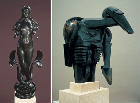
left: Morgan Le Fay by Pierre Roche (1904).
right: The Rock Drill by Jacob Epstein (1913–14).
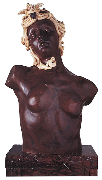
An exhibition of ‘fantastic’ sculpture opened at the Henry Moore Institute in Leeds last week with some fascinating juxtapositions, ranging from Fernand Khnopff’s Mask to Jacob Epstein’s marvellous Rock Drill which is more commonly one of the landmarks of the Tate Britain collection. Also on display is some work by a Romanian artist I hadn’t come across before, Dimitrie Paciurea (1873–1932), whose chimeras might seem influenced by Symbolism but which look a lot stranger than the usual Symbolist statuary.
Against Nature runs until May 4th, 2008.
Sculpture has frequently been used as a medium of metamorphosis. Its malleable materials allow fantastic forms to become real as it mixes human, animal and vegetal components. This was never more so than during the late 19th century when many sculptors turned their back on classical notions of anatomy and used sculpture as a vehicle for the imagination. This exhibition begins in the late 19th century and presents a common fascination with the world of the hybrid across the various art movements of the 20th century right up to recent years with the work of Louise Bourgeois.
Figures drawn from classical mythology—sphinxes, chimeras and centaurs—were the stock subjects of late 19th century Salon exhibitions. Meanwhile, outside the gallery, the pressures of industrialisation and of Darwin’s theory of evolution provided compelling new contexts for the hybrid. To say that sculpture was ‘against nature’ at this time is to suggest two lines of enquiry: firstly that sculpture could create impossible beings that went beyond the natural order, but which evolution could potentially deliver; secondly, that sculpture presents absurd fantasy creatures by means of realistic modelling so as to suggest their ‘real life’ existence.
Despite the various positions of each successive avant-garde movement—symbolism, futurism, vorticism, constructivism, surrealism—fantasy sculpture and anatomical reinvention run across them all. Sculptors soon moved from taking on mythological subjects to inventing their own modern monsters, drawing on the machine as much as on myth, as with Jacob Epstein’s Rock Drill (1913-14).
This exhibition introduces little known sculptors from across Europe and the Americas and places them in a freakish family tree which also includes some of the ‘iconic’ images of modern sculpture. Thus the exhibition includes works by Hans Arp, Umberto Boccioni, Max Ernst, Julio González and Germaine Richier alongside Thomas Theodor Heine and Dimitrie Paciurea. It suggests a new way of looking at the emergence of modern sculpture and at its underlying continuities c.1890s–1980s.
Elsewhere on { feuilleton }
• The fantastic art archive
Previously on { feuilleton }
• Bruges-la-Morte
• The Cult of Antinous

.jpg)