Category: {music}
Music
Neville Brody and Fetish Records
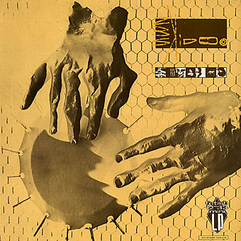
Seven Songs by 23 Skidoo, FM 2008, 1982.
Since I made a post earlier about bad album design, it’s only right to redress the balance somewhat. Neville Brody has long been a favourite designer and something of an influence since it was looking at his work during the 1980s that made me think seriously about design when I’d previously had little interest in the field.
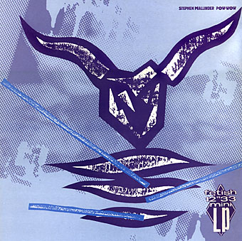
Pow-wow by Stephen Mallinder, FM 2010, 1982.
The record sleeves Brody produced for Fetish Records from 1980–82 are great examples of post punk style that showcase his particularly individual approach to design. This involved much use of hand-crafted elements, whether painted, printed, cast or carved. (In the days before computer design everything had to be pasted together from paper cut-outs, film overlays or PMT [photo-mechanical transfer] prints, with type provided by a professional typesetter.) Some of the Fetish sleeves used three-dimensional work that was then photographed, such as the wooden carvings or plaster hands on the 23 Skidoo sleeves. This approach might have provided a new direction for other sleeve designers but was quickly passed over as the decade progressed in favour of a weak pastiching of Modernist styles and the cultivation of a slick corporatism, much of it watered-down from Brody’s highly influential innovations for The Face magazine.
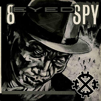
8 Eyed Spy by 8 Eyed Spy, FR 2003, 1981.
Brody has said of the Fetish period:
The musicians on Fetish were also totally open to the idea of me working under my own steam; there has been such a shift in this respect—most groups now take a much bigger hand in design which does not necessarily make for a better cover.
The Graphic Language of Neville Brody, 1988.
The situation is just as bad, if not worse, today. The open-ended nature of digital art has created a situation whereby a given design can be subject to endless revision merely because the client knows that the technology allows changes to be made.
Brody continues to work as a designer even though he’s less visible now, heading his own Research Studios.
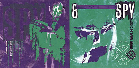
Diddy Wah Diddy by 8 Eyed Spy, FE 19, 1980.
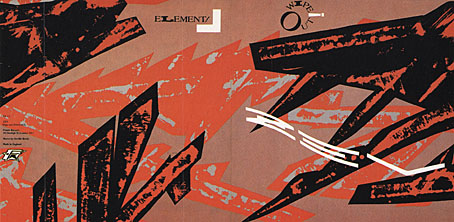
Wipe Out by Z’ev, FE 13, 1982.
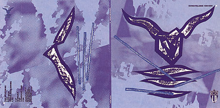
Pow-wow by Stephen Mallinder, FM 2010, 1982.
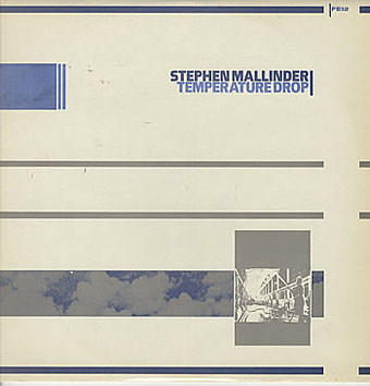
Temperature Drop by Stephen Mallinder, FE 12, 1981.
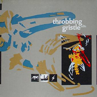
Five Albums by Throbbing Gristle, FUX 001, 1981.
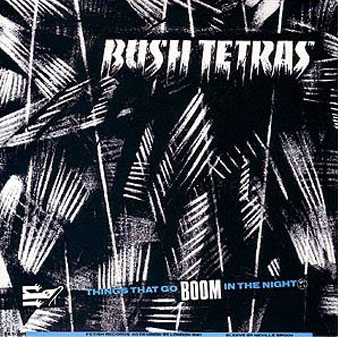
Things That Go Boom In The Night by Bush Tetras, FET 007, 1981.
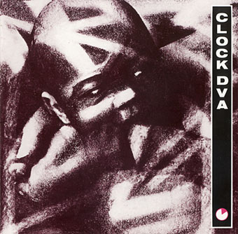
Thirst by Clock DVA, FR2002, 1981.
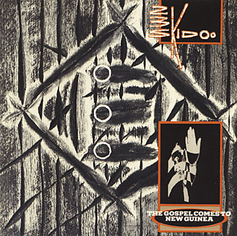
The Gospel Comes To New Guinea by 23 Skidoo, FE 11, 1981.
(This is actually the cover of a CD compilation which somehow gained
three circles that weren’t on the original sleeve.)
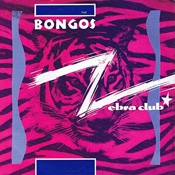
Zebra Club by The Bongos, FE 17, 1982.
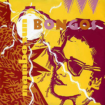
Mambo Sun by The Bongos, FE 18, 1982.
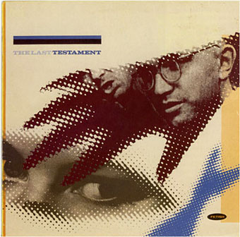
The Last Testament, Various Artists, FR 2011, 1983.
Update: added a couple more sleeves (Bush Tetras and Clock DVA). Since there’s little information about the record company available, I’ve also added Jon Savage’s sleeve note from The Last Testament (1983), the final Fetish release and a compilation which acted as a celebration and epitaph for the label.
I’D IMAGINE IT TO BE SYMPTOMATIC that the word Fetish should have changed in the middle to late 70s, from being a slogan on an obscure Mail Art T Shirt to becoming the tradename of an internationally renowned record label—Maida Vale’s own ‘Home of the Hits’—but that’s showbiz.
AS WAS PRACTISED FOR A BRIEF TIME: Fetish now appears a product of a particular period when the separate streams of pop and avant-garde—the difference being in self-estimation as much as anything else—were thought expedient, cool and all those things, to crossover. In practice, this tended to mean press coverage disproportionate to sales, plenty of amusing attitudes struck, and streams of ill-advised people like myself being persuaded to view such artistes as are on offer here in dark and dingy basements. These last would always give the lie to pop’s brave new world pretensions.
IN THIS PULSATING SCENE, Fetish represented an opportune, if haphazard, meeting of New York, Sheffield, and Hackney. All of these spots have been glamourised to a greater or lesser degree, so you would have thought that this brand name was onto a winner. It is, however, an undoubted sign of human perversity that Fetish’s greatest success was to occur at the point when mogul Rod Pearce was shutting up shop: in early 1982, 23 Skidoo’s ‘Seven Songs’, produced by noted noisemakers Genesis P-Orridge and Peter Christopherson, became NUMBER 1 in the indie charts. Phew! Luckily, insufficient interest combined with too much time spent promoting the Bongos meant that this incredible success was nipped in the bud: disheartened at rock ‘n’ roll’s indifference, Pearcey announced that Fetish was to cease operating. People in polytechnics wept.
MAY I NOW IMAGINE YOU holding what I hope will be a beautifully designed sleeve (although you never can tell) and wondering why you should part with the money? (And, as they used to say, if you’re not going to, please don’t leave fingermarks all over Neville Brody’s labour of love). Apart from all the usual ‘unreleased’ and ‘live tracks’ sales points, you will own 12 tracks from a brief, hothouse period, a temporary delay in the long slide from the Sex Pistols to ABC. You will find preoccupations of the times faithfully represented: the full flowering of ‘industrial’, mature works from your favourite New York noisemakers, and the first UK meshing of punk and funk
1980! 1981! THOSE WERE THE DAYS! Those heady days of idealism are over. The fragile dividing line between art and commerce which Fetish represented has now shattered: Rod Pearce and Perry Haines are now prostituting themselves with King, Genesis P-Orridge and Peter Christopherson with Psychic TV, Adi Newton with DVA, and Neville Brody with the Face. I too, am deeply implicated, having sold my soul similarly to PTV and the Face. How worlds change! Isn’t life tough?
JON SAVAGE
Elsewhere on { feuilleton }
• The album covers archive
The Museum of Bad Album Covers
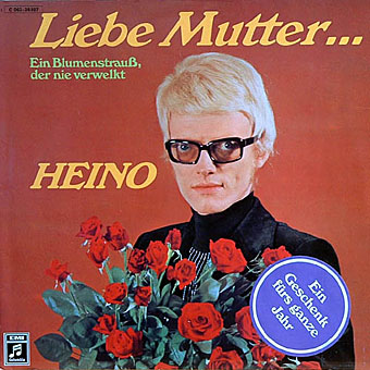
The world is over-stuffed with bad design, from food packaging to tv graphics and awful websites, but it’s fun to be reminded now and then just how bad things can get when all aesthetic considerations are thrown to the winds. The Museum of Bad Album Covers features some of the choicest examples from the music world, such as the sleeve above for Marty Feldman-eyed Heino, a classic of Easy Listening kitsch (Cooper Black is a favourite typeface for this kind of thing). Heino’s records don’t look that terrible compared to other German albums of the 70s which often managed to combine outrageous bad taste with abysmal graphics and illustration. God only knows what sounds Foster Edwards and his band of bewigged elephants produced. Next time someone tells you that you can get any album on CD, ask them about Foster and his jumbos.
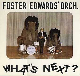
The Museum site threatens to bring us a complementary Museum of Bad Single Covers soon. If you’re still not sated in the meantime, Dana Countryman’s Virtual Museum of Unusual Cover Art has further examples of graphic strangeness from the vanished vinyl wastelands.
Elsewhere on { feuilleton }
• The album covers archive
The Drift by Scott Walker
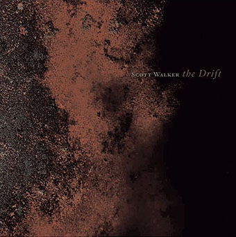
Coming to cast a giant shadow across your fuzzy warbles on the May 8th. The progression that runs from Scott 4 to Nite Flights to Climate of Hunter to Tilt is here continued in a quite extraordinary manner, leaving Scott looking down on the rest of the music world from very rarefied heights indeed. Impossible to describe although Momus does his best here. Think of Coil jamming with Penderecki or something. The cover art is very apt, this is a journey across a rusted landscape into darkness.
Alex in the Chelsea Drug Store
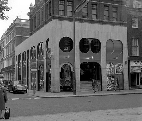
The Chelsea Drug Store, 49 King’s Road, London, circa 1970.
“I went down to the Chelsea Drug Store,”
“To get your prescription filled…”The Rolling Stones, You Can’t Always Get What You Want, 1969
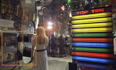
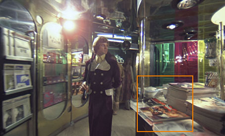
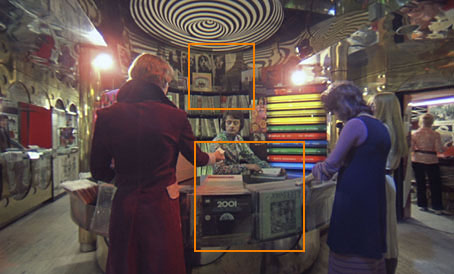
How much Stanley Kubrick trivia can you stand? One of the delights of DVD over VHS tape is the ability to step frame by perfect frame through any given film sequence without the picture being disturbed by noise. This reveals a lot more detail should you wish to scrutinise a favourite scene such as the dolly shot in A Clockwork Orange where Malcolm McDowell makes a circuit of the “disc-bootick” before chatting up a couple of devotchkas.
The scene was filmed in the then very trendy Chelsea Drug Store on the corner of Royal Avenue and the King’s Road, London SW3. In 2001: A Space Odyssey (1968) the world as it might be forty years was created with models and some elaborate and expensive sets. For the more satirical A Clockwork Orange Kubrick adopted the same approach as Jean-Luc Godard in Alphaville, with carefully-selected views of the contemporary world standing for a fictional future. There’s no attempt made in this scene to disguise any of the cultural products of 1970, the year it was filmed.
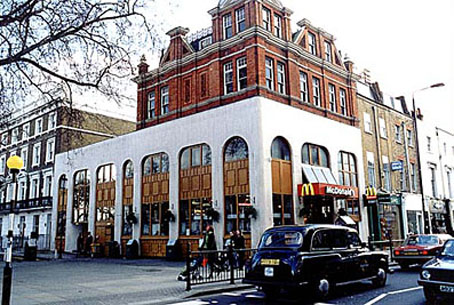
The location as it is today, rendered safe and banal courtesy of McDonald’s.
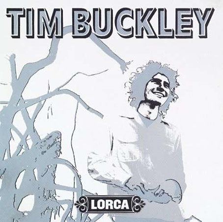
Throughout the 1980s and 1990s A Clockwork Orange was unavailable in Britain in any form due to a bizarre embargo by the director. This means that Kubrick enthusiasts like myself who were too young to have seen the film in the cinema had to rely on bootleg videos of depressingly limited quality (often copies of copies) that did no justice to John Alcott’s superb photography or to Wendy Carlos’s electronic soundtrack. Especially frustrating was spotting Tim Buckley’s Lorca album on one of the shelves in the record shop scene but not being able to make out what else might be there. This might seem like a rather fatuous complaint but there aren’t many places you find such a pristine snapshot of a British record emporium in the early 70s. More to the point, with a clearer view you have a chance here to enjoy some sly Kubrick humour. So what does the DVD reveal?
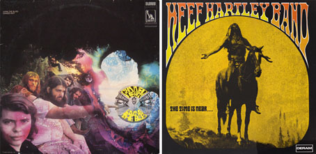
Before Alex appears we can see two albums in the racks, Livin’ the Blues by Canned Heat and The Time is Near… by the Keef Hartley Band.
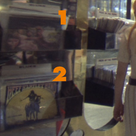
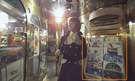
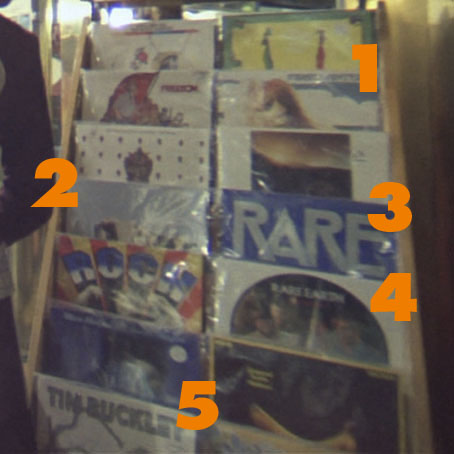
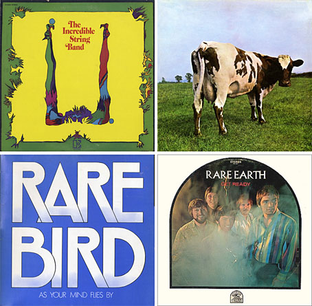
When Alex wanders in he passes a large rack of albums, some of which elude my occasionally sketchy knowledge of 70s’ rock. I can recognise these: 1) U by The Incredible String Band, 2) Atom Heart Mother by Pink Floyd, 3) As Your Mind Flies By by Rare Bird, 4) Get Ready by Rare Earth and 5), the one that started it all, Lorca by Tim Buckley.
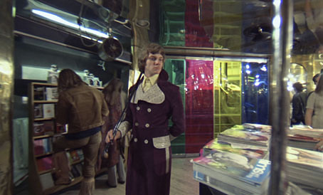
Alex passes a booth stacked with magazines and newspapers. The one at the lower right is a popular film magazine of the time, Films and Filming.
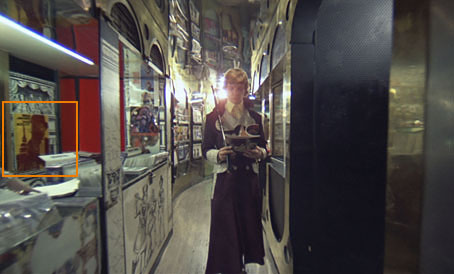
He passes the other side of the magazine booth, selects a magazine and leafs through it while he walks. I’d never paid much attention to this before until I was stepping through the scene again and recognised the cover as a copy of Cinema X (The International Guide for Adult Audiences), an exploitation mag that existed solely to show people stills of nude scenes in current films. This is Kubrick’s first joke since Cinema X is exactly the kind of title that would attract Alex’s attention even though he discards it a few moments later.
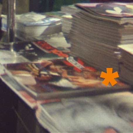
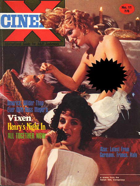
Cinema X, vol. 2, #11 (1970).
The magazine above is the issue Alex selects (minus the censored boobs). The logo was easy to spot because I own the issue (below), volume 4, no. 6, which has as its main feature…A Clockwork Orange.
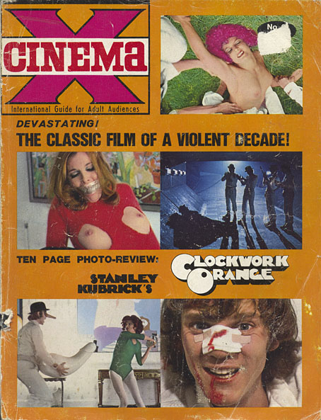
Cinema X, vol. 4, #6 (1972).
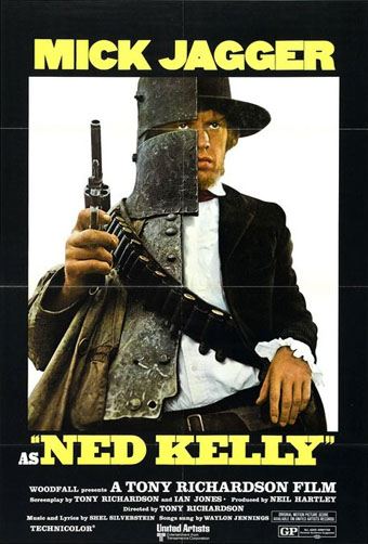
Alex leafs through the mag and passes a poster for Ned Kelly, a film starring Mick Jagger who’d sung about the Chelsea Drug Store only a couple of years before. No idea how I recognised this, it was a lucky guess.
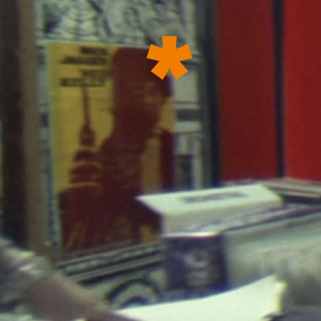
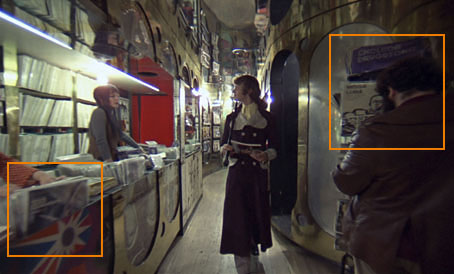
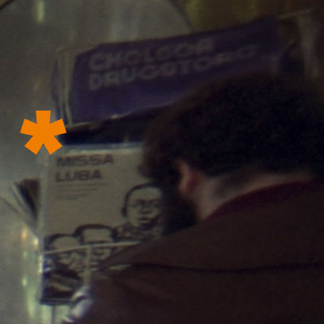
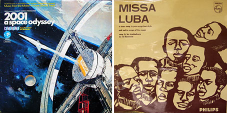
Two more Kubrick jokes: on the left there’s a copy of the soundtrack to SK’s earlier film 2001: A Space Odyssey at the front of the album racks. On the right there’s a gentleman who many people assume is the director although I believe this has been soundly refuted. Besides his face there’s another joke, the sleeve of the Missa Luba album by Les Troubadours du Roi Baudouin, an album of gospel songs sung by an African school choir that was released in 1959. The ‘Sanctus’ song from side two was played throughout Lindsay Anderson’s film If…. which featured Malcolm McDowell in his first major role playing another figure of rebellion. It was this role that landed him the lead in A Clockwork Orange.
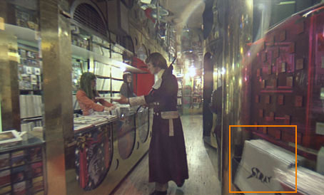
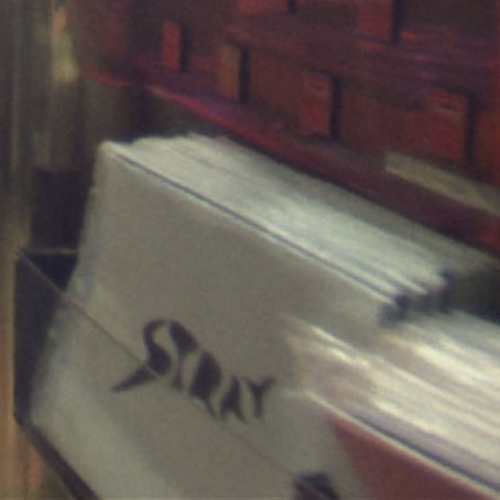
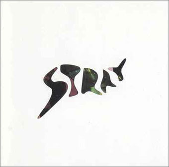
Alex ditches his Cinema X and passes a copy of the debut album by British rock trio Stray.
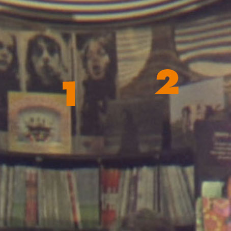
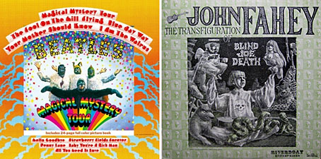
Arriving at the record booth we can see a number of albums on display. On the upper shelves there are copies of Magical Mystery Tour by The Beatles and another copy of Pink Floyd’s Atom Heart Mother. In the racks at the front there’s a more prominently displayed copy of the 2001 soundtrack (in a different sleeve) next to John Fahey’s “fake” blues album, The Transfiguration of Blind Joe Death.
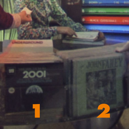
Might there be a reason for placing Fahey’s not-at-all futuristic blues record next to the 2001 soundtrack? How about this: one of the songs on Fahey’s album is Bicycle Made For Two (aka Daisy Bell), the very thing that the HAL 9000 computer famously recites when it’s being shut down.
Lastly, that big graphic swirl above the booth is the symbol of the Vertigo record label.
Places like the Chelsea Drug Store were the magical homes of music before the corporations moved in and turned high street stores into warehouses flogging albums in bulk. In this scene at least A Clockwork Orange serves less as a warning of the future and more as a window on a world that’s disappeared.
Update: All the images have been upgraded from a Blu-ray edition of the film.
Elsewhere on { feuilleton }
• The album covers archive


