An illustrated book from circa 1926 at the NYPL Digital Gallery. Art by T Hasegawa, words by Lafcadio Hearn.
Elsewhere on { feuilleton }
• The illustrators archive
Previously on { feuilleton }
• 8 out of 10 cats prefer absinthe
• Monsieur Chat
A journal by artist and designer John Coulthart.
Fantasy
An illustrated book from circa 1926 at the NYPL Digital Gallery. Art by T Hasegawa, words by Lafcadio Hearn.
Elsewhere on { feuilleton }
• The illustrators archive
Previously on { feuilleton }
• 8 out of 10 cats prefer absinthe
• Monsieur Chat
The second of my book designs for Tachyon Publications is published this month and it was good to receive a copy in the same week as getting a load of new CDs. Medicine Road is a contemporary fantasy of shape-shifting and shamanic magic set in the American South West. This job was particularly pleasurable for being illustrated by Charles Vess, celebrated among other things for his many collaborations with Neil Gaiman, including Stardust. I embellished the opening pages with designs based on Native American petroglyphs, a couple of which are from the tribes mentioned in the text.
Laurel and Bess Dillard are charismatic bluegrass musicians enjoying the success of their first Southwestern tour. But the Dillard girls know that magical adventures are always at hand. Upon meeting two mysterious strangers at a gig, the red-headed twins are drawn into a age-old, mystical wager along the Medicine Road.
One day, seeing a red dog chasing a jackalope, Coyote Woman gave them human forms. They became Jim Changing Dog and Alice Corn Hair. In return, both of them must find true love within a hundred years or their “five-fingered” forms will be forfeit. Alice has found her soul mate, but trickster Jim is unwilling to settle down — until he sets eyes upon free-spirited Bess Dillard.
Yet time is running out for the red dog and the jackalope. In just two weeks they will journey to their reckoning at the Medicine Wheel. Meanwhile, a motorcycle-riding seductress and a vengeful rattlesnake woman are eager to meddle, and Bess and Laurel, caught in a web of love and lies, must find their own paths into the spirit world.
Next up from Tachyon will be a book by Kage Baker. More about that later.
Previously on { feuilleton }
• The Best of Michael Moorcock

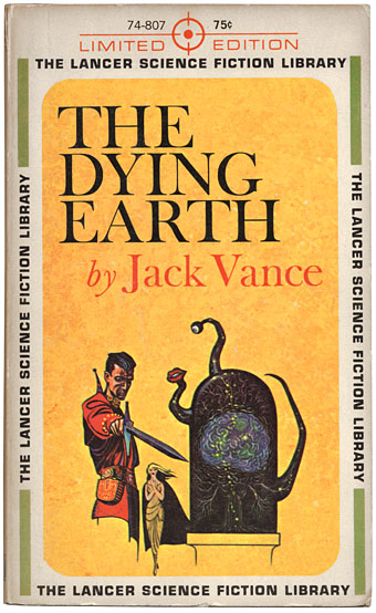
Another item brought to light during the Great Shelf Re-ordering and Spring Clean is this 1962 Lancer paperback of The Dying Earth by Jack Vance, a slim collection of six short connected stories, and another favourite book. Despite the SF label this is far more a work of fantasy (science fantasy, if you must), being tales of the bizarre and occasionally grotesque inhabitants of the last days of the earth. Magic is the order of the day, not advanced technology, although Vance hints that the book’s elaborate spells may be a higher ordering of mathematics capable of manipulating reality. I like the simple cover layout of this edition; Ed Emshwiller’s illustration manages to be sparing yet fully representative of a key scene.
French sf portal Noosfere has recently revamped its artwork showcase and has a substantial collection of Emshwiller’s cover paintings. I’d prefer to see more of his earlier style but the collection includes some striking designs.
Sunstone (1979).
Emshwiller was a very prolific illustrator but from the 1960s on also developed his own style of experimental filmmaking, some examples of which can be found at YouTube. I’d actually seen Sunstone—a very early piece of computer animation—years ago without registering the credit. In addition there’s also Thanatopsis, a strange b&w short which is remarkably similar in tone to some of the films which William Burroughs and Antony Balch were making at around the same time.
• The genre artist | Jack Vance profiled in the NYT
Elsewhere on { feuilleton }
• The book covers archive
• The illustrators archive
Previously on { feuilleton }
• The King in Yellow
• Ballantine Adult Fantasy covers
• Clark Ashton Smith book covers
• Revenant volumes: Bob Haberfield, New Worlds and others
• The World in 2030
• The art of Virgil Finlay, 1914–1971
• Towers Open Fire
Along the shore the cloud waves break,
The twin suns sink beneath the lake,
The shadows lengthen
In Carcosa.Strange is the night where black stars rise,
And strange moons circle through the skies
But stranger still is
Lost Carcosa.The King in Yellow, Act i, Scene 2.
Rearranging the bookshelves this week had me looking again at this old Ace paperback of Robert Chambers’ weird classic, one of that select handful of books which can bear a blurb from HP Lovecraft. Any Lovecraft aficionados yet to read the first four stories in Chambers’ collection (the others pieces are of lesser interest) are missing out. These are as good as anything that Weird Tales published and together they achieve that unique blend of science fiction, fantasy and horror which Lovecraft and others also managed in the days when writers, and readers for that matter, were far less concerned with the definition and boundaries of genre.
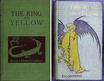
My Ace edition was the first paperback printing from 1965 and the cover painting is by Jack Gaughan, credited inside as being based on Chambers’ own first edition design. I’d often wondered what the original cover looked like and now, of course, it’s easy to find. Whether Chambers himself drew this is unclear but whoever the artist was, the design is rather more finessed than Gaughan’s sketchy painting.

Searching around reveals two further variations, one of which—the green cover—is described on a bookselling site as the actual first edition of the book from 1895. Yours for a mere $1,750. The other cover is probably a later reprint which gives a clearer view of the mysterious King. What’s notable here is the curious sigil on both the Neely editions. I was hoping this might be the dreaded Yellow Sign which is the subject of Chambers’ fourth (and Lovecraft’s favourite) story; it’s certainly more suitable than the squiggle which seems so unaccountably popular among certain quarters of Lovecraft fandom. It isn’t the Yellow Sign, however, it turns out to be the monogram for publisher F. Tennyson Neely. Perhaps this is just as well. “The solution to the mystery is always inferior to the mystery itself,” as Borges said, and some things, like the malevolent play which gives its name to this collection, are best kept out of reach.
• The King in Yellow at the Internet Archive
Elsewhere on { feuilleton }
• The book covers archive
• The Lovecraft archive
Previously on { feuilleton }
• Arthur Machen book covers
• Clark Ashton Smith book covers

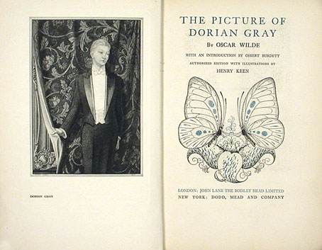
Returning to the golden boy again this week with an illustrated edition of Wilde’s novel from 1925. The publisher was Aubrey Beardsley’s old employer, John Lane, and the illustrator was Henry Keen, an artist of singular and dismaying obscurity. Perhaps some of my knowledgeable commenters can provide more information. Keen’s 12 plates look like lithographs but the book also featured ink embellishments and a splendid sunflower/butterfly design on the boards and slipcase.