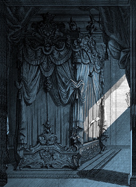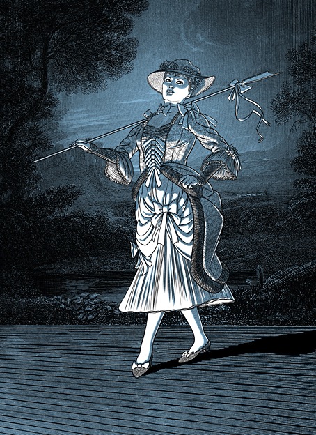
In last week’s anniversary post I threw some barbs at social media to which this piece might act as a riposte; the poisoned waterholes still have their uses. A link on Bluesky to a book by James Hume-Cook, Australian Fairy Tales (1925), had me looking for more information about the book’s illustrator, Christian Yandell (1894–1954), an Australian artist whose illustrations are as good as those being produced in Britain or America at the height of the boom in illustrated books. Ms Yandell is better known today under her married name, Christian Waller. In addition to working as an illustrator she was a printmaker and stained-glass artist. She was also another early 20th-century artist whose work reflects an interest in Theosophy, most notably in a print series from 1932 which she titled The Great Breath.
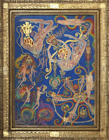
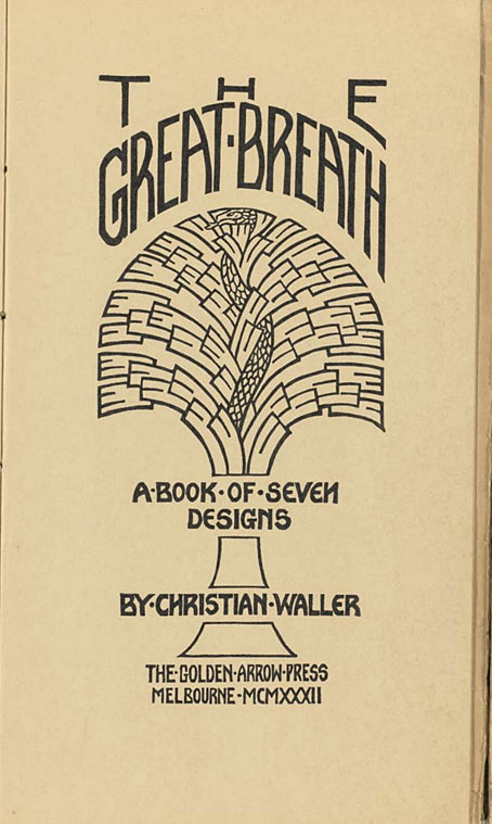
The production of The Great Breath was entirely undertaken by Waller; all aspects from the cutting and printing of the linoblocks to the manufacture of the distinctive gold-painted emerald green cover was done by hand. She printed the blocks on her 1849 hand-press in her studio at Ivanhoe, each book taking about four days to make, hand-bound with green cord. Although it was intended to produce an edition of 150, it seems only about 30 were made, with some unbound impressions extant, usually untrimmed. Each consisted of a title page, colophon, contents page and seven linocut designs. The images were printed in solid black on white translucent tracing paper, trimmed and tipped onto the cream pages. The books were not numbered sequentially, but rather in relation to the numerology of the buyer.
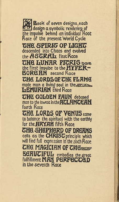
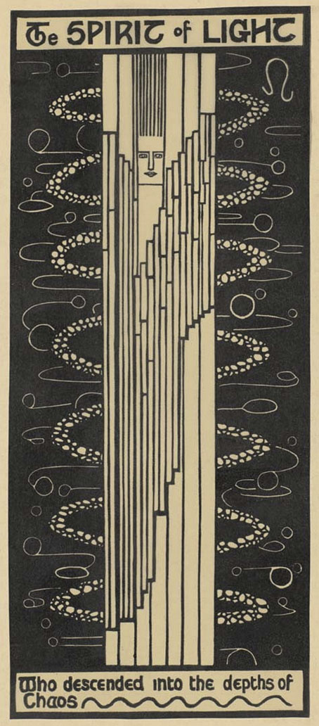
The bound collection comprises seven prints plus an eighth plate presenting vague clues about the meaning of the series and some of the symbolism in the imagery. The prints themselves are in a bolder style than Waller’s storybook illustrations, resembling templates for stained-glass designs. What “The Great Breath” refers to isn’t explained at all, I’d guess you had to be a reader of Madame Blavatsky’s magnum opus, The Secret Doctrine, to be sufficiently enlightened. The explanatory plate features Blavatsky-derived concepts such as “Root Races” and “the World Cycle”, along with references to Atlantis, Hyperborea and Lemuria. The Secret Doctrine incorporates the alleged histories of these lost continents into its collage of myth, religion and mysticism, as a result of which Madame Blavatsky is almost solely responsible for the legend of Atlantis migrating from books of archaeological speculation and pseudo-history to the more rarified realms of occultism. You can trace a thread of Atlantis references from Theosophy to The Golden Dawn, and on into the 20th century, through weird fiction to the crank shelves, where the submerged continent may be found among all the flying saucers, pyramidology and “ancient astronauts”. Since Theosophy has few adherents today it might be said that the elevation of Atlantis to a mystical plane was Blavatsky’s most substantial legacy, if it wasn’t for all the artists who fed off the soup of borrowed ideas in The Secret Doctrine to elevate work of their own. I continue to believe, semi-mischievously, that Theosophy ought to be recognised as the primary force behind the development of abstract art, so many important artists (Hilma af Klint, Kandinsky, Mondrian) were inspired by Blavatsky’s writings. “Inspire” is apt in this context, being derived from Latin and Greek words meaning “to breathe”. Maybe the significance of Waller’s title isn’t so hard to divine after all.
Continue reading “Christian Waller’s The Great Breath”