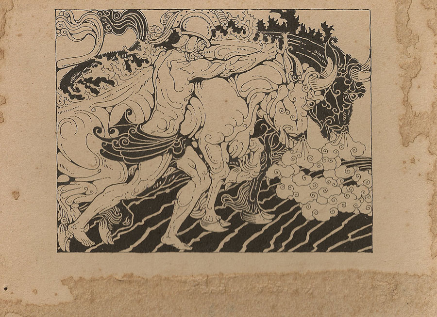
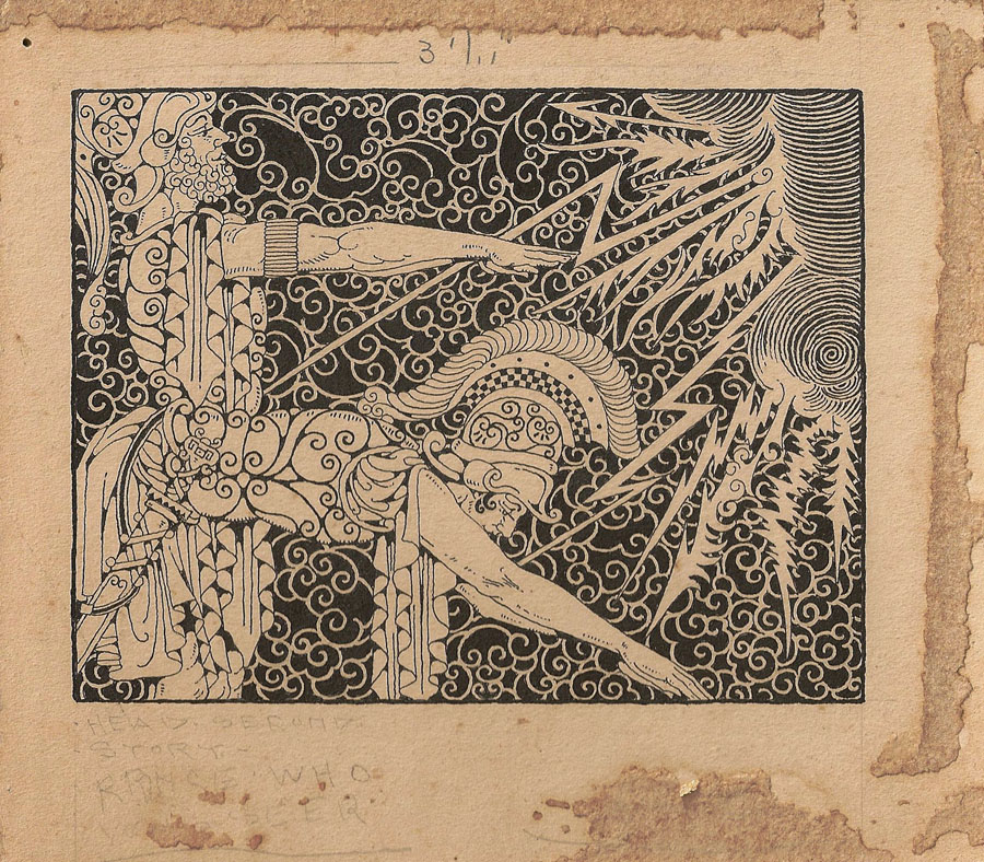
Patrick McGoohan and The Prisoner

prisoner1.jpg

Patrick McGoohan as The Prisoner.

“I will not be pushed, filed, stamped, indexed, briefed, debriefed or numbered. My life is my own.”

The Prisoner, which ran for seventeen episodes from 1967 to 1968, was the best original drama series there’s ever been on television. Period, as Harlan Ellison would say. Best because it grabbed the format of the TV adventure series with both hands to subvert the expectations of the audience and the people who were paying for it. Best because it dared to do this at a time when there was little precedent for experiment in a medium that was barely a decade old. Best because it had something important to say while still being entertaining. And best because it had Patrick McGoohan in the central role at the peak of his acting career.

Fiction can be anything, but to look at what we’re offered by TV channels you wouldn’t know it. Cop shows, hospital shows, detective shows and soap operas proliferate, ad infinitum. The Prisoner came out of Danger Man, an immensely successful post-James Bond spy series which may have been popular but, McGoohan’s presence aside, has little to recommend it today. It lacked the camp bravura of The Avengers and couldn’t compete with the budgets of the Bond films. But it’s fair to say that without it McGoohan wouldn’t have had the chance to do something radical. ITC’s Lew Grade thought he was getting Danger Man 2 with better production values; what he received—to his eventual dismay—was the kind of television one would expect if the staff of Michael Moorcock’s speculative-fiction magazine New Worlds had been given a fat budget and free reign. Like New Worlds, The Prisoner seized familiar genre themes but took them as a means to an end, not an end in themselves. The series borrowed from science fiction and spy thrillers—brainwashing and mind control, Cold War paranoia, the limitless surveillance and duplicity of Orwell’s Nineteen Eighty-Four—and used a drama format to say something direct and personal to its audience about individual freedom, the limits and excesses of the state, and the importance of being able to say “No” when the world insists that you capitulate.

prisoner3.jpg

Number Six by Roland Topor.

McGoohan was the driving force as well as the star. His own company, Everyman Films, produced the series for ITC; he planned everything with the writers, wrote three episodes and directed five of them himself. The Prisoner only lasted for a season and a half—cut short after Grade lost his patience—but the form was potentially endless, flexible enough to present a familiar Cold War spy story on the one hand, while having an entire episode play as a Western, on the other. In one of the later episodes McGoohan is largely absent when his mind is transferred to another man’s body and he finds himself living a new life, ostensibly a free man. (But freedom in The Prisoner is always circumscribed.) The last three episodes collapse everything that’s preceded them into intense and increasingly surreal psychodrama. Like Moorcock’s fluid character Jerry Cornelius, whose exploits were running in New Worlds while The Prisoner was being broadcast, McGoohan had found a vehicle to say what he wanted about the world using popular culture. It’s a coincidence but I’ve always found it apt that the cover illustration for Moorcock’s novella The Deep Fix (1966) included a figure obviously modelled on McGoohan’s Danger Man. The book’s tagline “Drugs took him into a nightmare world where logic ceased to exist” could be a description of a later Prisoner episode. Apt too that the first novel based on the series in 1969 was by New Worlds regular Thomas M Disch.

prisoner2.jpg

(James Colvin was a Moorcock nom-de-plume.)

The Prisoner was produced in the era of the social dramas of The Wednesday Play and Play for Today yet it remains relevant in a way its worthier contemporaries could scarcely manage. Social realism dates as quickly as yesterday’s news but allegory stays fresh. And it’s a dismal truth that the world of infinite surveillance has crept closer in a way that few would have imagined possible in 1968. The cameras that follow McGoohan’s Number Six everywhere are a familiar sight on Britain’s streets; a headline in yesterday’s Independent newspaper read: “Big Brother database a ‘terrifying’ assault on traditional freedoms“. McGoohan, who was raised in Ireland, would have appreciated the adherence of another Irishman, James Joyce, to the Luciferian cry of disobedience in Ulysses, “Non serviam!”—”I will not serve”. Joyce’s Stephen Dedalus defies God and his family; McGoohan’s Number Six defies everything else. That example, of the man who can “make putting on his dressing gown appear as an act of defiance”, is something we need as much now as we did in 1968. Hollywood is currently threatening a big-screen version but why wait for more compromised studio product when you can go to the source. Get yourself a deep fix—it’s a masterpiece.

Previously on { feuilleton }
Thomas M Disch, 1940–2008
Revenant volumes: Bob Haberfield, New Worlds and others

Buccaneers #2

pirate1.jpg

Continuing from yesterday’s post, these nameless characters were sketches for a proposed comic strip that writer Jamie Delano and I were planning in the mid-Nineties. We had a feeling that the long-neglected pirate genre was due for a revival and talked about a revisionist take on buccaneering which would dispense with the Robert Newton antics and steer closer to the brutal reality. Among the touchstones there was On Stranger Tides by Tim Powers, the anarchist pirate community in Cities of the Red Night by William Burroughs and the ferocious scalp-hunters in Cormac McCarthy’s masterpiece, Blood Meridian. There was also talk of throwing some voodoo into the mix, hence the veve tattoos. It wasn’t to be, of course. Little of my work has ever resembled mainstream comics fare and Jamie’s publishers, DC Comics, had already been underwhelmed by the detailed style I was using in the Lovecraft and Lord Horror comics. When I tried presenting them with some trial pages in a more open style I was told that they’d been expecting to see more of my detailed line work…

We had a couple of other characters planned, including a tattooed islander inspired by Queequeg from Moby Dick, but the samples here are the best of the sketches. The shark- or whale-jaw false leg was my own invention and something I’m fairly sure I’ve not seen before. I’ve no idea whether such a thing is workable but it was a nice touch.

Continue reading “Buccaneers #2”

Buccaneers #1

silver1.jpg

“For all the world I was led like a dancing bear” by NC Wyeth (1911).

This year’s reading began with a desire to explore some of the Robert Louis Stevenson volumes in my collection which I’ve so far neglected. At the moment I’m thinking of maybe reading everything I have by RLS, having begun with a return journey to Treasure Island, a book which seems to improve every time I revisit it. Setting out with Stevenson’s pirate tale was partly a result of having watched all three Pirates of the Caribbean films over Christmas, a series I’m probably in the minority in enjoying wholeheartedly, flaws, preposterousness and all. Much as I’d like to see a fourth film (there’s a hint of a sequel at the end), I’d prefer the makers to leave things be. The three films taken together can be watched as a single nine-hour ramble across the high seas and the tidy conclusion would be better left as it is.

My pocket-sized copy of Treasure Island from the Tusitala edition of Stevenson’s collected works is fine apart from the very small and poorly-printed map, something to which the reader is compelled to refer as we follow Jim Hawkins on his journey around the island. Happily the web provides many examples which can be printed out for viewing while reading. The web is also a resource for some of the numerous illustrated editions of the novel. The version by American illustrator NC Wyeth is one of the more well-known and more successful and his Long John Silver is a suitably powerful figure. Wyeth’s depiction of Billy Bones waiting on the cliff top was featured in a set of US stamps in 2001. The Internet Archive has scans of the Wyeth book (and a version with illustrations by Louis Rhead) although one of these, with better scans of Wyeth’s paintings, has some of the plates missing.

silver2.jpg

Long John Silver by Mervyn Peake (1949).

Far stranger—weirder, even—is Mervyn Peake’s Long John Silver, seen here on the cover of a more recent edition. Peake’s illustrations are probably my favourites but then I’m biased towards Peake as an author and illustrator so the preference is unavoidable. Even so, his depiction of Israel Hands brings to the fore the malevolent duplicity of that character in a way I’ve not seen any other illustrator attempt. It’s a shame the Peake site doesn’t have another of the artist’s renderings of Silver showing the sea cook posed on his single leg in an attitude more like a ballet dancer than a pirate. That drawing and his ogre-like Blind Pew show how original Peake could be as an illustrator. And lets not forget his own pirate creation, also his first book, Captain Slaughterboard.

silver3.jpg

It’s asking too much but it’s a shame that Walt Disney couldn’t have taken a look at Peake’s drawings instead of diluting Stevenson’s cunning buccaneer into the gurning caricature portrayed by Robert Newton in 1950. The less said about Byron Haskin’s film (and its sequels), the better. It has its moments visually but Newton’s portrayal has blighted all those that follow (Geoffrey Rush tips the hat in the Pirates films) and is single-handedly responsible for all subsequent pirate clichés.

davy_jones.jpg

Davy Jones from Pirates of the Caribbean, on the other hand, could almost have been designed specifically to please me alone, looking like the offspring of some unwholesome ménage between Long John Silver and the Great God Cthulhu. For the time being Davy Jones is probably my favourite screen villain, his tentacled face—and the fishy caste of his crew—is a wonder to behold. God knows what Stevenson would have made of this transfiguring of his creation but it suits me fine.

More buccaneers tomorrow.

Elsewhere on { feuilleton }
The illustrators archive

Previously on { feuilleton }
Mervyn Peake in Lilliput
Stevenson and the dynamiters
Howard Pyle’s pirates
Druillet meets Hodgson
Rogue’s Gallery: Pirate Ballads, Sea Songs, and Chanteys
Davy Jones

Finch

finch.jpg

A new book cover design which I’m posting slightly ahead of time—it still needs a suitable blurb adding—since Jeff VanderMeer was eager to show it to his readers. You can see it bigger size here.

Finch is the third book in Jeff’s cycle of unique fantasy novels and stories about the city of Ambergris. This book shifts emphasis from the previous ones with a tone borrowed from crime/thriller fiction (but still set in the fungus- and squid-infested city) hence the gun outline and blood spatters. I keep being drawn back to Ambergris, having provided designs for the first volume, City of Saints and Madmen, and recently designed a new edition of Shriek: An Afterword.

Publisher: Underland Press, October 31, 2009, trade paper

Description: A noir thriller/visionary fantasy set in the failed state of Ambergris, 100 years after Shriek: An Afterword. The gray caps, mysterious underground inhabitants, have re-conquered Ambergris and put the city under martial law, disbanding House Hoegbotton, and controlling the human inhabitants with strange addictive drugs, internment in camps, and random acts of terror. The rebel resistance is scattered, and the gray caps are using human labor to build two strange towers. Against this backdrop, John Finch, who lives alone with a cat and a lizard, must solve an impossible double murder for his gray cap masters while trying to make contact with the rebels.

Nothing is as it seems as Finch and his disintegrating partner Wyte negotiate their way through a landscape of spies, rebels, and deception. Trapped by his job and the city, Finch is about to come face to face with a series of mysteries that will change him and Ambergris forever.

The cat and the lizard watch intently. Something is about to happen. And they both want to know: who is Finch, really?

Previously on { feuilleton }
Steampunk Horror Shortcuts
A cover for Mr. VanderMeer
Pasticheur’s Addiction
Fungal observations
Shriek: The Movie
Jeff on Bldgblog
An announcement redux
City of Saints and Madmen

Bugger Boy

bugger.jpg

I think we’d guess the content even without the illustration. I love the phallic arch; no doubt if this was a Gothic style it would be Perpendickular (ouch!). From a collection of gay pulp novels at Homobilia. In a similar fashion there’s a page of book covers at Miss Magnolia Thunderpussy’s Flickr collection which I see is now discontinued following copyright warnings from the Yahoo! watchdogs. Bugger Flickr, say I. Finally, let’s not forget the splendid Gay on the Range.

Elsewhere on { feuilleton }
The book covers archive

Previously on { feuilleton }
Phallic worship
Gay book covers