Continuing an occasional series about artworks in feature films with a post that suits a week where Surrealism has been a dominant theme.
I’ve been watching a lot of film noir recently, and I do mean a lot. Since August last year I’ve watched almost 100 films that warrant the label (I’ve been keeping a written record to avoid losing track), with more of them still to come. Many of these have been first-time viewings, an experience that’s been enlightening and mostly positive. I’ll have more to say on the subject in the future but for now here’s a discovery from The Dark Corner (1946), a detective drama directed by Henry Hathaway, and one I hadn’t seen before.
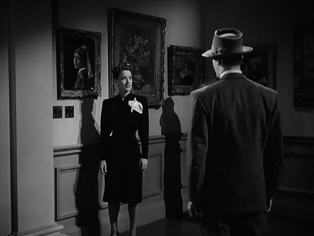
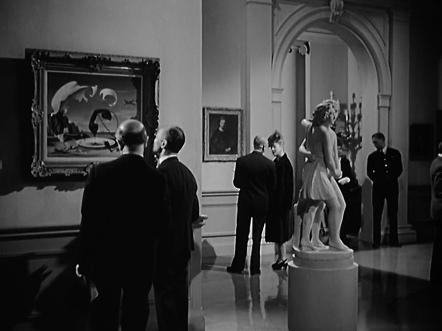
A Vermeer in a dark corner.
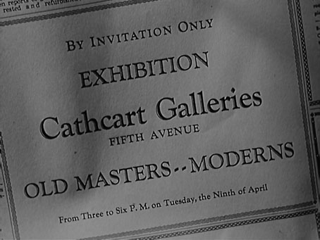
The story concerns a New York private eye, Bradford Galt (Mark Stevens), who’s being framed by parties unknown. When Galt investigates the mystery with his secretary, Kathleen (Lucille Ball in a straight role), their researches lead them to a Fifth Avenue art gallery run by Hardy Cathcart (Clifton Webb playing the same waspish aesthete as he did in Laura). Many of the art details can’t help but seem amusing or bizarre today, such as when someone brings home a genuine Vincent van Gogh painting and leaves it propped in a chair. There’s also a painting that we’re told is a rare Raphael but since this has to resemble Cathcart’s wife it looks nothing like a Renaissance picture. Elsewhere, a Donatello statue is priced at a mere $40,000, while Cathcart has Vermeer’s Girl with a Pearl Earring on sale despite the real painting having been in the collection of the Mauritshuis in The Hague since 1902.

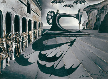
As to the Surrealism, a scene inside the gallery features a blink-and-you-miss-it moment when a pair of would-be purchasers are seen peering at this Salvador Dalí painting, one of the few pieces of contemporary art on display. Before the camera pans away we see the man on the right shaking his head. I think this painting was also created for the film but unlike the alleged Raphael it looks genuine, and resembles several pictures that Dalí painted in the 1930s (eg: this one), all of which feature telephone receivers. The choice of imagery is apt. Two years earlier Dalí had created a seven-picture sequence illustrating “The Seven Lively Arts”. The Art of Cinema is represented by a figure whose head is a giant eyeball positioned between two huge ears, and with eyelashes that are cords leading to yet more telephone receivers.
Imitation or not, the painting in The Dark Corner did at least end up on the screen. In 1946 Dalí was working with Disney’s animators on the Destino project but the results of this wouldn’t be seen for another 50 years. I’ve been wondering what other Dalínean references might be hiding in American feature films from this time. (Don’t say Spellbound, everybody knows that one…)
Previously on { feuilleton }
• Art on film: Je t’aime, Je t’aime
• Art on film: Space is the Place
• Art on film: Providence
• Art on film: The Beast