The return of The Thing: Artbook

thing-artbook.jpg

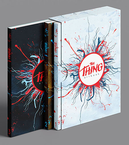
The most notable feature of the alien organism in John W. Campbell’s “Who Goes There?” is its physical mutability, a quality memorably expressed in John Carpenter’s film adaptation of the story, The Thing. Fitting, then, that The Thing: Artbook is due to be republished later this year in a new edition which adds fresh material to the original volume. I was one of over 350 artists asked to create personal responses to Carpenter’s film in 2016, the results of which were published by Printed In Blood as a heavyweight, large-format hardback. The new book will divide the original into a more manageable two-volume paperback set to which a third volume of fresh material will be added, with all three volumes being contained in a slipcase. The third volume will also be available as a standalone book. Pre-orders may be placed here.

For the reprint there’s the possibility of original contributors doing a new piece, a tempting idea but not something I have the time for at the moment. Last month I started work on a new series of book illustrations which I need to concentrate on even though I wouldn’t mind doing something new based on the film. Before the book was published I guessed that many of the artists would be working variations on favourite scenes or characters, an accurate prediction as it turned out. My own contribution was an attempt to depict some of the moments we don’t see, when transformations are taking place offscreen, but I also had a more complicated, poster-style design in mind which I never managed to work out to my own satisfaction. For now the idea will have to remain frozen in the conceptual ice.

thing-bantam.jpg

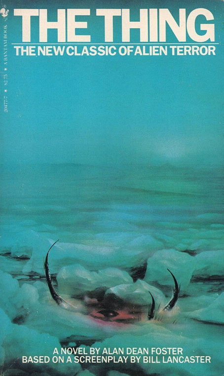
Before starting work on my own drawing I also read John W. Campbell’s story and looked for earlier depictions of his alien. One of the book covers that turned up was the Bantam paperback of Alan Dean Foster’s novelisation (above), a book with a better cover than the UK editions which recycled elements from the film posters. I couldn’t find an artist credit at the time but the cover art is by Jim Burns, a British illustrator best known for his depictions of spacecraft and futuristic technology. Looking for confirmation of his credit turned up a picture of the original painting which has a husky looking at the frozen alien. I can see why the art director wanted the dog removed—the cover is better with all the viewer’s attention drawn to those insectile legs—but Burns’ colour scheme is spoiled by the greenish tinge of the printed version. Ice is a difficult substance to paint well. If I was Burns I would have been a little annoyed that all those icy details had been lost.

Previously on { feuilleton }
The Thing: Artbook
The Thing Group Art Show
Things

Edmund Dulac’s Princesse Badourah

dulac01.jpg

The Chinese princess is usually named Badoura in English editions of The Thousand and One Nights but this volume is a French book which reprints the art that Edmund Dulac created for a retelling of the story by Laurence Housman published in 1913. The English edition was itself a recycled volume, expanded from an earlier Housman/Dulac collection, Stories from the Arabian Nights (1907). The story itself reads like an odd mirroring of some of the versions of Aladdin which end with the triumphant hero marrying a Chinese princess named Badroulbadour. The male character in Princess Badoura is Camaralzaman, the shy son of an Arabian king whose repudiation of women causes his father to throw him into a dungeon. As in Aladdin, a genie helps engineer events to bring the story to a happy resolution.

dulac02.jpg

Some of the art may be recycled but the book design is better than the English editions, with gold frames embracing the tipped-in colour plates. The paintings are consequently reduced in size but this doesn’t harm them too much. One thing the book doesn’t contain is any clue to the writer of the text. I’d guess it was a translation of the Housman version but it could equally be a French retelling taken from another edition altogether.

dulac03.jpg

dulac04.jpg

dulac05.jpg

Continue reading “Edmund Dulac’s Princesse Badourah”

Harry Clarke’s Elixirs of Life

jamesonad.jpg

A magazine ad.

Of all the books illustrated by Harry Clarke the most scarce are a pair of slim volumes published 100 years ago by the Jameson distillery to promote their brand of Irish whiskey. The books were never widely distributed, being given away to distillery visitors. Copies of the illustrations were still hard to find in 2011 when I wrote a brief post about them. Collections of Clarke’s work seldom pay the books much attention beyond reproducing one or two drawings but by trawling the auction houses it’s now possible to accumulate most of the illustrations. With the ongoing interest in Clarke’s work I keep expecting Jameson to publish facsimile reprints but so far this doesn’t seem to have happened. The information below is taken from Harry Clarke: His Graphic Art (1983) by Nicola Gordon Bowe. A couple more illustrations from The History of a Great House may be found in Hiroshi Unno’s exceptional study, Harry Clarke – An Imaginative Genius in Illustrations and Stained-glass Arts.


The History of a Great House — Origin of John Jameson Whiskey, containing some Interesting Observations thereon together with the Causes of Its Present Scarcity. Printed by Maunsel and Roberts Ltd, Dublin 1924 for the distillers; 24 pp, 8 x 4.75 inches, 21 black line drawings blocked in with viridian, one repeated as an endpiece, custard paper cover (8 x 5 inches), printed with additional black and viridian drawing.

jameson-history01.jpg

jameson-history02.jpg

jameson-history03.jpg

jameson-history04.jpg

Continue reading “Harry Clarke’s Elixirs of Life”

Fire in the Blood: Harry Clarke

clarke1.jpg

An all-too-short run through the biography of Harry Clarke, Fire in the Blood was made by Irish TV channel RTE in 2016 as part of a series devoted to the Celtic Revival. Camille O’Sullivan is the guide to Clarke’s life and work in a film which includes some commentary from Clarke expert Nicola Gordon Bowe, among others. 24 minutes isn’t enough time to cover the full range of the artist’s work but any Clarke documentary is better than none, and this one has a number of points in its favour. Clarke’s stained-glass windows are given a prominent place in the discussion, a reminder that stained-glass production was Clarke’s primary business even while his success as an illustrator increased. The stained-glass medium is an especially attractive one for a TV documentary—the colours of the windows glow on the screen in a manner they can never do on a page—and you could easily fill an hour with a discussion of Clarke’s remarkable glasswork alone. The end of the film includes some discussion about the scandal of Clarke’s last major work in the medium, the so-called Geneva Window, commissioned by the Irish government as a gift for the League of Nations then disowned when Clarke’s choice of subject (and the manner of its depiction) was deemed unsuitable. As with earlier objections to the work of Aubrey Beardsley, the complaints seem scarcely credible today but the window ended up being sold to an American collector.

clarke2.jpg

On the illustration side we get to see pages from a little-known work of Clarke’s, the frame designs for the pages in Ireland’s Memorial Records, a multi-volume record of the names of Irish soldiers who died in the First World War. Nicola Gordon Bowe’s Clarke studies show the title page but seeing all the frames in print wasn’t possible until the publication of Harry Clarke’s War by Marguerite Helmers. The silhouettes of the soldiers embedded in each frame form a sequential narrative describing the progress of the war amid knotted borders that hark back to the page designs of the Book of Kells.

Elsewhere on { feuilleton }
The illustrators archive

Previously on { feuilleton }
Harry Clarke’s illustrated Swinburne
More Harry Clarke online
Harry Clarke online
Harry Clarke record covers
Thomas Bodkin on Harry Clarke
Harry Clarke: His Graphic Art
Harry Clarke and others in The Studio
Harry Clarke’s Fairy Tales of Charles Perrault
Harry Clarke in colour
The Tinderbox
Harry Clarke and the Elixir of Life
Cardwell Higgins versus Harry Clarke
Modern book illustrators, 1914
Illustrating Poe #3: Harry Clarke
Strangest Genius: The Stained Glass of Harry Clarke
Harry Clarke’s stained glass
Harry Clarke’s The Year’s at the Spring
The art of Harry Clarke, 1889–1931

Illustrating Hyperborea

hyperborea00.jpg

The Book of Hyperborea (1996). Cover art by Robert H. Knox.

“My Hyperborean tales, it seems to me, with their primordial, prehuman and sometimes premundane background and figures, are the closest to the Cthulhu Mythos, but most of them are written in a vein of grotesque humor that differentiates them vastly.” — Clark Ashton Smith

Since re-reading Clark Ashton Smith’s The Tale of Satampra Zeiros I’ve been revisiting more of Smith’s stories set in the lost world of Hyperborea. And having put together a post some years ago that gathered all the original illustrations for Smith’s Zothique cycle, I thought I’d try and do the same for another of his story series. As I noted in the earlier post, we’re fortunate today that it’s so easy to see illustrations that in the past would have been impossible to find unless you owned (or had access to) a huge collection of pulp magazines. Pulp illustrations aren’t always very good—in the case of the early issues of Weird Tales, they’re frequently amateurish—but those that illustrate new fiction for the first time are historically important if nothing else.

pennington1.jpg

Lost Worlds: Volume 1 (1974). Cover art by Bruce Pennington. Lost Worlds was a single-volume collection published by Arkham House (USA) and Neville Spearman (UK). The Panther paperback covers by Bruce Pennington could easily be used on other books but these were the first Smith volumes I owned.  

The first Hyperborea stories were among Smith’s earliest prose fantasies, owing something to Lord Dunsany on the one hand (HP Lovecraft detected a Dunsanian quality), and the writers of antiquity on the other, the name “Hyperborea” (“Behind the North Wind”) being borrowed from the Greeks. The northern location is about the only feature of the continent that the Greek writers would recognise, Smith’s world being a temperate pre-Ice Age realm of mountains and verdant jungles. Dinosaurs and megafauna share the lands with human inhabitants for whom sorcery is a common practice. As with Zothique, the cycle was an influential one. Lin Carter in the introduction to his Ballantine collection, Hyperborea (1971), suggests that the name of the continent might have prompted Robert E. Howard to set his Conan stories in “the Hyborean Age”. This could be the case: Howard and Smith were writing for the same publications, and the first Conan story was published in Weird Tales shortly after The Tale of Satampra Zeiros; but Howard was also reading the Greeks as well. A more substantial influence may be found in Fritz Leiber’s Nehwon, a world in which aspects of Hyperborea and Zothique are combined. Sword and sorcery begins “behind the North Wind”, in other words, although there’s very little sword-play in Smith’s fiction, that was Leiber and Howard’s department.

pennington2.jpg

Lost Worlds: Volume 2 (1974). Cover art by Bruce Pennington.

The original Hyperborea illustrations are fewer than those for Zothique. As with the later cycle, several of the stories are unillustrated, while others were given lacklustre artwork. In the earlier post I followed the story order chosen by Lin Carter which attempted to contrive an internal chronology for the cycle. Carter did the same with his Hyperborea collection so I’ve followed his example once again. Later collections, like Will Murray’s Book of Hyperborea, tend to order the stories by publication date.

hyperborea01.jpg

The Seven Geases, Weird Tales, October 1934.

An illustration of Tsathoggua by Smith himself. The toad-god turns up in person in this story.

hyperborea02.jpg

The Weird of Avoosl Wuthoqquan, Weird Tales, June 1932.

Continue reading “Illustrating Hyperborea”