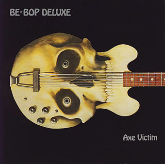
John Holmes, 1935–2011

holmes4.jpg

(1974).

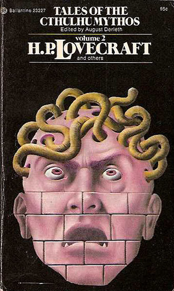
Artist John Holmes, whose obituary was published this week, had a style that was immediately recognisable from the many paintings featured on book covers (and a few record sleeves) in the 1970s and 1980s. His painting for The Female Eunuch is by far the most well-known, of course, although I often used to wonder how many people who knew the picture could have named the artist responsible. Holmes’ art brought a touch of Magritte-like Surrealism to cover illustration (at times the debt to Magritte was quite overt), and his images are familiar to anyone in the UK who was reading science fiction or horror during the 70s. He also has the distinction of being the first artist to provide a cover for an M. John Harrison book with the painting for Harrison’s debut novel, The Committed Men, in 1971. (Or not quite… See comments.)

The McNeill Gallery has some original work for sale while the artist himself talked about some of his cover art at All Things Horror.

holmes2.jpg

(1974).

holmes3.jpg

(1981).

Elsewhere on { feuilleton }
The album covers archive
The book covers archive

Virgil Finlay’s Salomé

finlay2.jpg

While chasing down Virgil Finlay’s illustration for Lovecraft’s The Colour Out of Space earlier this week I came across another Finlay drawing I’d not noticed before in a book I’ve owned for years. Makes me wonder what else is lurking on the shelves. Finlay’s depiction of Salomé was an illustration for Waxworks, a story by Robert Bloch published in Weird Tales for January 1939. I’ve never read much of Bloch’s fiction, this story included, so can’t say anything about it, but Finlay’s drawing impresses for the solid black night sky, and the peculiar flaming headdress, the kind of unique detail he often added to his pictures.

Bloch and Finlay had a memorable encounter a couple of years years before when Finlay illustrated The Faceless God, another Weird Tales piece which so impressed HP Lovecraft that it inspired a poem, To Mr. Finlay, Upon His Drawing for Mr. Bloch’s Tale, ‘The Faceless God’. Lovecraft’s handwritten draft can be seen (but not necessarily read) here.

Elsewhere on { feuilleton }
The Salomé archive

Die Farbe and The Colour Out of Space

farbe2.jpg

Die Farbe (2010).

The colour, which resembled some of the bands in the meteor’s strange spectrum, was almost impossible to describe; and it was only by analogy that they called it colour at all. Its texture was glossy, and upon tapping it appeared to promise both brittleness and hollowness.

The Colour Out of Space (1927).

Die Farbe (The Colour) is a German feature film by Huan Vu based on HP Lovecraft’s tremendous short story The Colour Out of Space. Vu’s film was completed last year, and has been well-received at film festivals and by Lovecraft aficionados but I’ve been rather tardy in hearing about it. Better late than never.

Having adapted two-and-a-half stories, I tend to take a more than cursory interest in works based on Lovecraft’s fiction. One of the reasons I tackled his works in the first place was out of frustration at the apparent inability of film producers and comic artists to treat the stories as they’d been written. The Colour Out of Space is one of the masterpieces of Lovecraft’s mature period, and was the favourite of his own stories, a skilful blending of horror and science fiction in the tale of a fallen meteorite infecting a farm with an inexplicable process of decay and physical mutation. The mysterious colour is the product of some unearthly substance inside the meteorite which corresponds to no known part of the visible spectrum. This wasn’t the first story of Lovecraft’s that I read—I’d earlier found The Moon-Bog in a ghost story anthology—but it was the first that made a serious impression when I came across it in another anthology at age 12 or 13. Since then, whenever people ask me which Lovecraft stories to read first The Colour Out of Space is always one I recommend.

farbe1.jpg

Continue reading “Die Farbe and The Colour Out of Space”

A Wilde Night

bragdon.jpg

A couple more pieces from yesterday’s Posters in Miniature. The drawing above is entitled A Wilde Night and credited to Claude Fayette Bragdon (1866–1946) whose design work has appeared here before. Bragdon was an acquaintance of Will Bradley’s, and like Bradley was a man of many talents being variously employed as an architect, writer and stage designer. Bragdon and Bradley both worked together on The Chap-Book, Herbert Stone’s Chicago periodical which commenced publication in 1894, the same year as The Yellow Book, a magazine whose style and light-hearted content Stone and co. seemed keen to emulate. Bragdon’s small drawings for The Chap-Book are less Beardsley-like than Bradley’s designs which is why this very overt homage appears as a surprise.

yellowbook.jpg

Bragdon’s picture is undated but the female figure is taken from Beardsley’s cover for the first issue of The Yellow Book which would place it in around 1894; the satyr-like male is an odd blend of bits of Beardsley’s male and female figures. Aubrey, however, would never have drawn bats like Bragdon’s, or a sleeping policeman…too gauche, my dear. As for the Wildeness, 1894 was only a year away from Oscar’s trial, a time when London was buzzing with scandalous rumours, none of which appear to have reached Chicago.

giannini.jpg

Also in Posters in Miniature is this piece by another American, Orlando Giannini (1860–1928), a glass designer and another Chicagoan who worked for a while with Frank Lloyd Wright. This design is dated 1895 and struck me with its radical appearance, so very different from the evolving Art Nouveau styles of the time. Giannini’s work as a glass designer evidently brought a different sensibility to graphic design, one which would have still looked bold and original ten years later.

Elsewhere on { feuilleton }
The Aubrey Beardsley archive
The illustrators archive
The Oscar Wilde archive

Will Bradley posters

bradley01.jpg

More from American illustrator and designer Will Bradley (1868–1962) from the height of his Beardsley period circa 1894–95. These are from a collection by Edward Penfield entitled Posters in Miniature (1897) in which Bradley’s work receives more attention than some of his better-known contemporaries. Half of these designs are familiar, the rest I hadn’t seen before, including the peacock piece below. Even though Bradley was trying out various Beardsley moves at this stage, his work was always a lot more versatile than the lesser imitators. More of Bradley’s designs, and work by other artists, can be found in the scanned edition of Penfield’s book at the Internet Archive.

bradley02.jpg

bradley03.jpg

Continue reading “Will Bradley posters”