Hugo Steiner-Prag’s Golem

golem1.jpg

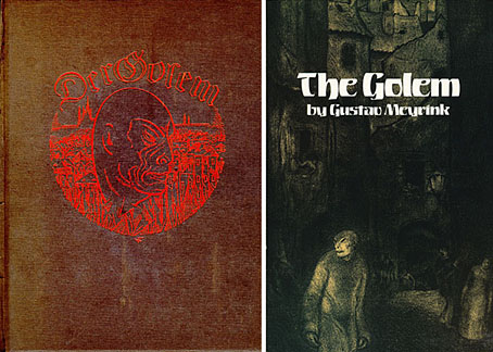
Der Golem, first edition (1915) and Dover reprint (1986).
Illustrations by Hugo Steiner-Prag.

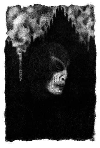
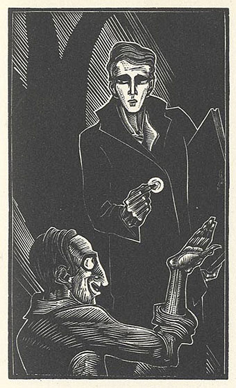
Before leaving Prague (for the time being), it’s worth mentioning the lithograph illustrations by Hugo Steiner-Prag (1880–1945) for Gustav Meyrink’s The Golem. These atmospheric drawings always remind me of the production sketches Albin Grau created for Murnau’s Nosferatu, eine Symphonie des Grauens in 1922. Grau was an occultist as well as a horror aficionado and would certainly have read Meyrink’s book which was a Europe-wide bestseller when first published. The success of the novel inspired Paul Wegener’s first Golem film (now lost) which in turn helped fuel the demand for horror films that led eventually to Nosferatu.
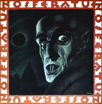
nosferatu.jpg

Nosferatu poster by Albin Grau (1922).

There’s little of Steiner-Prag’s work available on the web but the Dover paperback above contains all the illustrations. The novel has been re-translated recently but I’ve yet to read one of the more recent editions to see how it compares with Dover’s 1928 Madge Pemberton version.

golem3.jpg

The Golem by Hugo Steiner-Prag (1915).

Elsewhere on { feuilleton }
The illustrators archive

Previously on { feuilleton }
Nosferatu
Barta’s Golem

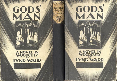
Gods’ Man by Lynd Ward

ward1.jpg

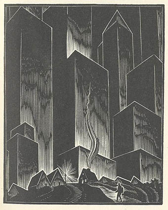
I’ve never tried woodcut engaving—the closest was scraperboard and some linocuts when I was a teenager—but I’ve always admired the form and Lynd Ward (1905–1985) was one of its masters. Ward’s wordless “novels” were inspired by the similar work of Frans Masereel and you can see pages from two of these, Gods’ Man (1930) and Madman’s Drum (1930) at The Visual Telling of Stories. Ward’s work is frequently referred to as an inspiration by later illustrators, and comic artists especially have responded to these pictorial narratives. Woodcut illustration had a resurgence of popularity before and after the Second World War; most of MC Escher‘s early work is woodcut engraving, for instance. There are still a few contemporary practitioners, Clifford Harper being one of the most visible in the UK.

Bud Plant’s Lynd Ward page
A Lynd Ward site with examples from other books

ward2.jpg

ward3.jpg

Elsewhere on { feuilleton }
The etching and engraving archive
The illustrators archive

In the hands of FATE

fate.jpg

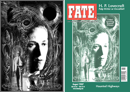
One of my works graces the cover of an American institution this month with the appearance of my HP Lovecraft portrait on the August issue of FATE magazine (volume 60, number 8, issue 688, if you must know). This is for an article about Lovecraft’s occult connections and I believe they’ve also used one of my views of R’lyeh for the article itself although I can’t confirm this just now.

predators.jpg

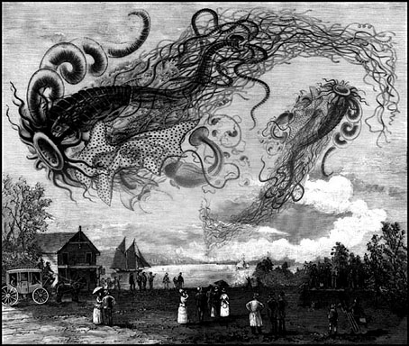
This is the third time my work has appeared in FATE (like TIME, the magazine prefers to see its name in caps). The first occasion was for another Lovecraft feature about Cthulhu in (I think) 1999. Then in 2000 I was commissioned to produce the illustration above for an article on “sky predators” which led me to plunder once again Ernst Haeckel’s Art Forms in Nature, a wonderful book I’ve frequently swiped from when in need of organic weirdness.

A couple of years later this picture was featured in a Fox TV documentary of all things, part of a post X-Files series called Conspiracy Theory. The subject was “flying rods”, one of the less convincing manifestations of cryptozoological phenomena, and the program needed some antique pictures to back up their thin veneer of evidence. They rather scurrilously used my picture to illustrate flying rod history as though this was a Victorian illustration, not a piece of Photoshop work. Fox documentaries, like their news channel, seem to have a flexible approach to the truth.

Previously on { feuilleton }
New things for June
Le horreur cosmique

Weel done, Cutty-sark!

faed.jpg

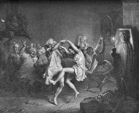
Brad David wrote last week asking about the picture I used on the recent Jack Rose poster design. I’d seen this engraving for years in various books but was unsure of its provenance so the enquiry made me curious as well. The picture in question is an illustration for the poem Tam O’Shanter by Robert Burns and since it’s a depiction of cavorting witches and warlocks it turns up frequently in occult encyclopedias.

After a bit of searching it transpires that the engraving is based on a series of six paintings illustrating the poem by Scottish artist John Faed (1819–1902). Here we’re seeing the moment just before drunken Tam (his face visible at the window) shouts “Weel done, Cutty-sark!” to the young witch in the centre, whereupon the lights go out and a shrieking horde of angry witches chase him home.

Elsewhere on { feuilleton }
The etching and engraving archive

New things for July

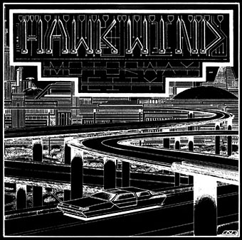
motorway_city_sm.jpg

Motorway City by Hawkwind, Flicknife Records single (1983).

This month’s issue of Record Collector magazine has a feature about Hawkwind which featured my Motorway City sleeve among its illustrations. It was odd seeing this again, being a single it doesn’t turn up so often and it has the distinction of being one of the oldest of my works in print. Although the single was released in 1983, the drawing was done in 1980 (I was 18 at the time) and it ended up with Dave Brock somehow.

The A-side is taken from the Zones album, which sports one of my more successful cover illustrations for the band, and the song is a Ballardian eulogy to driving on motorways at night. Despite their reputation for being a bunch of spaced-out hippies, Hawkwind were frequently drawn to the harder side of things (Lemmy used to shout “Die! Die!” at their tripping audience and was proud of freaking people out), and this song isn’t even science fiction, despite my flat futuristic cityscape in the background. Before he finished with the band for good, singer Robert Calvert wrote two songs based on JG Ballard books, High Rise and the punk- and Crash-derived thrash piece Death Trap, both on the PXR5 album from 1979. Motorway City was written around the same time and it’s a shame it didn’t have Death Trap on the B-side instead of yet another version of Master of the Universe. My drawing was done as black on white but the record company smartly (for once) reversed out the design which I always felt made it look a lot better, as well as fitting more with the night-driving theme.

Also this month, I’m in the process of reworking the website a bit which means making more prints of artwork available. I’ve started with some of the Lovecraft pictures, which is always the most popular stuff but I’ll gradually be working through everything and setting up PayPal facilities for other items. Many pictures and designs can already be had as prints at CafePress but that system is best for t-shirts and other goods, it lacks the personal touch which people often want from a signed print.

Previously on { feuilleton }
Hawkwind: They’re still feeling mean
Barney Bubbles: artist and designer