Tetragram for Enlargement

tetragram.jpg

A stunning architectural video installation produced by Apparati Effimeri for last month’s Itinerario Festival, in which the stolid Rocca Malatestiana in Cesena, Italy, is painted with stripes, then mutated, melted and finally blown apart in slow motion. I’d love to see this effect applied to large city-centre buildings but the results are so striking they’d probably create no end of traffic accidents.

Via Further.

Previously on { feuilleton }
Alexandre Alexeieff and Claire Parker

David Becket’s bookplates

becket.jpg

From David Becket: His Book of Bookplates, a slim volume published in 1906. The wonderfully spare style of these looks advanced for the time but probably owes something to William Nicholson‘s earlier work. Nicholson collaborated with brother-in-law James Pryde (as “The Beggarstaffs”) on poster designs with the same reduced detail, masses of black and hand-drawn type.

For 764 (!) further bookplates, see LUNA Commons.

Andy Paiko’s glass art

paiko1.jpg

The Glass Chair.

Today’s glass artists continue to astonish. Andy Paiko‘s one-off creation above is a chair whose vitrines contain a rhesus monkey skull, a piece of octopus coral, a murex spiny trumpet shell, the skeleton of a rat, and a mountain lion skull. The piece below contains a 24 carat gold-plated coyote skull with the work as a whole being described by the artist as representing various stages of the alchemical process. Go and feast your eyes on the rest of his creations. Thanks again to Thom for the tip!

paiko2.jpg

Canis Auribus Tenere.

Previously on { feuilleton }
The art of Josiah McElheny
The art of Angelo Filomeno
IKO stained glass
Cristalophonics: searching for the Cocteau sound
Glass engines and marble machines
Wesley Fleming’s glass insects
The art of Lucio Bubacco
The glass menagerie

Charles Ricketts’ Hero and Leander

ricketts1.jpg

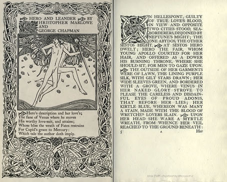
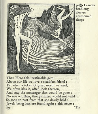
Enthusiasts of Charles Ricketts’ illustrations can find book collections of his drawings and paintings but the artist (with partner Charles Shannon) was also a printer, typographer and book designer who would no doubt have preferred his illustrations to be seen in their intended setting. The Internet Archive has a few choice examples of Rickett’s books, of which the most profusely illustrated is Hero and Leander (1894), Christopher Marlowe’s poem (completed by George Chapman).

ricketts2.jpg

Also of interest is Danaë (1903) by Thomas Sturge Moore with its black and red type, A Bibliography of the Books Issued by Hacon & Ricketts (1904), and A Defence of the Revival of Printing (1899). The latter is of interest to book designers and typographers for its presentation of Ricketts’ aesthetic philosophy. Ricketts’ and Shannon’s books made continual use of a small leaf motif as a pilcrow to mark a fresh paragraph. In A Defence of the Revival of Printing Ricketts discusses his replacement for the ampersand (&), which he disliked, preferring instead a new character combining the letters E and T, ampersands being a contraction of the Latin word “et”. There’s also some discussion of his unique type designs which he charmingly refers to as “founts”, preferring, like contemporary William Morris, the antique terminology.

ricketts3.jpg

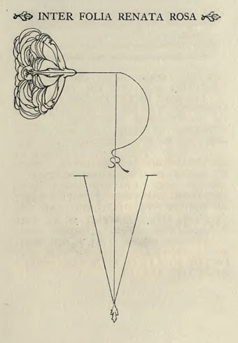
Colophon from Hero and Leander. A rose forms the monogram of Ricketts’ and Shannon’s Vale Press.

Elsewhere on { feuilleton }
The illustrators archive

Previously on { feuilleton }
Art Nouveau illustration
Dorian Gray revisited